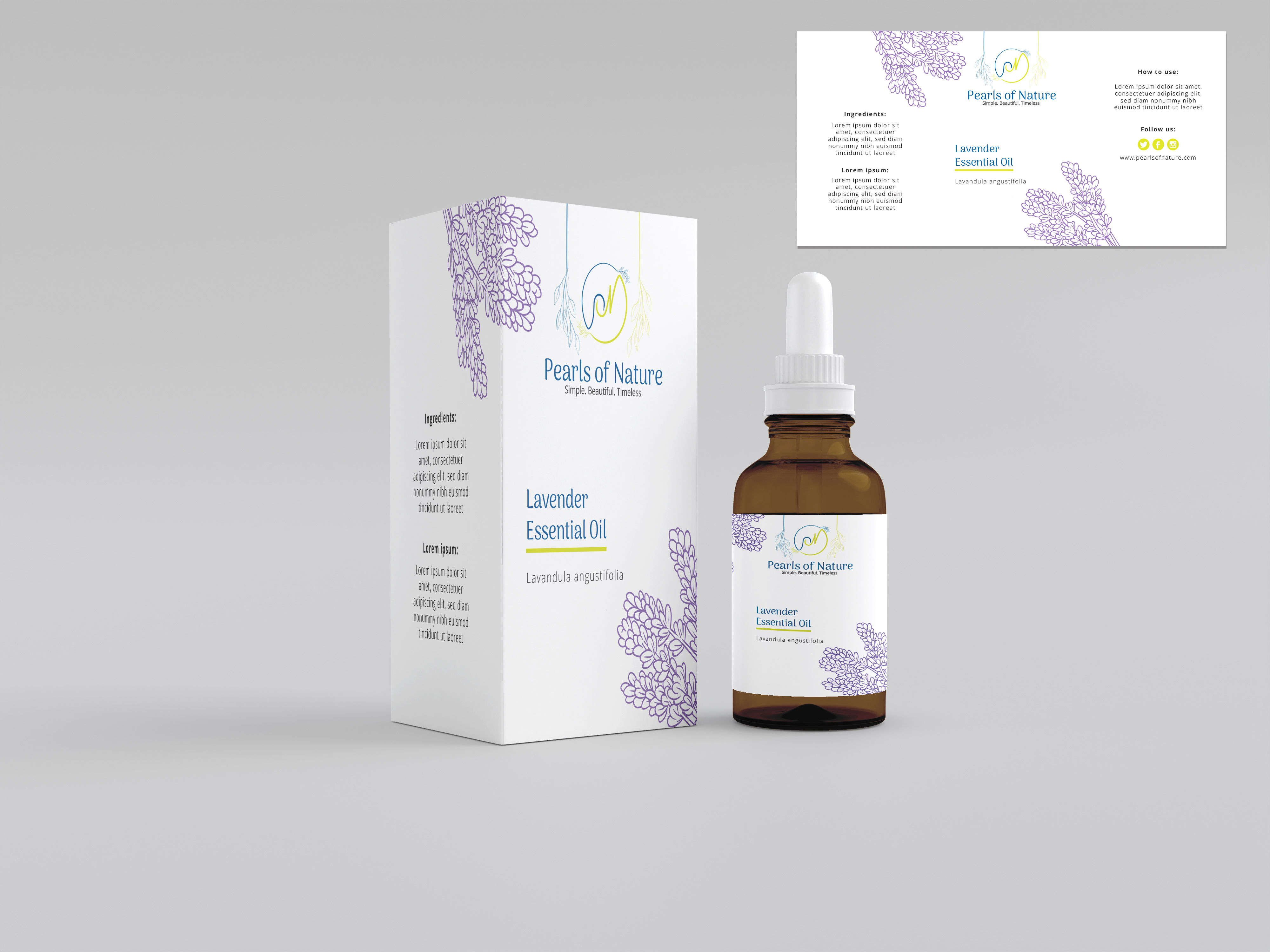
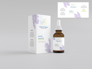
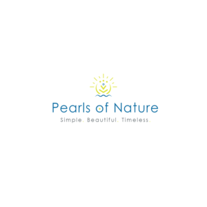
Pearls of Nature Uniform Label Redesign
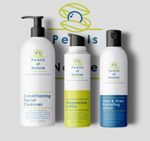
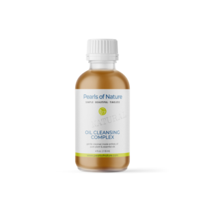
Pearls of Nature needed a packaging design and received 105 Serious, Modern, Natural Skin Care and Wellness packaging designs from 20 designers
Designs
Designers
Budget


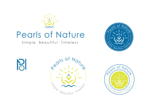


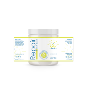
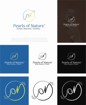
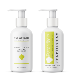
1 - 20 of 105 packaging designs submissions
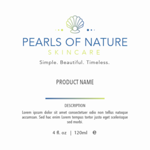
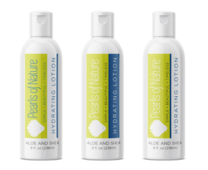
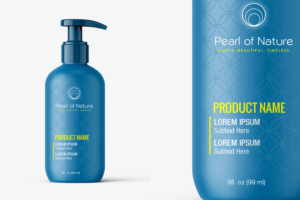
This is what Pearls of Nature was looking for in their packaging design
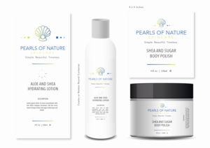
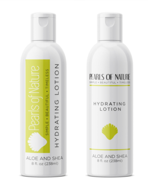
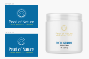
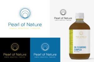
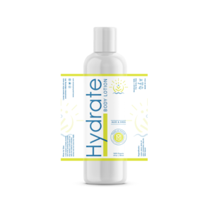
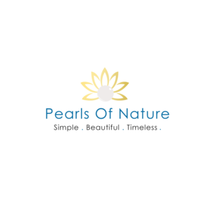
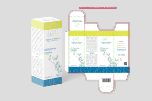
To refine our current product label designs into one, simple, modern, crisp, general look that can be adapted to all our all Natural Skin Care and Wellness products. I am inspired by the elegant versatility of products like Innersense Organic Beauty or Juice Beauty label schemes. We no longer want labels that indicate scent or ingredients. We have two primary colors that we want to maintain (#096CA3 and #DEE33F), and are willing to entertain subtle additions of others, other than black. Our labels will be printed on white or clear material. We use mainly Cosmo or Boston Round container shapes, plus flat top, smooth, round jars. Maybe a faded watermark highlight the "natural" or "beautiful" side of our products. we need to convey confidence, while remaining simple. We currently use the Advantage font. Maybe Century Gothic may work. Something similar that is easy on the eyes. Maybe vertical main text? We are willing to entertain a lot of ideas. These designs will offer ideas into our e… Read more