Electric bike company logo
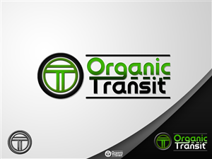
Organic Transit needed a logo design and received 29 Bold, Conservative, It Company logo designs from 9 designers
Designs
Designers
Budget


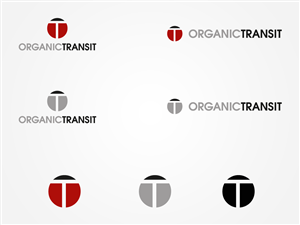
1 - 20 of 29 logo designs submissions
This is what Organic Transit was looking for in their logo design
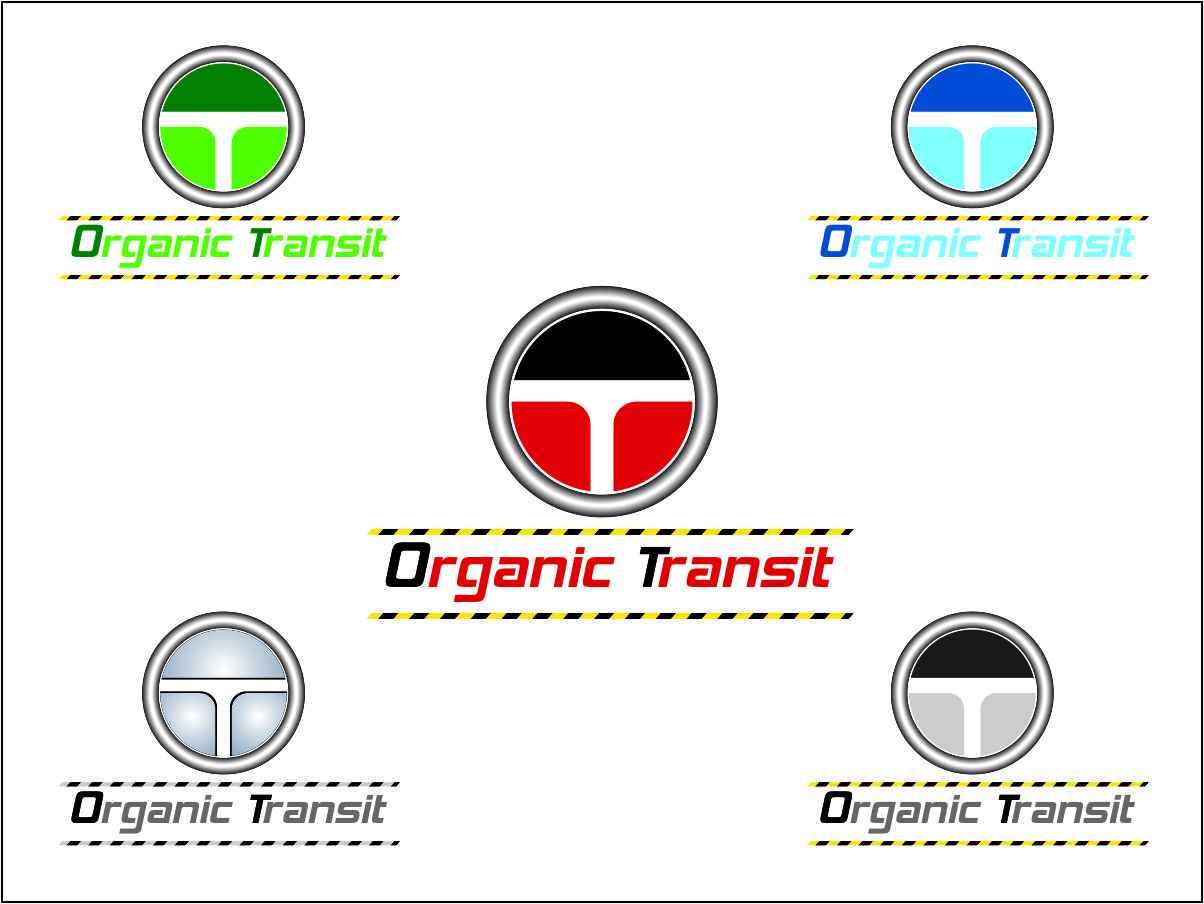
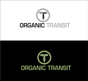
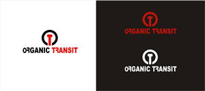
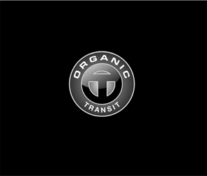
We need a logo for a pedal/solar electric bike company in Durham, NC called Organic Transit. We have a logo that we mostly like, but it needs a little tweaking to make it more professional and distinctive. The design should retain the T inside an O that we are using now, and should also incorporate the name in a way that can be easily removed.
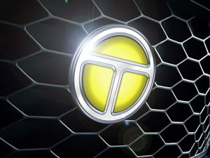
Our vehicle has a car-like quality so we want the O/T combination to be usable as a badge on the front and doors of the vehicle, with the name of the company positioned around it in such a way that it can used on cards and letterhead but removed for the badge. You can see the shape and style of the vehicles on our website: www.organictransit.com
Update 7/2/12:
At our most recent meeting to review the submitted logos we had a few insights into what we really want. Here are the most essential components:
1. The design should very clearly be an "O" and a "T" and these letters should be in balance with one another.