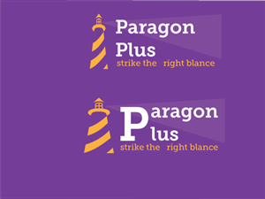
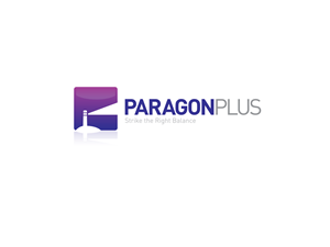
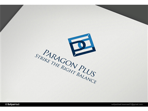
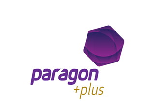
Logo Design Project for Paragon
Paragon Plus - Strike the Right Balance needed a logo design and received 16 Modern, Colorful, It Company logo designs from 11 designers
Designs
Designers
Budget
1 - 16 of 16 logo designs submissions
This is what Paragon Plus - Strike the Right Balance was looking for in their logo design
We've been a recruitment services company placing IT permanent and contract staff since 1992. over the past 12 months we have been providing additional professional/consulting services, beyond recruitment, but still with a human resources focus. We no longer want to be known as Paragon Recruitment Services - our new name will be Paragon Plus. Our current logo is really name mark and i like having the name in the logo but I am also interested in seeing if there's a way of including an image or icon within the name mark.I failed to mention that the colour Purple has to be used. See our website www.paragonrec.com.au for an idea of the colour (also I think gold goes well with it)
I dont' want a wide design....more compact....the word PLUS should not follow PARAGON on the same line
Read more
