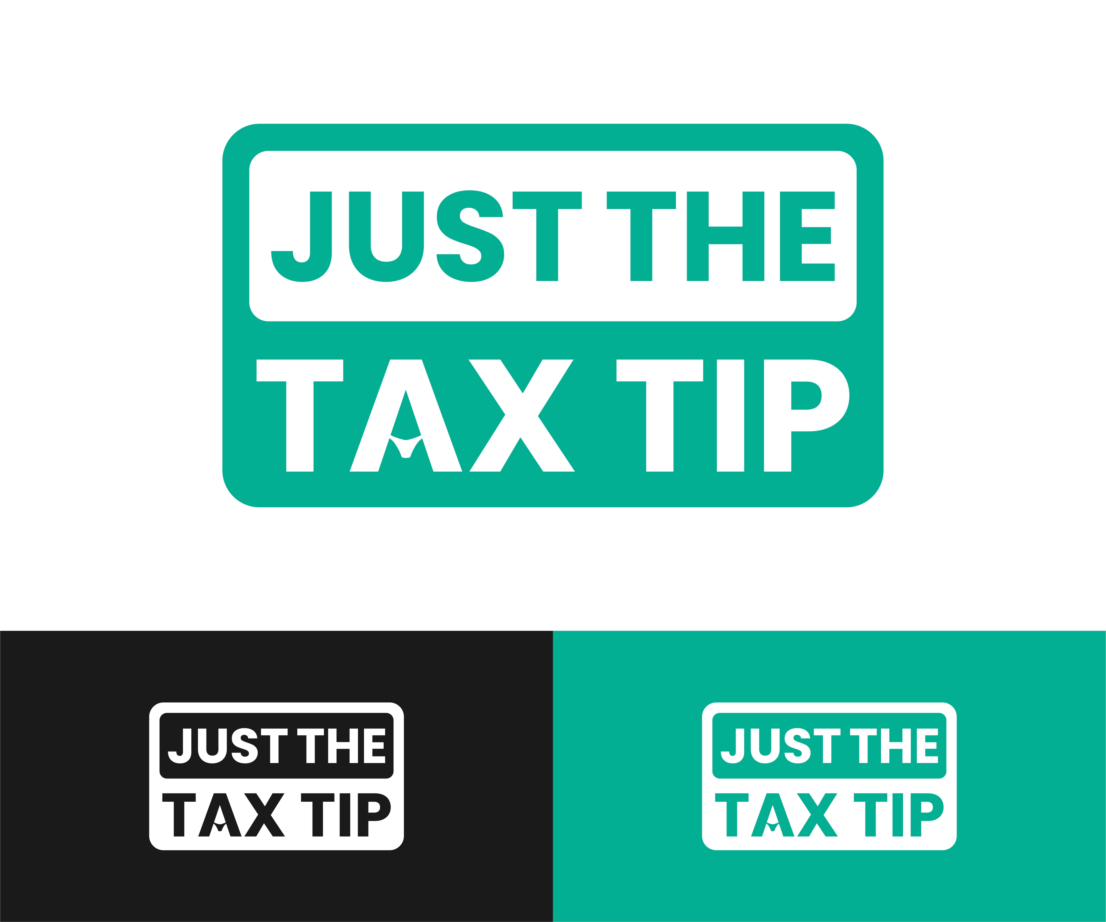
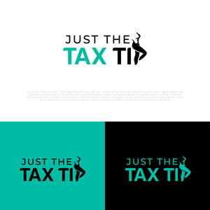
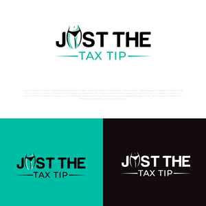
Logo Design - Just the Tax Tip for Tax Company - Subtly Inappropriate
Just the Tax Tip needed a logo design and received 88 Elegant, Modern, Tax logo designs from 44 designers
Designs
Designers
Budget


1 - 20 of 88 logo designs submissions
This is what Just the Tax Tip was looking for in their logo design
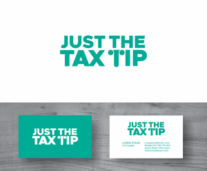
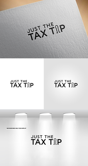
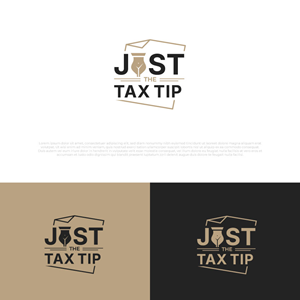
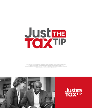
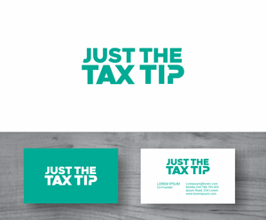
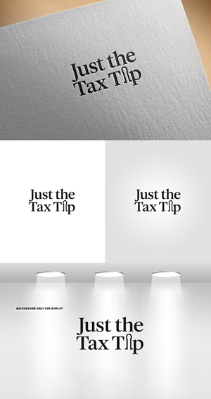
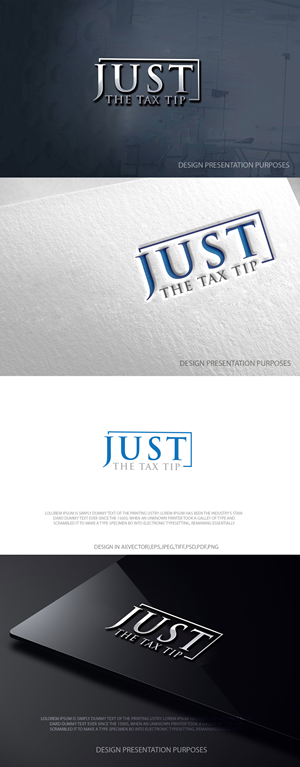
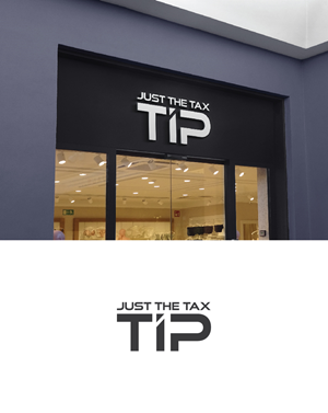
I need a logo designed for my tax company, “Just the Tax Tip.” The brand is fun, cheeky, and a little suggestive, but still professional and trustworthy. I want the logo to balance classy and subtly inappropriate – think clever innuendo that makes people smirk, not anything vulgar or over-the-top.
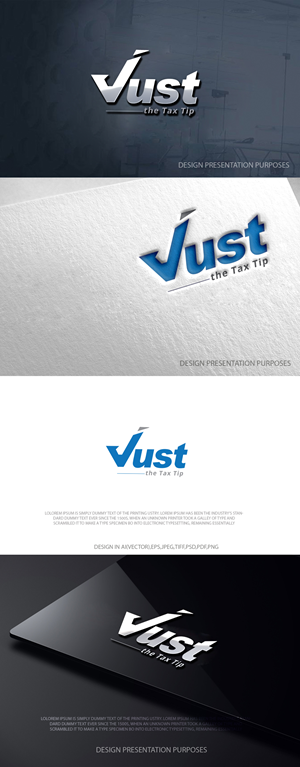
Visually, I’m very drawn to modern wordmark-style logos. Clean typography is key. I don’t want anything too busy, overly bold, or cartoony. Sleek, minimal, and well-kerned type with a clever twist would be ideal. Sans-serif or modern serif fonts are both okay, as long as it feels current and upscale, not corporate-bland.
The name itself, “Just the Tax Tip,” already carries the playful innuendo, so any sexual reference in the design should be subtle and smart. This could be done through shapes, negative space, or gentle curves rather than anything explicit. I want people to look at it and think, “Oh, that’s clever,” not “Whoa, that’s inappropriate.”
I primarily work…
Read more