Empowering sex workers
Want to win a job like this?
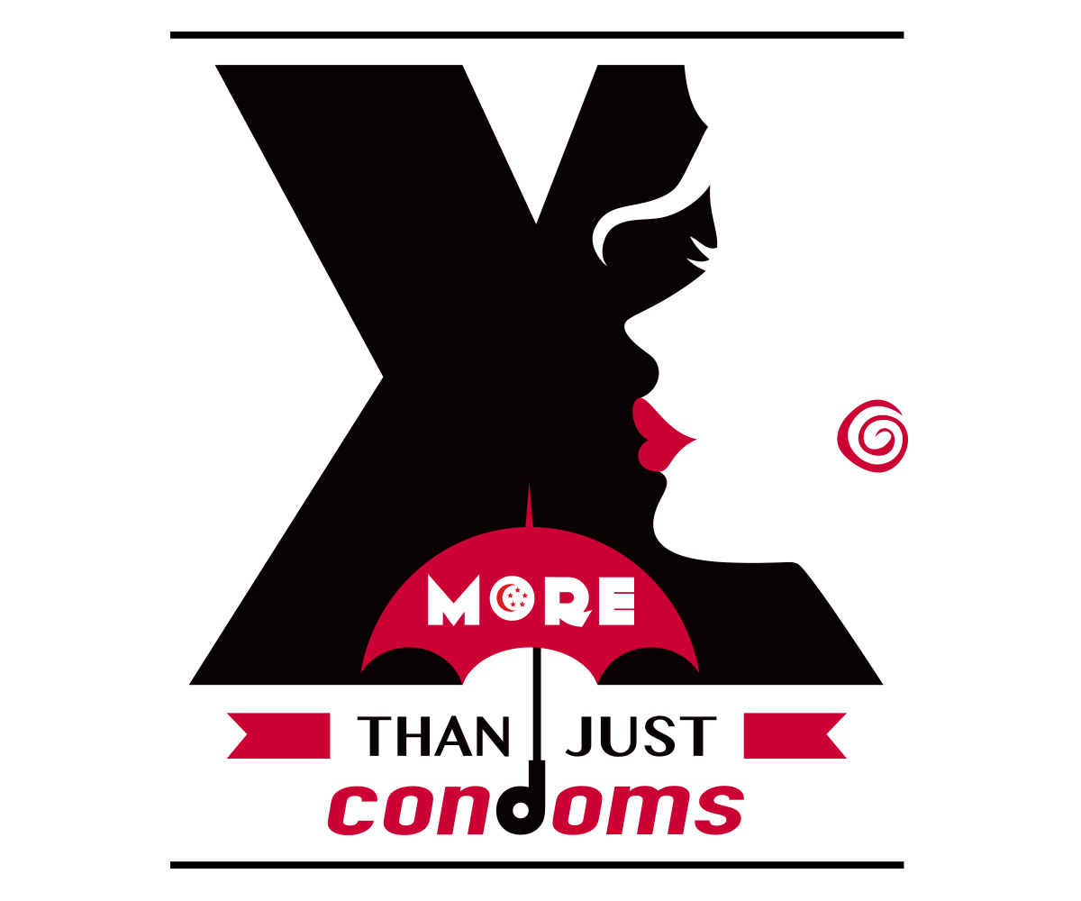
This customer received 58 logo designs from 14 designers. They chose this logo design from robbosphere as the winning design.
Join for free Find Design Jobs-
 S$240
S$240
-
 58 designs
-
 14 designers
Logo Design Brief
We are a group based in singapore that advocates for sex workers' human rights. We seek to end all verbal, physical, emotional and financial violence and discrimination against sex workers. We also wish to challenge the stigma around sex work and empower sex workers.
We have a logo but wish to redesign it such that it will reflect our newly refined vision and mission. The logo should be in red, black and white. We are looking for a red that has a pinkish tone, and is quite a deep tone rather than blood red. Our current logo is in blood red and it's very striking, but at the same time, it is not very endearing/ quite scary.
We envision our logo to embody the meaning of "Strut without fear". It should have a face—stylised or silhouetted. This is so that when sex workers see this logo, they are able to recognize themselves in the logo and feel empowered at the same time. This face should be unisex or androgynous so that male and female sex workers can recognize themselves in it. The logo should also evoke some sense of sensuousness—something a little bit sultry or sexy so as to be attractive.
The key elements of the logo are: the "X" (should be very prominent), a red umbrella (symbol of sex workers' rights), a face/ silhouette, and the tagline "more than just condoms".
I attach 3 files for reference--our current logo (the red one), a sketch with a silhouette (a bit too pale), and a sketch with umbrella with a face it in (the font and the placement doesn't work).
Thank you~!
Updates
Project Deadline Extended
Reason: Keen to see more designs.
Added Monday, February 09, 2015
Target Market(s)
The target audience for the logo are sex workers themselves. We wish to engage more people in the services and events that our organization provides. As such, it should be something that they can relate to.
The other target audience is non-sex workers. For the purpose of advocacy, the logo should be quite striking.
Industry/Entity Type
Financial
Logo Text
Project X, More Than Just Condoms
Logo styles of interest
Pictorial/Combination Logo
A real-world object (optional text)
Font styles to use
Look and feel
Each slider illustrates characteristics of the customer's brand and the style your logo design should communicate.
Elegant
Bold
Playful
Serious
Traditional
Modern
Personable
Professional
Feminine
Masculine
Colorful
Conservative
Economical
Upmarket
Requirements
Must have
- A nice deep red with pinkish tone.
The "X" should be very prominent.
Nice to have
- To embody the meaning of "Strut without fear"/ "Fearless"/ "Confidence".
The word "Project" is optional.