Community Theatre needs a new logo
Want to win a job like this?
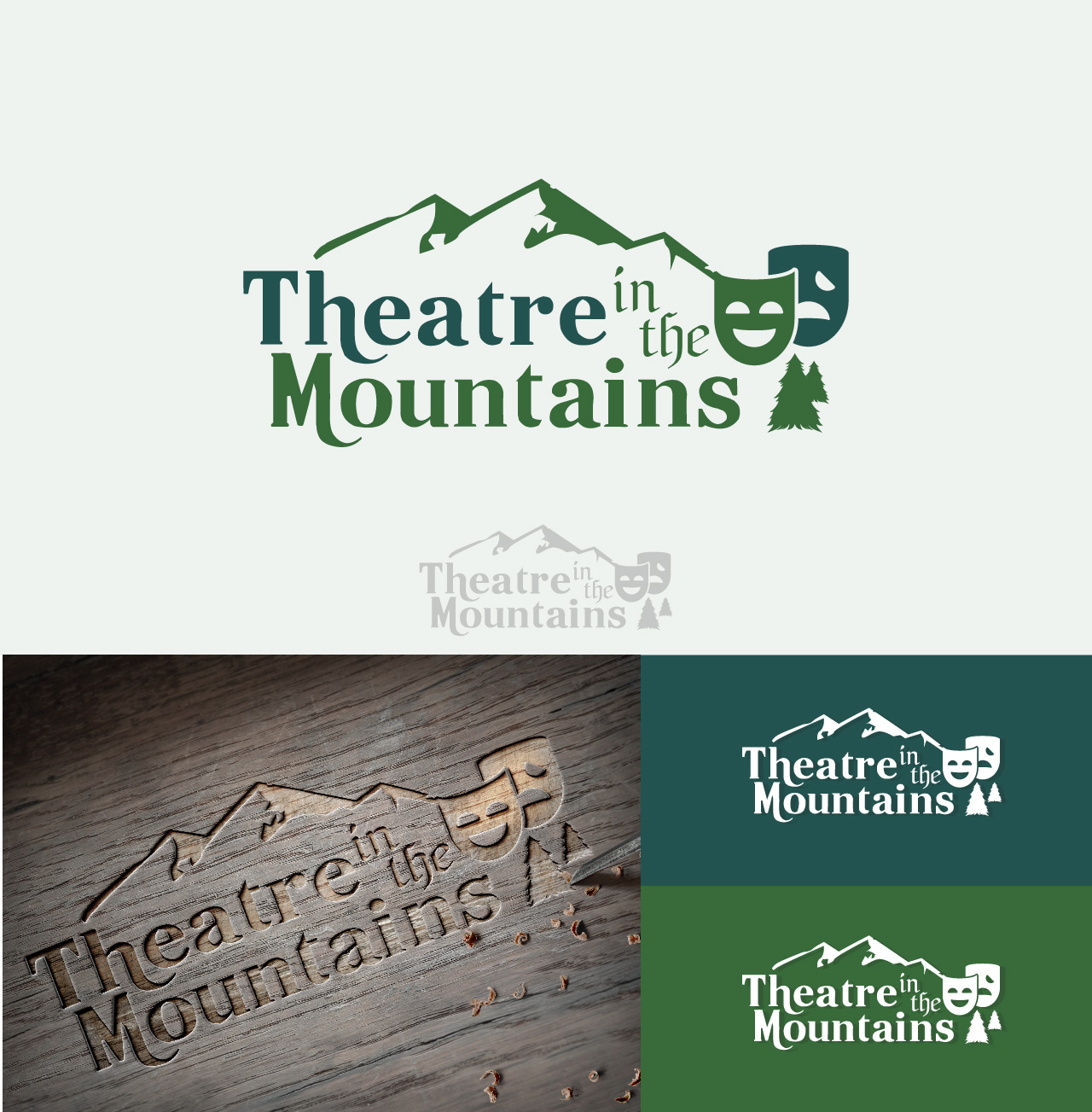
This customer received 127 logo designs from 35 designers. They chose this logo design from uniquetarget as the winning design.
Join for free Find Design Jobs- Guaranteed
-
 US$210
-
 127 designs
-
 35 designers
Logo Design Brief
We are a community theatre company located in mountain area (low elevation no regular snow fall). Our current logo is very simple and hard to distinguish from other generic mountain logos in the community. We started as an adult theatre company, however, we are now closely associated with an elementary school and a middle school. To the point where most people think we are a school entity. We would like to move back toward our beginnings, and would like our new logo to project a more 'grown up', community theatre. We would like the logo to incorporate our mountain community (many redwood and pine trees), yet reflect a more well rounded theatre company.
You can view our website at www.theatreinthemountains.org to see our current logo. The mountain outline is very prevalent in our community as I said so while we like the 'idea' of the mountain in the logo, it needs to change. We also refer to ourselves frequently as TIM, so that can be incorporated but is not a must.
While we want to be taken 'seriously' we are not upscale, stuffy, etc A true community theatre run by mostly volunteers who like to have fun and put on amazing productions,
Updates
Hi,
So excited with the submissions so far. Realized I needed to clarify a few things (sorry maybe too much information.) I updated my brief to include this new information. Our mountains are low elevation, not high peaks. If you google Santa Cruz mountains you will see what I mean. I also uploaded a new file with a sample of mountain outline with trees (from evite, so can't use exact but I think it is some what representative of our mountains). Please do not use the same mountain outline that is in our current logo. It is over used here. Also, realized that I placed a stronger emphasis on modern than I wanted to project.
Thanks again. I'm just really impressed with the creativity. Wish I had gone this route the first time (hired a local friend and it backfired).
Looking forward to the process.
Pennie Dembry
Added Thursday, January 29, 2015
Hi Everyone,
I'm just so happy with many of the submissions and the great and quick response to my feedback. This process is very enjoyable. I just wanted to let everyone know that we are in the middle of a production which opens on Friday Feb 6. This is the reason I needed a 15 day contest. It will be challenging to provide as timely feedback as I would like and to also get input from the rest of my team. I am obviously invested in this, which is why I guaranteed the project, so I really appreciate your patience the next week.
So excited!
-Pennie Dembry
Added Friday, January 30, 2015
Target Market(s)
All customers who enjoy theatre, not just the parents/relatives/friends of the children in our school associated productions. We want to attract people who love theatre, period. We want to be known as a reliable source for performing arts entertainment.
Industry/Entity Type
School
Logo Text
Theatre in the Mountains
Logo styles of interest
Emblem Logo
Logo enclosed in a shape
Pictorial/Combination Logo
A real-world object (optional text)
Lettermark Logo
Acronym or letter based logo (text only)
Look and feel
Each slider illustrates characteristics of the customer's brand and the style your logo design should communicate.
Elegant
Bold
Playful
Serious
Traditional
Modern
Personable
Professional
Feminine
Masculine
Colorful
Conservative
Economical
Upmarket
Requirements
Must have
- Mountain/outdoor reflection. (Sample from a board member uploaded) Should not be more than 3 colors and must convert easily to black and white. Logo will be used on website, correspondence, banners, signs, clothing, etc.
Nice to have
- TIM abbreviation focus. Star or Stars. All of our children's production incorporate stars in the 'tag line'. Rising Stars, Stars to Be, Shining Stars.
Should not have
- Typical theatre symbols curtains, spotlights, etc. Could possibly have the comedy tragedy face (concept drawing uploaded) but not as the main focus. Please do not use the same mountain outline that is in our current logo. If you google Santa Cruz mountains you will have an idea of what our mountains look like. Low elevation with trees, not high peaks with snow.