Apartment Listing Website Needs a Logo Design
Want to win a job like this?
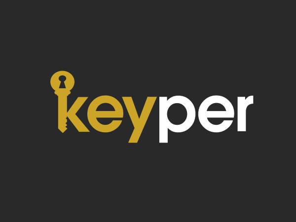
This customer received 526 logo designs from 81 designers. They chose this logo design from Grace A as the winning design.
Join for free Find Design Jobs- Guaranteed
-
 US$160
-
 526 designs
-
 81 designers
Logo Design Brief
Please see the attached image. We drew that to show exactly what we want and would like the logo to follow that idea.
- All lowercase letters
- The letter "k" is the key
- The hole in the key and the letter "p" is the same size
- Clean looking and simple
- Please feel free to fiddle with different colors and fonts
Updates
We are also looking for designs now that will just say "Keyper" instead of the full name ("Find a Keyper"). Added Sunday, February 08, 2015
Project Deadline Extended Reason: We are extending the deadline because at first we said the logo should state "Find a Keyper" but now we are also accepting just "Keyper" because it may look/sound better. Sorry for the confusion. Added Tuesday, February 10, 2015
Can we see some designs using only the word "Keyper" and maybe an orange and blue color scheme? No particular shades of those colors, so feel free to be as creative as you like! Added Saturday, February 14, 2015
Everyone please see the updated design brief for more instructions. Thank you! Added Sunday, February 15, 2015
Target Market(s)
Renters: students, young families, working professionals, all people who rent.
Industry/Entity Type
Apartment
Logo Text
Keyper
Logo styles of interest
Wordmark Logo
Word or name based logo (text only)
Font styles to use
Other font styles liked:
- Any bold/modern/inviting looking font is fine.
Look and feel
Each slider illustrates characteristics of the customer's brand and the style your logo design should communicate.
Elegant
Bold
Playful
Serious
Traditional
Modern
Personable
Professional
Feminine
Masculine
Colorful
Conservative
Economical
Upmarket
Requirements
Must have
- Please see the attached image. We drew that to show exactly what we want and would like the logo to follow that idea.
- - All lowercase letters
- - The letter "k" is the key
- - The hole in the key and the letter "p" is the same size
- - Clean looking and simple
- - Please feel free to fiddle with different colors and fonts
Nice to have
- Please see the attached image. We drew that to show exactly what we want and would like the logo to follow that idea.
- - All lowercase letters
- - The letter "k" is the key
- - The hole in the key and the letter "p" is the same size
- - Clean looking and simple
- - Please feel free to fiddle with different colors and fonts
Should not have
- The project should not be a generic logo that any real estate or real estate advertising company would have (such as: the company name with a roof over top of it).