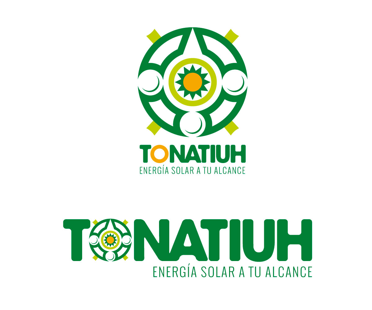
Tonatiuh: solar energy at your reach

Want to win a job like this?
This customer received 77 logo designs from 35 designers. They chose this logo design from Com1escale as the winning design.
Join for free Find Design Jobs- Guaranteed
Logo Design Brief
Solarscape de México is a US-Mexican based solar energy company, we have headquarters in San Diego and Hermosillo, MX and we specialize in large industrial and commercial solar photovoltaic systems.
However, we want to enter the small commercial and residential market with a friendlier, smaller brand called Tonatiuh, obviously powered by Solarscape.
We have the concept, but we need a new logo design to go along with it. We had a basic logo design but found it really similar to the one of INAH México (please google "logo INAH Mexico").
I'm sure you will find a lot of literature regarding this, but just to explain it a little bit further, the basic shape of this popular icon is formed by the face of Tonatiuh, the aztec god of the sun; a North arrow, the rest of the cardinal points are represented by round shapes, and the squares at the diagonals are representing the four suns of the previous eras, (in aztec mythology, we're supposed to be living the era of the 5th sun: Tonatiuh)
Our new logo should communicate easy access, user-friendliness, and trustworthiness. Our slogan "Energía solar a tu alcance" means "Solar energy at your reach". We basically want to go down a notch from our big company identity without really loosing the relationship between the two.
Updates
A more compact design will be appreciated. Please leave the slogan out for now. You can use our previous design to get the idea, but we want something fresh (not just our same logo with a few changes). Added Monday, October 13, 2014
Target Market(s)
Small commercial and residential market
Industry/Entity Type
Solar Energy
Logo Text
Tonatiuh
Logo styles of interest
Emblem Logo
Logo enclosed in a shape
Pictorial/Combination Logo
A real-world object (optional text)
Abstract Logo
Conceptual / symbolic (optional text)
Wordmark Logo
Word or name based logo (text only)
Font styles to use
Look and feel
Each slider illustrates characteristics of the customer's brand and the style your logo design should communicate.
Elegant
Bold
Playful
Serious
Traditional
Modern
Personable
Professional
Feminine
Masculine
Colorful
Conservative
Economical
Upmarket
Requirements
Must have
- It must be identifiable on the spot, not a complicated design as the original iconography of aztec mythology, but something that strongly reminds you of its identity with simple lines and a strong message.
Nice to have
- The logo of our "mother" company is a Sun merging with a green leaf (representing the renewable energy world), something to hint the user of the relationship between the two companies could be good but nothing really obvious as we are trying to provide Tonatiuh with its own powerful identity.
Should not have
- We are trying to reach a market that seeks affordability, but we do not want to look cheap trying to accomplish that. We would not like cartoonish designs (and specially no characters) as we believe appropiate simplicity can also communicate this feature.
- I'm attaching the logo from INAH MEXICO (please see why we are looking for a fresh idea, the INAH logo looks almost identical to our previous logo, and it is a huge government entity here in Mexico. Their logo is everywhere now. Please help us find something that sets Tonatiuh apart from this logo.