Rose Among Thorns Creations Logo, It's ok to be a r*a*t! Fashion that inspires the r*a*t in us!
Want to win a job like this?
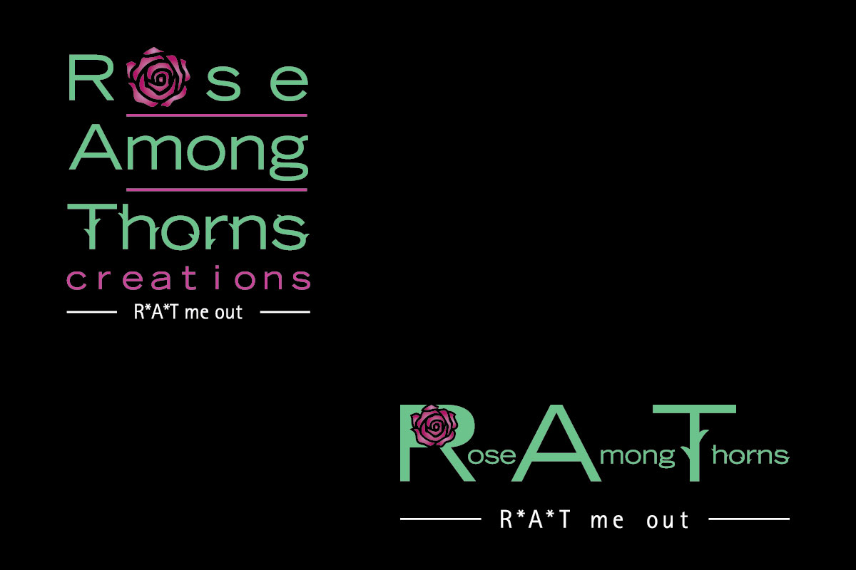
This customer received 89 logo designs from 11 designers. They chose this logo design from pixelbox as the winning design.
Join for free Find Design Jobs- Guaranteed
-
 US$320
-
 89 designs
-
 11 designers
Logo Design Brief
The name of my business is "Rose Among Thorns Creations". I will be selling my designs for fashion and home decor.
My message:
R*A*T me out
Fashion that inspires the r*a*t in us.
May the beauty around you inspire the rose within you.
As the only girl of eight children, I was referred to as a “rose among thorns”…..This reference inspired me to be a “rose” in the hurting thorny lives of others.....Reach out, smile, show kindness, give sacrificially, serve, love and live a life moved by compassion and passion. Be a rose.
My message isn’t my products although I do hope that you enjoy the colors and my nature inspired designs. Surround yourself with beauty and let that inspire the beautiful rose within you.
With every purchase I will give a portion of my profit to a cause that ties to the battered, the assaulted, the hungry, the orphan, or the ill. Together let’s allow the sweet aroma of our hearts and actions touch others and perhaps motivate them to be a “rose among thorns”.
Logo Idea I’d like you to develop:
My logo needs to create a visual that sticks in people’s minds so that it is easy to recall and by their recall, they know they will find me online at: www.roseamongthornscreations.com But of course, I don’t want my web address in my logo.
Rose or rose
Among or among
Thorns or thorns
Creations or creations
My thought is to have Rose Among Thorns Creations in a stacked format with the word "Creations" diminished, a smaller font and moved several spaces to the right of the margin so the first letters of Rose Among Thorns, R*A*T forms this acronym. This format would provide 2 visuals at once, so hopefully because the visuals are connected, (name of my business and r*a*t) it will be easier for a first time viewer to recall how to find me on the internet. Rose Among Thorns should be the dominant message, but I want the acronym to stand out as well. It may be the tool that helps them recall the full name, thus getting them to my website.
I am open to other formats rather than stacked if the same message of the subtle acronym can be attained. I do somewhat like the look of lower case letters, which seems to give a more informal, softer feel to the look.
I don’t want any rats. I don't want the word “rat” without either the *s or periods separating r.a.t.
One suggestion: I like a rose blossom forming the letter “o” in rose. Going in a different direction, I also considered the R in the word Rose to be shaped from a rose… the stem forms the staff of the R, the top hump of the R is shaped by the blossom of the rose (could perhaps be a side view of a rose blossom), and the lower slanted leg of the R is a leaf extending from the stem somehow. I also considered the T in Thorns to be shaped by a thorny stem both in the vertical and horizontal lines of the T. I’ve been told that simple can be better, so this idea may or may not hold to the “keep it simple” philosophy. The thorny rose stem “T” may be too much. I’m open.
I am open to different fonts, but not too ornate or overly complex. I somewhat like Batang in bold or Arial. Or something similar in fat squatty letters.
I am open to different color combinations however be aware that this logo may be made into an applique or embroidered patch that would be sewn most likely on black or blue denim. So I’d like the background of the logo to show up on dark blue or black.
I like hues of lavender/purple/periwinkle blue, in combination with hues of green and blue teal, and also with combination of hues of pink/fuchsia/reds, and yellow /orange. So, I do like colorful!
I’d like the logo with and w/o the tagline, “It’s ok to be a r*a*t (or r.a.t.)”.
I’d like the logo in jpeg, gif, and eps formats.
Target Market(s)
Females 12 and older
Industry/Entity Type
Fashion
Logo Text
Please see description above: Rose Among Thorns Creations It's ok to be a r*a*t!
Logo styles of interest
Pictorial/Combination Logo
A real-world object (optional text)
Font styles to use
Other font styles liked:
- Batang, Arial, but am open to others
Look and feel
Each slider illustrates characteristics of the customer's brand and the style your logo design should communicate.
Elegant
Bold
Playful
Serious
Traditional
Modern
Personable
Professional
Feminine
Masculine
Colorful
Conservative
Economical
Upmarket
Requirements
Must have
- Final file as jpeg, gif, EPs formats.
- Name of business
- First letter of business emphasized to form r*a*t acronym. By seeing the logo one time, viewer needs to be able to recall Rose Among Thorns Creations. Use of Rose visual, acronym r*a*t, It's ok to be a r*a*t. Can be tools in logo to help viewer recall.
Nice to have
- Please see Project Description.
Should not have
- A visual of a rat or the word rat w/o asterisk, periods, or some way to space the letters rat.