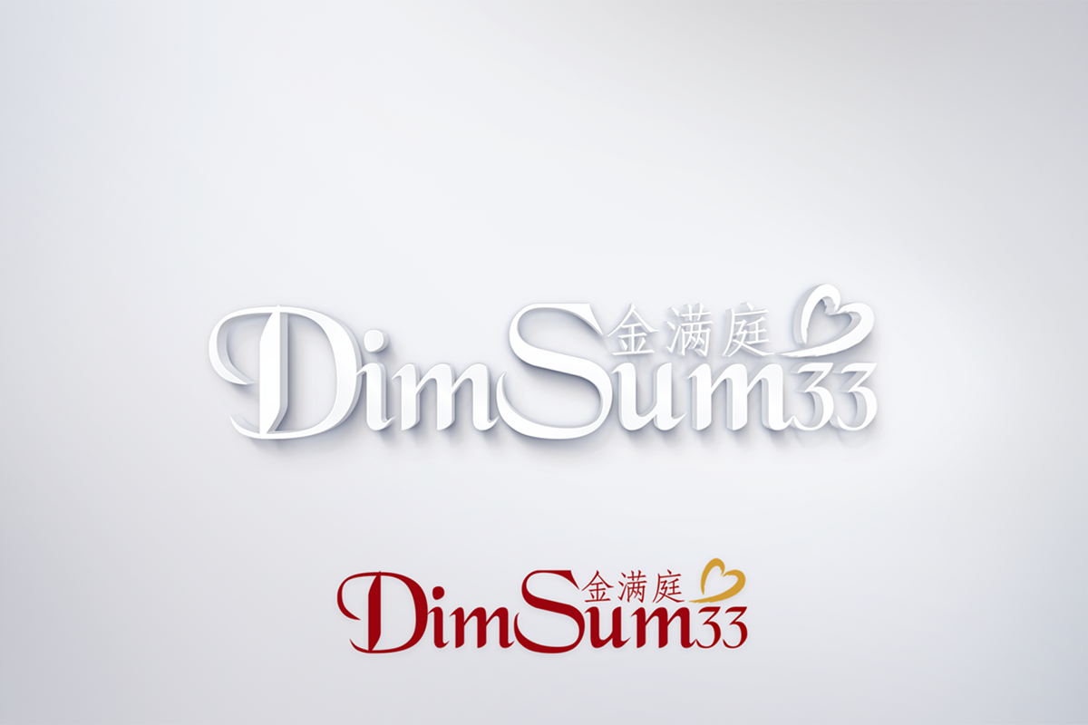
Chinese Restaurant Logo Dim Sum 33

Want to win a job like this?
This customer received 69 logo designs from 21 designers. They chose this logo design from KM.Design as the winning design.
Join for free Find Design JobsLogo Design Brief
Hi, our restaurant Dim Sum 33 (金满庭). Dim Sum literally means "Point" or "Dot" "Heart" in chinese. It's a type of chinese food. So as far as the logo, we prefer modern simple and elegant, since we are not a cheap take-out place.
For the words Dim Sum, we've noticed a lot times people put it on top of one another, optional. Add 33 next to it, below, above.
Color: I've uploaded Coffee World picture, our Back is that Dark Red color, so our Name must be different.
金满庭
The focus will be on the English name, not the chinese name of our restuarant.
If you are able to incorporate the Chinese name also, that'd be perfect. If not, it's also okay because our market/neighborhood is mostly none asians. Found the characters from Google translate, "Gold Full and the second character of Family"
Target Market(s)
American clients, under 30
Industry/Entity Type
Restaurant
Logo Text
金满庭 Dim Sum 33
Logo styles of interest
Abstract Logo
Conceptual / symbolic (optional text)
Colors
Designer to choose colors to be used in the design.
Look and feel
Each slider illustrates characteristics of the customer's brand and the style your logo design should communicate.