Packaging Design Project For Chocolate Brand
Want to win a job like this?
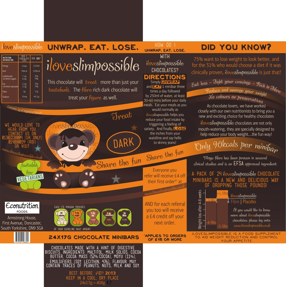
This customer received 126 packaging designs from 23 designers. They chose this packaging design from Marilena as the winning design.
Join for free Find Design Jobs- Guaranteed
-
 £265
£265
-
 126 designs
-
 23 designers
Packaging Design Brief
We need a fresh, vibrant and colourful packaging for our healthy chocolate brand, iLoveSlimpossible.
WHAT IS iLoveSlimpossible?
iLoveSlimpossible are indulgent chocolates that help reduce your body weight by controlling your appetite and calorie intake. And the best thing is that it tastes 100% genuine chocolate, only healthier.
WHAT WE NEED FROM YOU
Although we have collected a few logos from other designers, it's not quite catchy to the eye. As it will appear on retail shelves, it needs to catch the eye. It's up to the designers if they want to design the logo all in one word or two words. We will provide feedback quickly. We are contemplating on a sub-title beneath the logo, with the words "Unwrap. Eat. Lose." It is the main logo "iLoveSlimpossible" that needs to stand out though with possibly some chocolatey or slimming/dieting aspect. However we do not want any images of thin bodies around the logo. Use of imagination involving chocolate could be beneficial, e.g. melting chocolate etc.
Use different colours for 'i', 'Love', and 'Slimpossible'. Maybe include an illustration around the logo if you feel it will brighten the brand.
Packaging
Although we do not have a specific theme in mind, the designer may want to try a retro look with illustrations/images, funky, maybe professional but keep it modern and looking like a chocolate bar.
Dimensions - 155mm(width) x 76.8mm(height) x 34mm(depth)
Portrait or landscape. Designers choice.
There are three flavours, Milk, White and Dark so three different packages with different colours. The rest of the packages will look more or less the same. The packaging itself needs 'wavey' aspects of chocolate. Wavey, circular, elegant shapes which appeal to the eye
There are certain texts which need to go on the front end of the box. The designer has the option of using 2 different texts in their work to come up with the best design. Texts are on the files. More text may be added but in the meantime please use what is given.
Updates
Project Deadline Extended
Reason: Hi,
The deadline has been extended a further 7 days for those who designers who started their designs late are concerned about the timeframe. So there is no need to rush your designs. I hope the 7 days extension is enough for those that need it.
Many thanks,
Added Thursday, December 06, 2012
Target Market(s)
Women aged 16-45, C1C2 class
Industry/Entity Type
Landscape
Look and feel
Each slider illustrates characteristics of the customer's brand and the style your logo design should communicate.
Elegant
Bold
Playful
Serious
Traditional
Modern
Personable
Professional
Feminine
Masculine
Colorful
Conservative
Economical
Upmarket
Requirements
Must have
- Appealing mostly to women aged 16-45, C1C2 class.
Colourful
Chocolatey feel with wavey lines etc
Strong Logo
Nice to have
- It can come across as a food supplement that you normally see on the pharmacy shelf but with an unconventional design twist. Or the designer may think it will not work and for it to have the chocolatey feel, there cannot be any connection a pharmaceutical package. It has to remain like a regular chocolate bar that you see in the supermarket. Up to the designer to choose. It will be going into both supermarket stores and healthfood stores.
The designer should have some personal input in the design. If you were browsing around the supermarket and spotted it, would you stop and look at it? If not, the design will need changing.
Secondly, maybe a brand illustration would go well with the logo. Possibly an animal illustration relating to chocolate (somehow) or simply a chocolate with a measuring tape around it getting slimmer and slimmer. Just a few thoughts