Logo Design

Want to win a job like this?
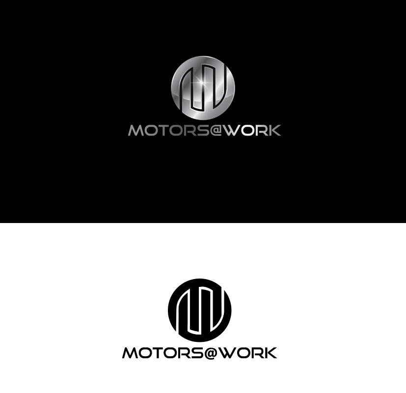
This customer received 39 logo designs from 15 designers. They chose this logo design from Katariart as the winning design.
Join for free Find Design Jobs- Guaranteed
Logo Design Brief
Our software helps industries and facilities save money on their electric bills by using their motors more efficiently. We have a logo that we like okay, but would love to have a more professional one.
We want to look like a modern cloud based software company.
What we like about the sample:
-Three prongs in the middle represent electric plug/socket.
-Incorporates the characters 'M' '@' 'W' for Motors@Work.
-The green arrow is to convey the idea of sustainability (saving electricity). It doesn't have to be done this way, but we would like to incorporate sustainability.
-If you look at as a 3d image, it looks like a cylindrical motor with a power cord.
-We like the colors.
-Circle with single line through the middle is similar to an on/off switch.
What we don't like:
-The circular parts are jagged.
-Looks a little too much like a devil's trident and tail for my liking. Some of that may be unavoidable due to the things we like above.
Doesn't have to be drastically different from the sample. At the same time it does not have to look anything like the sample.
Industry/Entity Type
Sustainability
Logo Text
Motors@Work
Logo styles of interest
Abstract Logo
Conceptual / symbolic (optional text)
Look and feel
Each slider illustrates characteristics of the customer's brand and the style your logo design should communicate.