Logo for a sculptress (Belgium)
Winner
Want to win a job like this?
This customer received 198 logo designs from 31 designers. They chose this logo design from jizzy123 as the winning design.
Join for free Find Design Jobs- Guaranteed
-
 €130
€130
-
 198 designs
-
 31 designers
Logo Design Brief
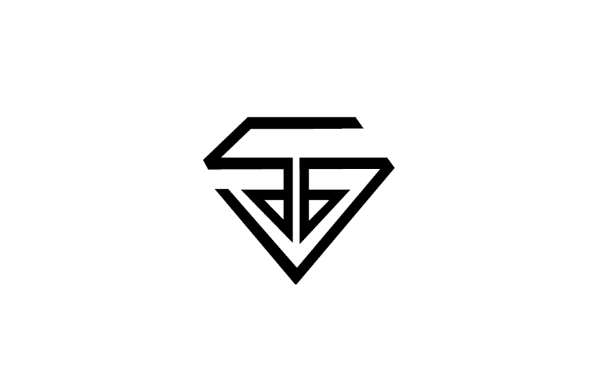
Hello, I'm a Belgian sculptor. I specialize in stone at the moment. When I finish a sculpture I have to carve my very long name ‘SYLVIE VAN DEN BROECK’ in it. Signing the sculpture takes a lot of time, so I need a logo or symbol to make it shorter, simpler and visually more attractive. It should be designed in black and white. Using my initials is a plus. I would also use the logo on my website: http://www.sylvievandenbroeck.com
Target Market(s)
Art buyers
Industry/Entity Type
Graphic Design
Logo Text
S.V.d.b.
Logo styles of interest
Lettermark Logo
Acronym or letter based logo (text only)
Font styles to use
Sans Serif
Colors
Colors selected by the customer to be used in the logo design:
000000
ffffff
Look and feel
Each slider illustrates characteristics of the customer's brand and the style your logo design should communicate.
Elegant
Bold
Playful
Serious
Traditional
Modern
Personable
Professional
Feminine
Masculine
Colorful
Conservative
Economical
Upmarket
Requirements
Must have
- -What I do: please take a look on my website. There are some interviews, and if you have any questions about anything, please don’t be afraid to ask me anything.
- -Logo: it should be as much a ‘signature’ as a logo. I am not a company. I would like it to have a ‘personal’ touch.
- -Size of execution: approx. 4,5 cm x 4,5 cm. Proportions can be altered.
- -Less is more: I actually like ‘more’, but I’m looking to save time. The less lines the less work. SYLVIE VAN DEN BROECK (see example) = 45 lines. I’d like for the design to end up with max 20 lines.
- -Lines: Lines are easier then plains. Straight lines are easier to carve then curvy lines (few curvy lines, but all straight may feel distant). It doesn’t matter so much wether the line is long or short. The smaller the letter, the harder, actually. Letters under 10 mm are almost impossible.
- -The final design will be ‘tested’ in stone and may have to be improved accordingly.
- -Font: something sans serif. For exemple: Avant Garde
Nice to have
- -Initials: My full name is : Sylvie Van den broeck (notice use of capitals). I guess this makes my initials S.V.d.b. I would like the logo to include my initials, but I’m also open to autonomous creations.
- -Stamp: i'd like to receive some designs in a square frame or circle. I like the idea of signature being interpreted as a stamp in which the outer form is constricted. But I also love to find a good reason to break out of the square. Could you help me find it?
- -Since sculpture is so much about reflection and construction I would like the logo
- to feel balanced and (almost, but not exactly) symmetrical. It can feel a little bit like a construction itself.
- A little history of stonemasonry to finish:
- I’ve found some examples of the marks the early stonemasons used. These signs were found on ancient building sites, cathedrals, etc. :
- http://www.freemasons-freemasonry.com/mason-mark.html
- The signs showed on the page rather refer to a specific group of craftsman or religion. Not to individuals.
- You notice that, for technical reasons and speed, these signs are extremely simple and geometrical with (a hint of) symmetrical.
- Later, it became common for stonemasons to design their own personallogo, following lines on one out of 2 grids: http://tetraktys.de/mystik-7.html#dombauherren
- Letters and initials were incorporated.
- When today’s young craftsman have to come up with a signature, they interpret this grid freely, using lines out of both grids, or they add new invented lines to make their ‘logo’. Some of them still refer to initials, some are autonomous creations. I once saw one that looked like a yin-yang sign but better.
Should not have
- -Colors : the design should be in black & white (not greyscale. Just black and white)
Files
Download all files - 4.7 MBJPG
carvings Wednesday, 15 October 2014 13:36:44
Saturday, October 18, 2014
PNG
2000px-AvantGarde_logo.svg Saturday, 18 October 2014 13:48:43
Saturday, October 18, 2014
JPG
LOGOs1 Saturday, 18 October 2014 13:48:48
Saturday, October 18, 2014
Payments
1st place
€130