Logo for a web app that generates productive 'flow' for individuals and teams
Want to win a job like this?
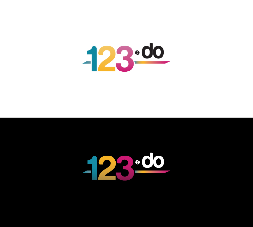
This customer received 88 logo designs from 15 designers. They chose this logo design from Bogdan Tanase-Marinescu as the winning design.
Join for free Find Design Jobs- Guaranteed
-
 £200
£200
-
 88 designs
-
 15 designers
Logo Design Brief
I'm developing a web application to generate productive flow in individuals and teams. Our alpha site is here: iqdo.com.
The app works by streaming activities into "queues". The queues have three sections: past, now and next (blue, orange, green). You can feel progress as you move things into the past (i.e., done) or punt them into the future (i.e., next). There will be three distinctive colours for each section of the Q - (do, doing, done).
I'm rebranding the site and have registered the domain name: "123.do" . The project is to create a logo for this new domain: "123.do".
I would like the new brand to capture and communicate the feeling of 'productive flow' .... being in the 'zone' ... having time fly as you get things done and you feel good. Ideally users of the application should feel happy and the brand should help here. The site and application is about taking action: do, doing, done - and how this can lead to feeling flow - a fantastic state of stress-free happiness and productivity (e.g., like a child playing with lego).
The brand in four words: Happiness, Productivity, Utility, Simplicity.
My current strapline is: 123.do - doing - done.
The target customers are unhappy commercial teams currently mired in complexity.
The previous iqdo logo was inspired by the phi character - and all its great deeper meanings. There is also a gamification element to the app involving queue points (i.e., qp) - this will be retained.
I'm interested in logo's that can incorporate 'qp' - "qp" is the mirror image of "do" - and the logo could look like this ...
123 do
-
qp
Where "do" is reflected as "qp"?
Have fun designing and please feel 'flow' as you do it! ;-)
The logo needs to work across media types: web, business cards, iphone/ipad icon, favicon, banner, original psd etc. I will need files for these different formats.
Updates
I like the designs with a different colour each for 1 - 2 - 3
I would like to raise for "do" up so it is like a 10 to the power of 2 in mathematics.
I also think we could capture more of the zen-like qualities of flow - happiness, utility, productivitiy
Nige
Added Friday, November 09, 2012
Some more design ideas ...
The dot "." could be raised up and made more of a feature - so it looks almost like a mathematical expression - 123 x do - 123 . do. Also the dot could be used to connote focus (essential to flow) or action (target / button) etc
The "do" could appear in lowercase in a box. Actions in the application are written in lowercase in the application "do" "doing" "done". The icon for something in the "do" state is an open box ready to be ticked.
A tick could be incorporated into the design - although this has been done quite a bit in these applications - I'm looking for something original.
Added Saturday, November 10, 2012
Another idea is to incorporate a ying/yang style dot - to connote karma - finding productive flow and being balanced.
Added Wednesday, November 14, 2012
The
"do" portion of the logo should appear on a big button (pressable =
action) - the button itself should look a bit like YING/YANG to suggest
achieving 'flow' in action.
The system will work in a team environment - so anything connoting collaboration, sharing and team work is helpful too.
Thanks for your submissions so far.
Added Thursday, November 15, 2012
Project Deadline Extended
Reason: I need the design to work on a black background as well as a white background.
I'm still looking for a design that captues the ideas of productive flow, action, progress and getting things done:
do - doing - done!
Added Tuesday, November 20, 2012
Thanks for all your submissions.
I'm not sure incorporating the ying/yang symbol has worked. I'm still looking for new designs. This competitiion is still wide open!
The system employs "queues" and as you make progress in the queue you are given queue points - or "qp" for short.
A design could incorporate "qp" like so ....
123 do
-
qp
where "qp" is the mirror image of "do"? Like a mathematical fraction.
I'm very interested in seeing designs incorporate idea.
The brand values are: happiness, productivity, simplicity, flow.
Added Saturday, November 24, 2012
Project Deadline Extended
Reason: Thanks for all your efforts.
I'm very interested in seeing a logo that uses a reflection on "do" to mirror "qp" - qp's (queue points) are an important part of the task queuing system in 123.do.
So the logo could look like:
123 do
-
qp
The - bar could represent the progress bar that each q has with its three section (past, now, next)
Thanks
Nige
Added Sunday, November 25, 2012
I've just added an image to the brief that includes the "do" | "qp" reflection line.
As you can see I don't have the skillz to make this work. The logo is also not properly balanced - however I hope it gives you an idea?
Added Monday, November 26, 2012
Target Market(s)
stressed out commercial teams looking to get things done without too much overhead
people who want to feel happy and work and get into a state of 'flow'
Industry/Entity Type
Business
Logo Text
123.do
Logo styles of interest
Emblem Logo
Logo enclosed in a shape
Pictorial/Combination Logo
A real-world object (optional text)
Abstract Logo
Conceptual / symbolic (optional text)
Character Logo
Logo with illustration or character
Wordmark Logo
Word or name based logo (text only)
Lettermark Logo
Acronym or letter based logo (text only)
Look and feel
Each slider illustrates characteristics of the customer's brand and the style your logo design should communicate.
Elegant
Bold
Playful
Serious
Traditional
Modern
Personable
Professional
Feminine
Masculine
Colorful
Conservative
Economical
Upmarket
Requirements
Must have
- The logo should include three colours - each work queue is divided into 3 sections (PAST, NOW, NEXT). Each section will have distinctive colours.
The logo should communicate - happiness, productivity, utility and action.
Nice to have
- The . could be raised up and made more of a feature - so it looks almost like a mathematical expression - 123 x do - 123 . do. Also the dot could be used to connote focus (essential to flow) or action (target / button) etc
The "do" could appear in lowercase in a box. Actions in the application are written in lowercase in the application "do" "doing" "done". The icon for something in the "do" state is an open box ready to be ticked.
A tick could be incorporated into the design - although this has been done quite a bit in these applications.
The "do" portion of the logo should appear on a round button (pressable = action) - the button itself should look a bit like YING/YANG to suggest achieving flow in action.
The service helps you get stuff done - but you don't get too stressed while using it.
Should not have
- I do not want it to look like the logo at 123do.com