Logo Design Required for Professional International FX Solutions Company
Want to win a job like this?
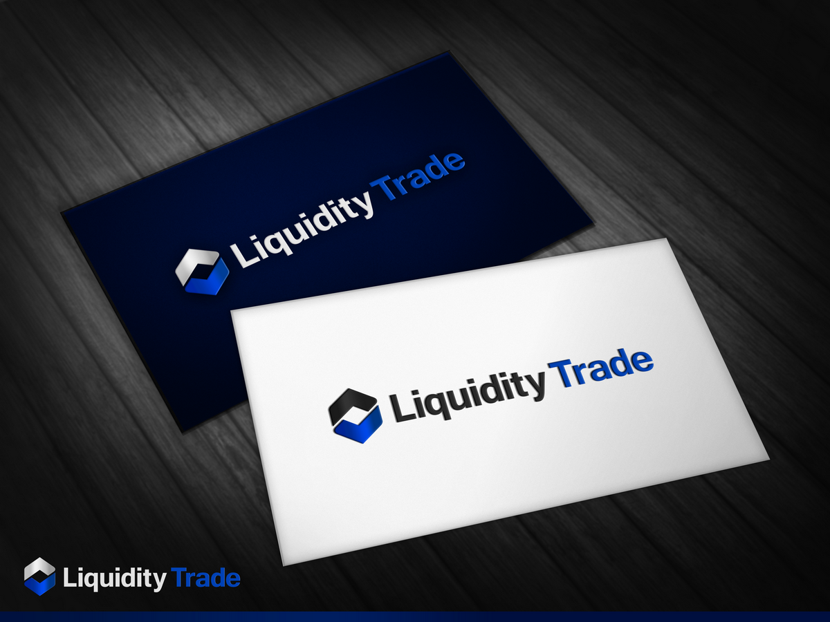
This customer received 171 logo designs from 56 designers. They chose this logo design from DoveFendi as the winning design.
Join for free Find Design Jobs- Guaranteed
-
 C$400
C$400
-
 171 designs
-
 56 designers
Logo Design Brief
BACKGROUND
Liquidity Trade is a successful and dynamic professional FX (foreign exchange) solutions company offering trading solutions to shareholders throughout the USA, Canada, Europe and Asia. While the company has a proven track record with existing customers, there is tremendous opportunity to attract new customers with an increased online presence and improved brand identity that accurately reflects Liquidity Trade’s products and services. With an established brand identity and updated marketing collateral, Liquidity Trade will be well positioned for future growth and success.
Liquidity Trade’s primary audience is high net worth individuals, corporate, institutions and funds, and as such, the brand identity should be targeted and aligned with the demands of this affluent customer base. Currently, the use of blue symbolizes its position in the financial sector; however, it lacks the sophistication and elite status that is often synonymous with high-value clients.
MARKET INSIGHT
In recent years, companies that target high net worth individuals have significantly elevated their marketing with collateral that is sophisticated, prestigious and immediately identifiable as “special”. This is achieved through the use of premium quality finishes and production (ie. paper and printing, metallics, foils etc), unique formats, to achieve stand-out from competitors. Additionally, the colour palettes tend to utilize platinum/gold, black and rich tones (navy, deep green, burgundy etc). These details should be intentionally considered to instill confidence that Liquidity Trade is a proven, credible and intelligent choice for your investment needs.
BRAND VALUES
Sophisticated, prestigious, exclusive, elite status
Intelligent, reputable, credible, makes financial sense
Something customers are proud to associate with
MANDATORIES
Company name must remain as Liquidity Trade
Use of colour palette that aligns with prestige and sophistication
Should have strong associations with financial sector, specifically FX market
CONSIDERATIONS
May use icons/design elements that are linked to “liquid” (ie. water droplet), but not required
May continue to use blue in the colour palette but primary colour should be more “prestigious”
Industry/Entity Type
It Company
Logo Text
Liquidity Trade