Marketing Automation Wordpress Design Project for Savvy Designers
Want to win a job like this?
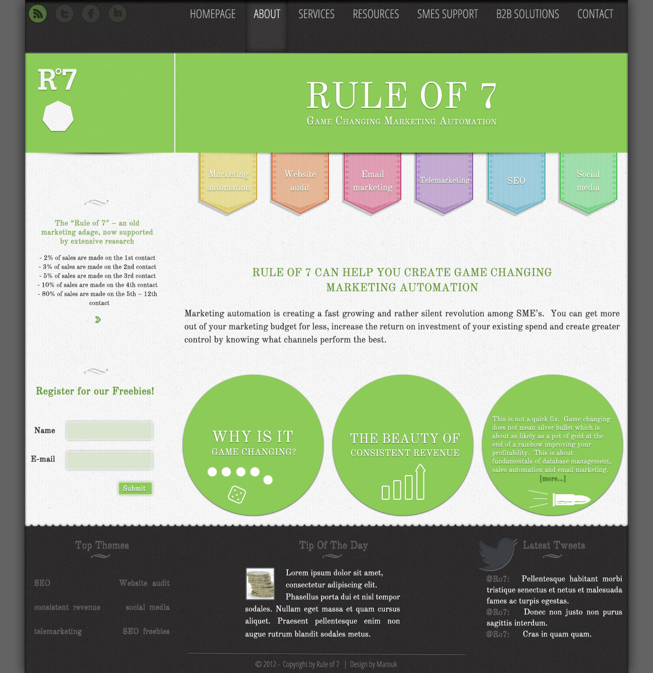
This customer received 11 Wordpress designs from 4 designers. They chose this Wordpress design from Marouk as the winning design.
Join for free Find Design Jobs- Guaranteed
-
 US$350
-
 11 designs
-
 4 designers
Wordpress Design Brief
We are looking to create a clean, professional and sharp website design. RULE OF SEVEN is about marketing automation services aiming to provide sales solutions and lead management for SMEs. (please check out the document attached with the homepage content in order to better understand our value and try to use it on the template)
The site is intended to be dynamic, to provide CLEAR UNDERSTANDING of what Rule of 7 is offering in terms of VALUE and services: marketing automation, website audit, email marketing, telemarketing, SEO, Social Media. Users need to know immediately (from the homepage) what Rule of 7 is about and what does it help the Visitor achieve.
What are the main competitors? www.marketo.com, www.infusionsoft.com, www.hubspot.com
How do we differ from our competitors: We don`t offer exclusively marketing automation as a product, but also services needed in order to achieve consistent marketing revenue.
What we disliked before- lack of creativity.
Please try to avoid bright, strong colors (like black, red, pink, yellow). We don`t want to visually stress the users, but we don`t want to be dull either (please take our logo into consideration, on www.ro7.co, green is calming, has a soothing effect and conveys the idea of new beginnings). The widgets (from Social Media, and RSS feed) will be matched will the rest of the colors and patterns so as to fit in the design.
We would prefer traditional types of fonts (like Times New Roman), but not necessarily, if you think it does not suit the overall aspect of the site.
We don`t want any busy backgrounds, a plain color or combination of colors (a texture maybe, you have the liberty to choose this). In order to put emphasis on our marketing message, we can suggest to develop a visual graphic in order to draw attention, but nothing cheeky(not a combination of many colors, maybe something dynamic, a word composed moving headline perhaps?). There can be a horizontal bar across the page(s), with our messages in big fonts which circulate (maybe). The background theme must be consistent throughout the navigation process, so no variations here.
We like shadows and lightnings of elements when you move the cursor over. We would also like the Contact/Registration form fonts to be large so as to stand out (especially because we will be giving a FREE giveaway and this part needs attention)
We like round edges and 3d looks (we like depth, you can use different layers to give this feeling to the user). Also please don`t use any popups.
Regarding layout, the pages can be scrolled, but not much(for 17inch monitors). You have the liberty to choose whether the message should stand above or below the picture (not necessarily of human or animal beings, it can be a symbol or a representative object). The idea is the user to see the headlines upfront, to place emphasis on them (regarding color as well) because they will be leading the navigation process.
We really like the boxes with different topics on the downside homepage of www.econsultancy.com -take that as a point of reference as we will be having "debate" pages on different topics, so the More tag will be necessary when incorporating the snippet of the article. The Social Media sharing buttons will be placed on top of each article from the debate page.
The site will include:
Homepage
About
Services
Resources
SMEs support
B2B Solutions
Contact form
Registration form
Video-clips(demo) page
Also, we want a mobile friendly layout with the theme you created for the Wordpress design.
Target Market(s)
Target audience: SME`s business owners, marketing executives, marketing people, entrepreneurs, fast growing companies(mainly from UK)
Industry/Entity Type
Marketing
Look and feel
Each slider illustrates characteristics of the customer's brand and the style your logo design should communicate.
Elegant
Bold
Playful
Serious
Traditional
Modern
Personable
Professional
Feminine
Masculine
Colorful
Conservative
Economical
Upmarket
Requirements
Nice to have
- Examples of sites we like:
http://www.deep.co.uk/- really nice and clean
http://www.adamscreative.co.uk/ - like the simple banners below introducing the user with what they do
http://www.umpf.co.uk/ - i like the cloud effect
http://www.tictocfamily.com/- I like the cards flipping
http://www.best-onlinemarketing.co.uk/ - like the SEO scheme on the right (we can create this around our main focus- marketing automation)
http://clock.co.uk/ - like the horizontal streamline of pages organized like slides (we can deliver our marketing messages and incorporate More tags to continue the navigation process towards user`s needs)
http://www.quirk.biz/ - like the effect on the main horizontal bar with messages being discovered - we can develop our black, blue, red strategy in terms of marketing automation and our company DNA)
http://www.adido-digital.co.uk/ - like the combination of colors and the symbols below
Should not have
- What we DON`t like: http://www.custard-media.com/ - too much color, to busy, distracting and powerful combination of colors)