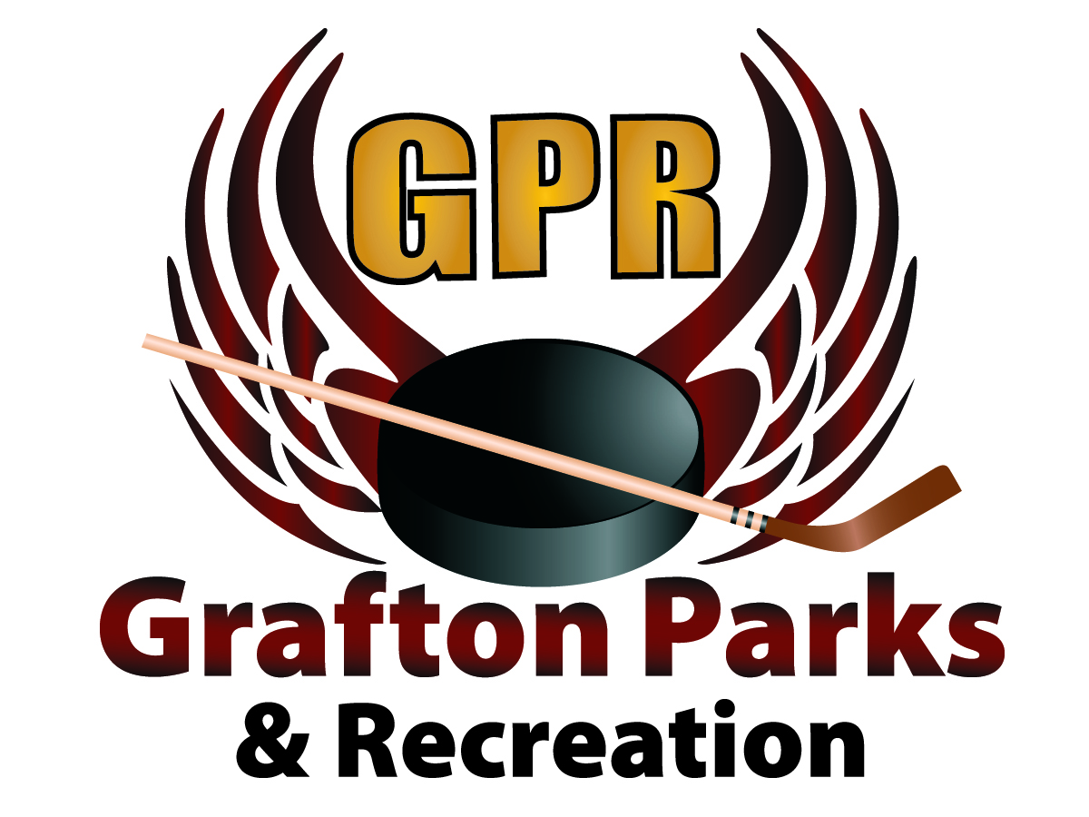
Grafton Parks & Recreation LOGO that reflects hockey
Winner
Want to win a job like this?
This customer received 93 logo designs from 29 designers. They chose this logo design from Christine Truter as the winning design.
Join for free Find Design Jobs- Guaranteed
-
 US$170
-
 93 designs
-
 29 designers
Logo Design Brief
This is a logo design for an entity in town that handles ALL the high school sports that happen within their buildings.
This logo is for an ice arena, with HOCKEY as their main sport. The INITIALS G-P-R will be the most predominate feature with the lettering very close or incorporated in each enitial. They wish to have hockey sticks, pucks or something of the sort along with it.
G-GRAFTON
P-PARKS
R-RECREATION
Target Market(s)
The hockey fans, young & old. Mainly High School students.
Industry/Entity Type
Recreation
Logo Text
GPR- Grafton Parks & Recreation
Logo styles of interest
Emblem Logo
Logo enclosed in a shape
Look and feel
Each slider illustrates characteristics of the customer's brand and the style your logo design should communicate.
Elegant
Bold
Playful
Serious
Traditional
Modern
Personable
Professional
Feminine
Masculine
Colorful
Conservative
Economical
Upmarket
Requirements
Must have
- big initials G-P-R with the words that each initial stands for G = GRAFTON P=Parks R= RECREATION can use the word REC instead if you want. Must have a hockey theme; puck, hockey sticks, etc. Colors are MAROON & GOLD
Should not have
- broken teeth
Payments
1st place
US$140
Participation payments x 2
US$15