UpDownForward.com - Human Behavior + Personal Develpment Tools & Coaching
Want to win a job like this?
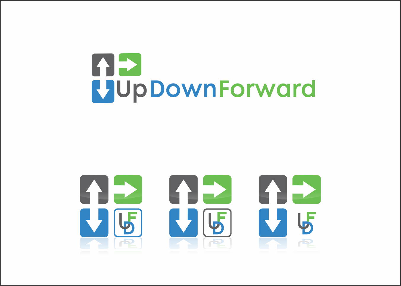
This customer received 139 logo designs from 31 designers. They chose this logo design from SEOanalyst as the winning design.
Join for free Find Design Jobs- Guaranteed
-
 US$200
-
 139 designs
-
 31 designers
Logo Design Brief
Looking for a modern, professional & fun logo that captures the essence of personal development and behavior change. Sometimes there are areas where we want to increase a certain metric; sometimes decrease.
Website will have 3 components: Blog/Newsletter, App, & Coaching.
Am partial to grey + blue colors (kind of like DesignCrowd logo) but am flexible. Would like to somehow have a logo that conveys the directionality of the words. Current logo but am completely open for ideas as to the best way to accomplish this. Took a stab at it myself with my current logo but got slammed in usability tests for being too difficult to read.
Updates
| One thing to keep in mind as you submit your design: It is my preference to have one unitary logo that integrates seamlessly with the words (UpDownForward) as opposed to say a logo/image off to the left with words beside on the right. I''m looking for creative ways to combine words+image into one single message that drives the point home without forcing the users to have to think twice (once to process the image and once to process the words). |
| What I Have Liked Most: - Darker/bolder colors in the grey/blue hues vs lighter - Proper Noun Capitalization (vs all lower or UPPER case) - Sleek and elegant fonts (sans-serif) - Creative use of arrows incorporated into or around the letter/word design - A few of the best designs I''ve seen so far created 2 versions of the logo. One with just the words and another above with just a creative use of the initials UDF - There are a few exceptions, but in general, I''ve liked the ones with 2 different colors vs 3 What I Have Liked Least: - Embedding arrows inside of the spaces of letters like ''O'' ''D'' ''P'' - Big blocky letters (usually due to being all caps) - Letters of words too cramped together - Small little icons at the beginning of the words ''UpDownForward''...not interested. Am looking for something integrative not two separate entities - Only 1 color or different shades of the same color Thank you again for your interest and submissions. While I have certainly seen some pretty great submissions; I've yet to see something that I'm 100% sold on as of yet...so please feel free to take the feedback above and continue to experiment. I promise to take care and provide feedback on every one. All the best, Jason By You |
Added Thursday, April 24, 2014
Industry/Entity Type
It Professional
Logo Text
Up Down Forward (with or without spaces | with or without .com)