Modern, crisp, funky web 2.0 site required for childrens holiday programmes
Want to win a job like this?
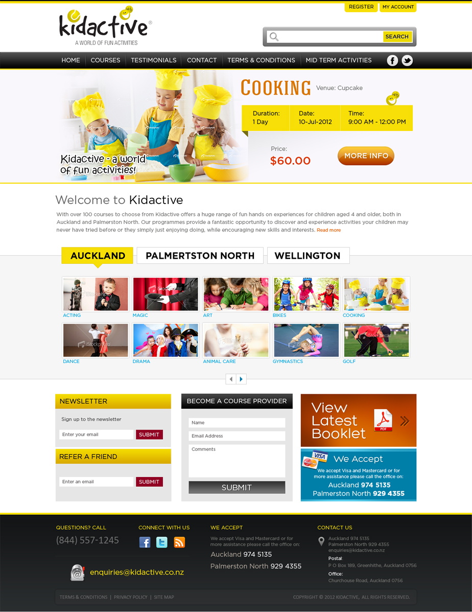
This customer received 33 web designs from 9 designers. They chose this web design from Mayank Patel as the winning design.
Join for free Find Design Jobs-
 A$700
A$700
-
 33 designs
-
 9 designers
Web Design Brief
We want a new "Wow" website. Please help this become a reality.
Kidactive is a provider of childrens holiday programmes aimed primary at children 5yrs to 12 yrs. You can view our current site at www.kidactive.co.nz
This website is a primarily a booking portal. Parents typically come to the website to register and book for courses after having seen them in a booklet. However we are changing the marketing approach and are now trying to attract parents directly to the website. Therefore we want the website to be very graphically appealing, very easy to browse and navigate and must be easy to register and book.
The front end is what is being re-designed. The new front end MUST be compatible with the existing back-end system and processes and the back-end should not need to be changed at all. People lodging a tender must familiarise themselves with the existing site and ensure that the new front end will be fully compatible.
The site must be PHP
This tender will not include a re-design of the logo. Please use the current logo which is attached with this document.
Everything else is up for re-design. The site needs a new, clean, crisp modern design. (See Likes and Dislikes).
Some yellow must be used somewhere within the colour scheme to be in keeping with the brand colours. However no yellow background please.
We currently operate in 2 main regions: Auckland and Palmerston North. However we will be adding new regions soon. The website should make it easy for users to find courses in their region easily.
We also offer term time activities – the site needs another area for that. Perhaps emulated as another “region”.
Beyond that courses are offered across a range of activities. Ideally the website would organise courses logically so that users can find what they are looking for easily.
However, if possible it would be good for the user to be able to browse by area. For example within Auckland there would be North Shore, Central, West, East and South. Within each area a range of course are available – e.g. Skateboarding, Surfing etc. However we don’t want this to be the primary design goal. This is more a “could have” than a “must have”
Once the user has found the course they want the site needs to have a course identification button / tab / box e.g. Tennis. Once the user has clicked through all the details pertaining to the tennis courses on offer should be presented. People are used to searching the existing website in this manner.
When clients click through from the course they have chosen to book the GREEN box that’s say “More Info” needs to be changed to say Book Now
Needs to the ability to have photos displayed on each page next to course descriptions or a panel of photos showing the children doing the activity displayed on that page.
Needs the ability to select the “Pick up locations” To show up in the booking form and class attendance sheet e.g. 7.45am/4.45pm: Greenlane Mcdonalds Carpark. In front of McDonalds by the shopping trundler bay.
8.10am/4.10pm: Coxes Bay Reserve, West End Road, Westmere in the car park in form of the tennis courts
Needs to have Course options above the line (at the top of the page)
Needs to have a description of Kidactive below the line (at the bottom of the page)
You can provide stock images but they must be New Zealand activities (i.e. not American Football) and pre-approved by us. Alternatively we can supply some images.
What adjectives should best describe your website design?
Clean, modern, professional, vibrant, both kid and adult appealing, fun, interesting
What content must be included in the website design?
• Home page
• Contact us
• Testimonials
• Terms and conditions
• New customer sign or log in
• My account or existing client log in
• Facebook button,
• Sign up to the newsletter (mailchimp)
• Refer a friend option – where they input a friend’s contact details, we then send them a one-off email “from” the friend with a HTML email describing our website. Content of the email must be able to be modified easily later (by a programmer).
• “Become a course provider” enquiry tab. This could be a simple form which emails details through.
• Have “View latest booklet” tab which downloads a PDF of the booklet after submitting the users email address onto our MailChimp mailing list (must offer mailchimp integration).
• Must support Google analytics data collection
Updates
Project Deadline Extended
Reason: I have not really seen anything that greatly excites me. I am concerned we re not getting the level of design work in as committed to on the starting up stage we only have 18 designs (Many from the same designer and repeats) I was expecting closer to 50. Please can you assist and advise as to how to improve the results
thanks Lisa
Added Friday, July 06, 2012
Target Market(s)
Parents, both working and stay at home, children aged 5-15 years of age with middle – high income.
Industry/Entity Type
Marketing
Look and feel
Each slider illustrates characteristics of the customer's brand and the style your logo design should communicate.
Elegant
Bold
Playful
Serious
Traditional
Modern
Personable
Professional
Feminine
Masculine
Colorful
Conservative
Economical
Upmarket
Requirements
Must have
- The site must be easy to use and navigate.
Users need to be able to navigate with the minimal number of clicks as the site is used by busy mums with no patience!
Users should be able to find exactly what they want with absolute ease.
Needs to be appealing to children aged 5 – 12 years old as well as parents of children within that age range.
Needs to have lots of images of children doing the activities offered. Should NOT have cartoon images!
Must be able to written in PHP – this is to enable it to be compatible with the existing back-end.
The front end is what is being re-designed. The new front end MUST be compatible with the existing back-end system and processes and the back-end should not need to be changed at all. People lodging a tender must familiarise themselves with the existing site and ensure that the new front end will be fully compatible.
Likes:
Big Icons
Clean, crisp design
Vivid, striking in appearance
Uncluttered
Easy to navigate
Social Media integration
Modern
Not much ‘below the line’
Thematically consistent
Easily modifiable pictures and content
Like real images
Search bar would be good if effective ONLY
What colours do you want to see in your website design?
The Yellow in the logo BUT NOT as the background, purple as in the balls etc on logo, white for clean and simple easy to read, black for writing and other areas for details ie boarders etc.
Should not have
- Dislikes:
Cartoon images – must be real images.
Moving, floating in and out and spinning pictures text or photos
Clutter
Underlining
Intentionally misspelt words and typos
Content ‘below the line’ on the Home page
Backgrounds ending before the edge of the screen
What colours do you NOT want to see in your website design?
Browns, pink, pastel colours, mustard, pale yellow, and not a confusion of colours – must be themed and consistent.