European Rail Discovery Logos wanted: InterRail, Eurail and Company Logo Development and Alignment
Want to win a job like this?
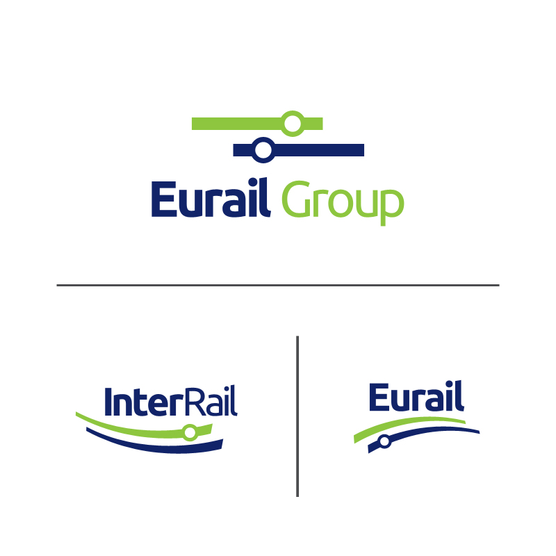
This customer received 102 logo designs from 38 designers. They chose this logo design from ketoprofen as the winning design.
Join for free Find Design Jobs- Guaranteed
-
 €690
€690
-
 102 designs
-
 38 designers
Logo Design Brief
Development of 3 logos for InterRail (product logo), Eurail (product logo) and Eurail Group (corporate logo)
Eurail Group offers two sister products for European Rail Travel: InterRail (for our European customers) and Eurail (for non-European customers). For information please look at our resellers website www.eurail.com and www.interrail.eu.
We are currently aligning our product communication and want to go for a clear product brand approach. It is clearly visible that InterRail and Eurail are familiar products (the underlying concept is equal). Today, both product logos use the same tones of green and blue. Still, they are not really aligned from a style perspective. Both logos shall be brought closer together, whilst still being recognizable and keep their playfulness. In addition, we would like to have a new company logo for Eurail Group. This should be corporate style and taken a bit aback. Nevertheless, it would be great to have some familiarity with the product logos. Our corporate communication is held in a dark blue.
The InterRail communication is green with a recognizable red line element. The Eurail communication is blue with a recognizable green line element (examples in the attached presentation).
You can take into account elements of our Vision:
At Eurail, we strive to provide our international guests with
an unique and life-changing travel experience
by offering freedom to travel flexibly across Europe,
discovering its cultural, geographical and historical richness and diversity
and connecting to local people and fellow travellers.
Eurail is a touristic provider of a life-time experience.
Updates
Dear Designers,
thank you for submitting your proposals so far. Last week, I have updated the briefing a bit. It would be great if you could take this into account.
We will probably extend the deadline of the contest a bit, to grant time for discussion and feedback.
Best regards,
Silvia
Added Monday, April 07, 2014
Project Deadline Extended
Reason: Give time for more feedback and improvements.
Added Monday, April 07, 2014
Dear Designers,
please be aware that we will grant a guaranteed payment for the top-three proposals:
1st: 450 Euro
2nd: 100 Euro
3rd: 60 Euro
Go for it and improve your proposal to refresh and rejuvenate our brand.
We are looking forward to your designs.
Best regards,
Silvia
Added Monday, April 07, 2014
Target Market(s)
Very diverse target groups, therefore I would keep it neutral.
Eurail is targetted at all overseas market from North and South America to Australia and Asia. Mostly 1st class adult travellers, but also huge youth markets inside.
InterRail is a product for European travellers exploring Europe. Mostly youngsters today, but the product is open to all ages and we want to spread the reach into the older segments.
Industry/Entity Type
Communication
Logo Text
1) "InterRail" (product logo) 2) "Eurail" (product logo) 3) "Eurail Group" (corporate)
Logo styles of interest
Pictorial/Combination Logo
A real-world object (optional text)
Wordmark Logo
Word or name based logo (text only)
Look and feel
Each slider illustrates characteristics of the customer's brand and the style your logo design should communicate.
Elegant
Bold
Playful
Serious
Traditional
Modern
Personable
Professional
Feminine
Masculine
Colorful
Conservative
Economical
Upmarket
Requirements
Must have
- The idea is to rejuvenate both brands that are well-known in the respective markets. Nevertheless, the communication became outdated and not too active in the recent years. The logo redesign stands in the context of a re-juvenation and re-positioning of both brands that shall be brought to the target groups mindset in a more prominent way in the future.