

 Refresh
LeadEngine
Want to win a job like this?
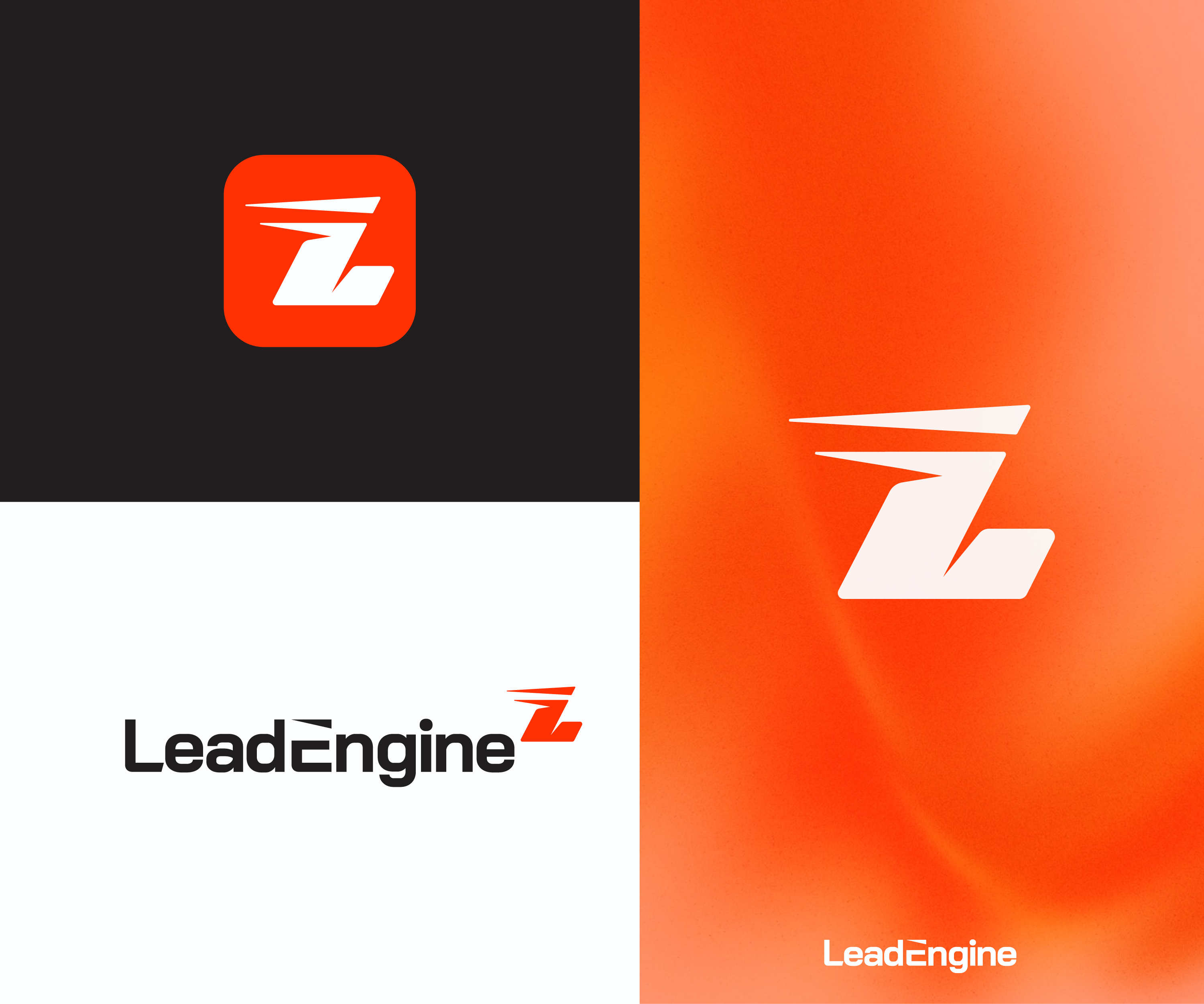
This customer received 390 logo designs from 129 designers. They chose this logo design from Zak deZign as the winning design.
Join for free Find Design Jobs
- Guaranteed
-
 £110
-
 390 designs
-
 129 designers
Logo Design Brief
What the business does
LeadEngine is an AI-powered Facebook and Instagram ads service for UK local service businesses: gyms, dentists, clinics, salons, kitchen fitters, driveway companies, window installers, roofers, electricians, heat pump installers and similar. We make the ads, get them live within 24 hours, follow up every enquiry and book jobs and appointments into the customer's diary. Customers try the whole system for £1 for seven days. No contracts, no setup fee.
Think of it as a modern software company with motorsport taste. The brand uses a light engine metaphor (the product's parts are named Spark, Ignition, Turbo, Telemetry, and so on), so a subtle nod to speed or engines is welcome. The nod must be subtle. This is a premium tech brand, not a garage.
Target audience
Owner-operators of UK local service businesses, 1 to 20 staff, usually 30 to 55, looking at this on their phone between jobs or appointments. Many have been burned by marketing agencies before. They love cars. They can smell "cheap" and "corporate" a mile off, and want neither.
Feel
Premium, fast, confident, clean. Modern and friendly, never corporate, never cheap, never "trade van".
What we need: an emblem + name logo (both parts required)
1. The emblem. An abstract shape, not a picture of a thing and not a letter. It should stand for three ideas: simplicity, speed and reliability. Think of how McLaren's mark is a single swept shape that suggests airflow and motion without drawing a car. We want our own equivalent: one clean flat form, usually a single stroke or a single piece, that reads as fast and dependable. It must work on its own as a favicon, an app icon and a social profile picture, and it must work in one colour.
2. The wordmark. "LeadEngine" as a text-only wordmark in a clean, bold, modern sans-serif. Custom type or a tailored typeface is welcome. Wide, geometric letterforms are preferred over tall condensed ones. It must read clearly at small sizes on a phone. The wordmark is one colour; only the emblem carries the accent colour.
3. The lockup. The emblem and the wordmark together as one logo, in the way a motorsport brand pairs its mark with its name (for example, the mark sitting small at the top right of the name, or standing beside it).
Show us the emblem alone, the wordmark alone, and the lockup. Please include one line explaining what the emblem represents and how it says simplicity, speed and reliability.
Colours
Papaya orange as the hero colour was our initial thought, but we are open-minded to other colours. Design is most important here. The logo must also work in a single colour (all black, all white, all orange).
Inspiration
McLaren's single-colour standalone mark and the way modern software brands (Linear, Stripe, Monzo) keep things minimal. Inspiration only. Do not copy any existing logo, livery or speed mark.
Please avoid
- Pictograms of objects as the emblem: helmets, spark plugs, steering wheels, pins, gauges, needles, pistons, turbos
- Letters as the emblem (no L, E or LE monogram)
- Spanner, hammer, hard hat, wrench, toolbox, cog or gear icons
- Hi-vis orange with navy (looks like a trade van)
- Gradients, 3D effects, drop shadows, bevels, chrome, metallic
- Flames, chequered flags, racing stripes, literal cars
- Rocket ships, magnets, funnels, lightbulbs, arrows going up, ticks
- Splitting the name into two colours ("Lead" in one, "Engine" in another)
- Italic or slanted wordmarks
- Mockups on vans, signs or business cards. Flat logo on white only.
- Any spelling other than LeadEngine
Target Market(s)
40-60 male UK
Industry/Entity Type
marketing
Logo Text
Lead Engine
Logo styles of interest
Abstract Logo
Conceptual / symbolic (optional text)
Font styles to use
Other font styles liked:
- Open minded - I like the Mclaren logo font
Look and feel
Each slider illustrates characteristics of the customer's brand and the style your logo design should communicate.
Elegant
Bold
Playful
Serious
Traditional
Modern
Personable
Professional
Feminine
Masculine
Colorful
Conservative
Economical
Upmarket
Requirements
Must have
- Emblem + logo name
Nice to have
- I want the emblem to be clean and simple, and to represent simplicity, efficiency, and speed. Remember it's a marketing company
Should not have
- Avoid just using "L" and "E" in the emblem, that's too obvious


