

 Refresh
Design book cover for KDP 6x9 book for Kindle and paperback copies
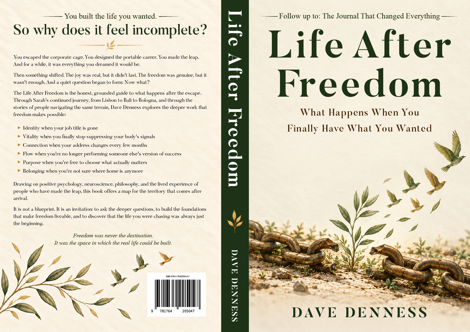
Want to win a job like this?
This customer received 52 graphic designs from 19 designers. They chose this graphic design from Titan Solbiz as the winning design.
Join for free Find Design Jobs
- Guaranteed
-
 A$110
A$110
-
 52 designs
-
 19 designers
Graphic Design Brief
The Life After Freedom Designer Project Overview
Title: The Life After Freedom
Subtitle: What Happens When You Finally Have What You Wanted
Author: Dave Denness
Series: Book 2 in The Changed Everything Series (follow-up to The Journal That Changed Everything)
Publisher: Amazon KDP
Trim Size: 6 x 9 inches (standard KDP paperback) or 5.5 x 8.5 inches if preferred
Page Count: 182 pages
Genre: Non-fiction / Self-development / Lifestyle Design / Personal Growth
Target Audience: Professionals 30 to 55 who have achieved career success but feel unfulfilled; digital nomads; freelancers; readers of self-development and lifestyle design
Design Direction Summary
The cover should communicate:
Continuity with Book 1 (The Journal That Changed Everything) without being identical
Evolution. This is the next chapter, not a repeat
Depth and warmth. This is a reflective, grounded, practical book, not a flashy hustle culture book
The threshold moment. Standing between one life and the next, asking Now what?
Approachability. The design should feel inviting, not intimidating or overly abstract
The overall aesthetic should be: warm, contemplative, elegant, grounded. Think quiet confidence rather than loud inspiration.
Front Cover Design Options
Designers: Please present concepts for at least three of the following six options. Each option should include full front cover artwork, with the title, subtitle, and author name integrated into the design.
Option 1: The Open Door
Visual Concept:
A minimalist, illustration-style front cover. A single door stands open in the center of the frame. Beyond the doorway, instead of a room or wall, there is a horizon: a soft, abstract landscape of rolling hills or a calm sea at dawn. Warm golden light spills through the door and across the floor toward the viewer. The door itself is slightly weathered, paint peeling in places, handle worn smooth, suggesting a journey already taken. The doorframe is solid, grounding the image.
Color Palette:
Background: Deep charcoal or midnight navy (#1a1a2e)
Door and frame: Warm wood tones or soft white (#f5f0e8)
Light through door: Golden amber (#f4a261) fading to soft peach (#e9c46a)
Horizon: Muted greens and blues, soft and inviting
Typography:
Title: The Life After Freedom in an elegant, readable serif (e.g., Playfair Display, Cormorant Garamond) centered above or below the door. Color: cream or soft gold.
Subtitle: What Happens When You Finally Have What You Wanted in a smaller, lighter sans-serif (e.g., Montserrat Light, Lato Light), placed below the title. Color: soft grey or muted gold.
Author name: DAVE DENNESS in a clean, modern sans-serif (e.g., Montserrat, Raleway), all caps, at the bottom. Color: cream.
Mood: Hopeful, inviting, contemplative. The open door suggests possibility without loss.
Why it works: The open door is a universal symbol of transition and possibility. It says: you have walked through one door, and now you are standing in a new space, deciding what to build. Simple enough to be striking as a thumbnail, evocative enough to hold up in print.
Option 2: The Unfinished House
Visual Concept:
A beautiful, soft-edged illustration (watercolor or digital painting style) of a house with no roof. The walls are complete, windows in place, a door standing open. Inside, we can see a few pieces of furniture: a wooden chair, a small table with an open journal and a cup of coffee, a potted plant on the windowsill. A single figure sits at the table, looking up at the open sky. The sky above is a gradient from dawn pink to soft morning blue, with faint stars still visible at the edges. The house sits in a field of wildflowers or tall grass.
Color Palette:
House: Warm terracotta (#c77d5e), cream (#f5f0e8), soft wood tones (#b08d6e)
Sky: Dawn gradient, soft pink (#f8c8c8) to pale blue (#a8d8ea) to deeper blue (#5a7fa0) at the top
Landscape: Muted greens (#8fbc8f, #6b8e6b), wildflowers in soft yellows and whites
Accents: Gold (#d4af37) for the journal pen, coffee cup warmth
Typography:
Title: The Life After Freedom in a hand-lettered or organic serif style (e.g., Josefin Sans, Amatic SC, or a custom brush script), placed in the sky area above the house. Color: deep navy or charcoal for contrast.
Subtitle: What Happens When You Finally Have What You Wanted in italic serif, smaller, just below the title. Color: muted grey-blue.
Author name: DAVE DENNESS in a refined sans-serif, bottom center. Color: deep navy.
Mood: Creative, contemplative, honest. The roofless house suggests that the structure is there but the interior life is still being built.
Why it works: This directly echoes the exterior-interior problem metaphor from Chapter 2. It visually communicates that freedom is the structure, but the interior life is what you build inside it.
Option 3: The Compass and the Map
Visual Concept:
A flat-lay style illustration on a warm, textured background (aged paper or linen texture). The composition includes:
A brass compass, open, its needle pointing not to a direction but resting gently on a word written on an open journal page beneath it: Enough.
The journal is open, with visible handwriting (illegible but suggestive), a few pressed olive leaves or flowers tucked between pages.
A small ceramic cup of coffee or tea, steam rising faintly.
A single sprig of rosemary or lavender.
A simple pen resting across the journal.
The entire composition is shot from above, arranged with care but not rigidity.
Color Palette:
Background: Warm cream (#f5f0e8) with subtle linen texture
Journal: Soft white pages, cream cover
Compass: Brass/gold (#c9a227) with dark markings
Coffee cup: Muted terracotta (#c77d5e) or soft cream
Greenery: Muted olive green (#6b8e6b), soft lavender (#b8a9c9)
Pen: Dark wood or brass
Typography:
Title: The Life After Freedom in a classic, elegant serif (e.g., EB Garamond, Cormorant), centered in the upper third. Color: deep charcoal or warm brown.
Subtitle: What Happens When You Finally Have What You Wanted in italic serif, smaller, just below. Color: muted brown-grey.
Author name: DAVE DENNESS in a refined sans-serif, bottom center. Color: deep charcoal.
Mood: Reflective, grounded, intentional. The flat-lay suggests a practice, a daily ritual of reflection, attention, and care.
Why it works: Signals that the book is practical and reflective, a guide to daily practices, not just abstract ideas. The word Enough ties directly to the book's closing chapters on sufficiency and contentment.
Option 4: The Two Horizons (Brand Continuity Concept)
Visual Concept:
A split-image or diptych design that echoes the cover of The Journal That Changed Everything. The cover is divided diagonally or vertically into two distinct but connected scenes.
Left side (or top): A silhouette of a person standing on a city rooftop or balcony at dawn, looking out over a skyline. The city is rendered in cool blues and greys, suggesting the corporate past, the moment of escape, or the threshold between one life and the next. The person holds a journal loosely at their side.
Right side (or bottom): The same silhouette, now seated at a small table with a journal, a cup of coffee, and a potted plant. They are looking out over a different horizon: a river, a sea, or a soft landscape at sunrise. This side is rendered in warm golds, pinks, and soft greens.
A subtle line or gradient connects the two scenes, suggesting continuity rather than rupture.
Color Palette:
Left side: Cool blues (#2c3e50, #34495e), greys (#7f8c8d), muted city lights (#f39c12 in small doses)
Right side: Warm golds (#f4a261), soft pinks (#e9c46a), muted greens (#8fbc8f), sky blue (#a8d8ea)
Transition: A soft gradient or a thin gold line connecting the two halves
Typography:
Title: The Life After Freedom in a bold, modern serif (e.g., Playfair Display, Libre Baskerville), spanning both sides or centered at the top. Color: cream or soft gold, with a subtle shadow for readability.
Subtitle: What Happens When You Finally Have What You Wanted in smaller sans-serif, centered below the title. Color: cream or soft grey.
Author name: DAVE DENNESS at the bottom center in clean sans-serif. Color: cream.
Mood: Transformative, balanced, hopeful. The split image suggests movement from one state to another without losing continuity.
Why it works: Creates direct visual brand continuity with Book 1 while showing evolution. Readers who loved the first book will immediately recognize it as the next chapter.
Option 5: The Kintsugi Bowl
Visual Concept:
A beautiful, close-up illustration or photograph-style image of a ceramic bowl repaired with gold lacquer, the Japanese art of kintsugi. The bowl sits on a warm wooden table. Inside the bowl are simple, everyday objects:
A few fresh figs or olives
A small, worn journal
A pen
A sprig of olive or rosemary
A few loose tea leaves or coffee beans
The gold repair lines are visible and beautiful, tracing the history of the bowl's breaks. The lighting is soft, natural, and warm, suggesting morning or late afternoon sun through a window. The background is softly blurred.
Color Palette:
Bowl: Soft ceramic white or cream (#f5f0e8) with gold repair lines (#d4af37, #c9a227)
Table: Warm wood (#b08d6e, #8b6f47)
Figs/olives: Deep purple (#5d3a5d) or muted green (#6b8e6b)
Journal: Cream or soft brown leather
Greenery: Muted olive (#8fbc8f)
Background: Soft, blurred warm tones (#e8dcc8, #d4c4a8)
Typography:
Title: The Life After Freedom in a refined, slightly organic serif (e.g., Cormorant Garamond, EB Garamond) centered in the upper third. Color: deep charcoal or warm brown.
Subtitle: What Happens When You Finally Have What You Wanted in smaller italic serif, below. Color: muted brown-grey.
Author name: DAVE DENNESS in a complementary sans-serif, bottom center. Color: deep charcoal.
Mood: Poetic, resilient, grounded. The kintsugi bowl is a powerful metaphor for the book's themes.
Why it works: Kintsugi is a deeply resonant metaphor for post-traumatic growth, identity reconstruction, and the practice of enough. Visually distinctive in the self-development market.
Option 6: The Night Sky and the Morning Light
Visual Concept:
A single, unified image that captures both night and day in a single frame. The composition is divided horizontally, but softly, like a watercolor wash.
Top half: A starry night sky over a calm sea. Deep indigo and navy, with scattered stars and a faint moon. The water reflects the stars.
Bottom half: The same seascape at sunrise. Warm light spreads across the water, gold, peach, and soft pink. The horizon glows.
On the horizon line between them: A small figure sits on a rock or a low wall, journal in hand, looking out. The figure is silhouetted against the light, neither fully in the night nor fully in the day, suggesting the threshold, the transition, the moment of arrival and beginning.
Color Palette:
Top: Deep indigo (#1a1a2e), navy (#16213e), starry white (#f5f0e8), faint moon gold (#f4a261)
Transition: Purple (#5d3a5d), soft pink (#e9c46a), peach (#f8c8c8)
Bottom: Warm gold (#f4a261), soft blue (#a8d8ea), sea green (#6b8e6b)
Figure: Dark silhouette (#2c3e50)
Typography:
Title: The Life After Freedom in a luminous, elegant serif (e.g., Playfair Display, Cormorant), positioned in the upper third, over the night sky. Color: cream or soft gold, with a subtle glow.
Subtitle: What Happens When You Finally Have What You Wanted in smaller italic serif, just below. Color: cream or soft grey.
Author name: DAVE DENNESS at the bottom, over the sunrise, in clean sans-serif. Color: deep navy or charcoal for contrast.
Mood: Expansive, contemplative, quietly triumphant.
Why it works: The night-to-morning transition mirrors the book's arc from the Arrival Fallacy and identity vacuum to purpose, belonging, and sustainable joy.
Back Cover Design Brief
The back cover should include the following elements, arranged in a clean, readable layout:
Required Elements
1. Header / Series Tagline (top):
A small line of text at the top, centered or left-aligned:
The follow-up to The Journal That Changed Everything
Font: Same sans-serif as used on front cover, small caps, muted color.
2. Blurb (center):
Use the short blurb version:
You built the life you wanted. So why does it feel incomplete?
You escaped the corporate cage. You designed the portable career. You made the leap. And for a while, it was everything you dreamed it would be.
Then something shifted. The joy was real, but it didn't last. The freedom was genuine, but it wasn't enough. And a quiet question began to form: Now what?
The Life After Freedom is the honest, grounded guide to what happens after the escape. Through Sarah's continued journey, from Lisbon to Bali to Bologna, and through the stories of people navigating the same terrain, Dave Denness explores the deeper work that freedom makes possible:
Identity when your job title is gone
Vitality when you finally stop suppressing your body's signals
Connection when your address changes every few months
Flow when you're no longer performing someone else's version of success
Purpose when you're free to choose what actually matters
Belonging when you're not sure where home is anymore
Drawing on positive psychology, neuroscience, philosophy, and the lived experience of people who have made the leap, this book offers a map for the territory that comes after arrival. It is not a blueprint. It is an invitation: to ask the deeper questions, to build the foundations that make freedom liveable, and to discover that the life you were chasing was always just the beginning.
Freedom was never the destination. It was the space in which the real life could be built.
Font: Readable serif or sans-serif, approximately 10 to 11 pt for print, with generous line spacing.
3. Author Bio (lower section):
Dave Denness is the author of The Journal That Changed Everything, The War That's Already Started and The World On The Brink. His work explores the intersection of personal freedom, global mobility, and the systems that shape our choices. Through writing and coaching, he helps readers design lives that are intentional, resilient, and deeply their own.
He lives between Brisbane, Australia but travels extensively for ideas and experiences.
Font: Smaller sans-serif or serif, approximately 9 to 10 pt.
4. Author Photo (optional but recommended):
A small, professional headshot of Dave Denness, placed in the lower left or right corner, approximately 1 x 1 inch.
5. Barcode Area (bottom right):
Leave a clear white space approximately 2 x 1.2 inches in the bottom right corner for the ISBN barcode. Do not place any text or design elements in this area.
6. Publisher Logo / Information (bottom left or centered):
Amazon KDP does not require a publisher logo, but if you have one, place it small at the bottom. Otherwise, leave clean.
7. Testimonial / Endorsement (optional, if available):
If you have advance praise or endorsements, place one short quote near the top of the blurb, in italics, with attribution.
Back Cover Color Palette:
Use the same palette as the front cover for cohesion. Typically, the back cover uses a solid color or subtle texture from the front cover palette, with text in a contrasting readable color.
Back Cover Layout Suggestions:
Option A (Minimalist): Solid background color from front cover palette. Header at top. Blurb in center, left-aligned or centered. Author bio at bottom left. Barcode bottom right.
Option B (Textured): Subtle texture or gradient background. Header at top. Blurb in a slightly lighter or darker text box. Author bio at bottom. Barcode bottom right.
Option C (Image-Based): A continuation of the front cover imagery (e.g., the horizon line continues, or a subtle version of the front cover motif appears as a faint background). Text overlaid.
Spine Design Brief
The spine is critical for shelf presence and must be clean and readable.
Required Elements (top to bottom):
1. Title (top third):
The Life After Freedom
Font: Same as front cover title, but sized to fit spine width (typically 8 to 10 pt for a 6 x 9 book with 180 to 220 pages, which yields a spine of approximately 0.45 to 0.55 inches).
Color: Contrasting with spine background.
2. Author Name (middle or bottom third):
Dave Denness
Font: Clean sans-serif, same as front cover author name.
3. Publisher Logo / Imprint (bottom):
If you have one. Otherwise, leave clean.
4. Series Indicator (optional, small):
Book 2 in The Changed Everything Series. Only if spine width allows. If too narrow, omit.
Spine Background:
Solid color from front cover palette, or a continuation of the front cover gradient.
Spine Width Calculation:
For KDP paperback, spine width = (page count x 0.002252) inches for white paper, or (page count x 0.0025) inches for cream paper. Confirm page count with your formatted manuscript.
For a 200-page book on cream paper: spine = 0.5 inches.
Full Cover Spread Specifications
Front Cover:
Full bleed: 6 x 9 inches plus 0.125 inches bleed on all sides = 6.25 x 9.25 inches
Safe zone: Keep all text and critical elements within 0.25 inches of the trim edge
Back Cover:
Same dimensions as front cover
Spine:
Width: Calculate based on page count (see above)
Height: 9 inches (plus bleed)
Text must be centered and readable
Full Spread Dimensions:
Width: 6 (back) + spine width + 6 (front) = 12 + spine width inches
Height: 9 inches
Plus bleed: Add 0.125 inches to all sides
Example for 200-page book on cream paper (spine 0.5 inches):
Full spread: 12.5 x 9 inches
With bleed: 12.75 x 9.25 inches
Typography Guidelines (All Options)
Title Font:
Should be elegant, readable, and have a literary or reflective quality
Recommended: Playfair Display, Cormorant Garamond, EB Garamond, Libre Baskerville
Avoid: Overly decorative scripts, thin sans-serifs that disappear at thumbnail size
Subtitle Font:
Should complement the title, lighter weight, smaller size
Recommended: Montserrat Light, Lato Light, Raleway Light
Italic is acceptable and often works well for subtitles
Author Name Font:
Should be clean, modern, and readable
Recommended: Montserrat, Raleway, Lato, Open Sans
All caps, with generous letter spacing
Body Text (Back Cover):
Should be highly readable at small sizes
Recommended: Garamond, Georgia, Minion Pro, or a clean sans-serif like Lato or Open Sans
Color Palette Summary (All Options)
Deep Navy. Primary background (Options 1, 4, 6). #1a1a2e
Warm Cream. Text, light elements. #f5f0e8
Golden Amber. Accent, light through door. #f4a261
Soft Peach. Accent, warm light. #e9c46a
Terracotta. Warm accent (Options 2, 3). #c77d5e
Muted Olive. Natural accent. #6b8e6b
Soft Sky Blue. Light accent. #a8d8ea
Brass/Gold. Kintsugi, compass. #c9a227
Deep Charcoal. Text on light backgrounds. #2c3e50
Mood Board / Visual References
Designers: Please reference the following for tone and feel:
Book 1 cover: The Journal That Changed Everything. Split image, warm/cool contrast, figure with journal
Brand feel: Calm, grounded, reflective, warm, inviting, literary
Comparable titles in market: The Midnight Library (Matt Haig), The Comfort Book (Matt Haig), Atomic Habits (James Clear, for clean layout), Untamed (Glennon Doyle, for warmth), The Artist's Way (Julia Cameron, for reflective tone)
Photography style: Soft natural light, warm tones, shallow depth of field, real textures (paper, wood, ceramic, linen)
Illustration style: Watercolor, soft edges, organic, hand-drawn quality, not overly digital or vector-clean
File Requirements for KDP
Format: PDF (print-ready) or high-resolution JPG/PNG
Resolution: 300 DPI minimum
Color Mode: CMYK for print, RGB for ebook
Bleed: 0.125 inches on all sides
Safe Zone: 0.25 inches from trim edge
Fonts: Embedded or outlined
Layers: Flattened
Ebook Cover (separate file):
Dimensions: 1600 x 2560 pixels (recommended for Kindle)
Format: JPG or PNG
Resolution: 300 DPI
Color Mode: RGB
Deliverables Requested from Designer
For each of the three concepts you present, please provide:
1. Front cover mockup (full color)
2. Back cover mockup (full color, with text placeholders)
3. Spine mockup
4. Full spread mockup (front + spine + back in one image)
5. Thumbnail preview (to check readability at Amazon thumbnail size)
