

 Refresh
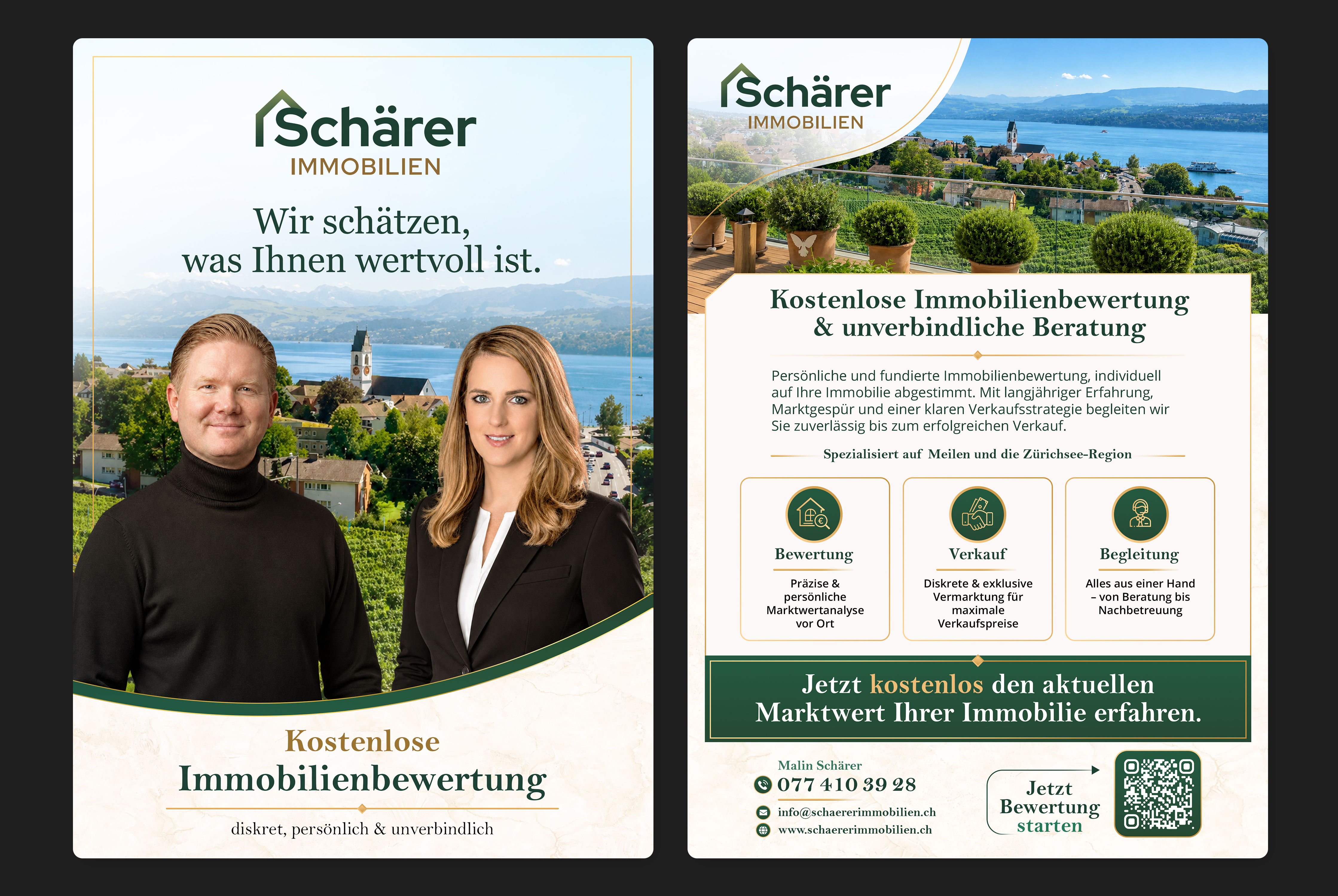
Elegant High-End Real Estate Flyer Redesign A5
Want to win a job like this?
This customer received 51 flyer designs from 15 designers. They chose this flyer design from Farvahar as the winning design.
Join for free Find Design Jobs
- Guaranteed
-
 €70
€70
-
 51 designs
-
 15 designers
Flyer Design Brief
Please make the flyer look more premium, elegant, and professional.
It is a real estate valuation flyer, so the overall design should feel trustworthy, high-quality, and appealing to homeowners.
Please review the people in the flyer as well — they may currently look a little too pale and the contrast may be too strong. Adjust the skin tones, lighting, and contrast so the people look more natural, balanced, and visually pleasing.
Also improve the overall layout, typography, spacing, and visual hierarchy to create a cleaner and more polished design.
The flyer should clearly highlight the offer “Free Property Valuation” and make it stand out as the main message.
The existing text can either be kept 1:1 or slightly optimized for a more professional and effective marketing style, while keeping the meaning the same.
Overall goal:
Create a more modern, sophisticated, and professional real estate flyer that looks high-end and builds trust.
Target Market(s)
Homeowners and property owners in Switzerland, especially in the Zurich / Lake Zurich region, who may be considering selling their property or would like to know its current market value.
Industry/Entity Type
Real Estate / Property Services
Colors
Colors selected by the customer to be used in the logo design:
Look and feel
Each slider illustrates characteristics of the customer's brand and the style your logo design should communicate.
Elegant
Bold
Playful
Serious
Traditional
Modern
Personable
Professional
Feminine
Masculine
Colorful
Conservative
Economical
Upmarket
Requirements
Must have
- The original flyer already has a look and overall concept that I like, so the redesign should build on the existing design rather than completely replace it. However, the current version still feels slightly too unprofessional for the high-end real estate market. The city in the background must remain, as it creates an important connection to the local region where the flyer will be distributed. The original logo is green, so the design should work harmoniously with the existing green branding. The two people shown on the current flyer must also remain. Please improve the photo editing, as the skin tones currently appear too pale and the contrast seems too strong. The people should look natural, warm, balanced and professional. Please also improve the presentation of the “Free Real Estate Valuation” call-to-action/button. It should look more elegant, premium and professional, while still being clearly visible and immediately understandable. Overall, the flyer should retain the character of the original design but be refined to look significantly more sophisticated, trustworthy and suitable for marketing high-priced and luxury properties.
Nice to have
- A clean, elegant and modern layout with strong visual hierarchy. Subtle real estate elements are welcome, but the design should remain sophisticated and not overloaded. A clear call-to-action would be appreciated.
Should not have
- No cheap or overly promotional look, no bright or aggressive colors, no cluttered layout, no excessive effects, no overly strong contrast and no unnatural skin tones. Please avoid a generic template appearance.


