

 Refresh
Fix my Logo!!!! See description for deets!!
Want to win a job like this?
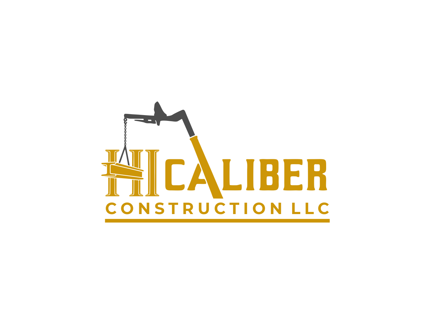
This customer received 229 logo designs from 88 designers. They chose this logo design from BNdesigner as the winning design.
Join for free Find Design Jobs
- Guaranteed
-
 US$150
-
 229 designs
-
 88 designers
Logo Design Brief
Need to clean up existing logo. People are calling us Caliber Construction because the HI is made up of I beams and are not catching the eye. I want to turn the HI more straight and maybe make it the same size as “Caliber”. Also maybe move or change the building shadow behind Caliber so it doesn’t pop more than “HI”. I do not want to ditch the forklift coming out of the “A” in caliber nor the I beam completing the horizontal part of the “H”. Just need to make the “HI” more uniformed so people see the whole name. Still want the “HI” to be made out of I-Beams if possible. Or maybe just the horizontal beam being swung by the forklift can be an Ibeam.
Logo Text
HI Caliber Construction LLC
Look and feel
Each slider illustrates characteristics of the customer's brand and the style your logo design should communicate.