Dispute Buddy brand & logo redesign
Want to win a job like this?
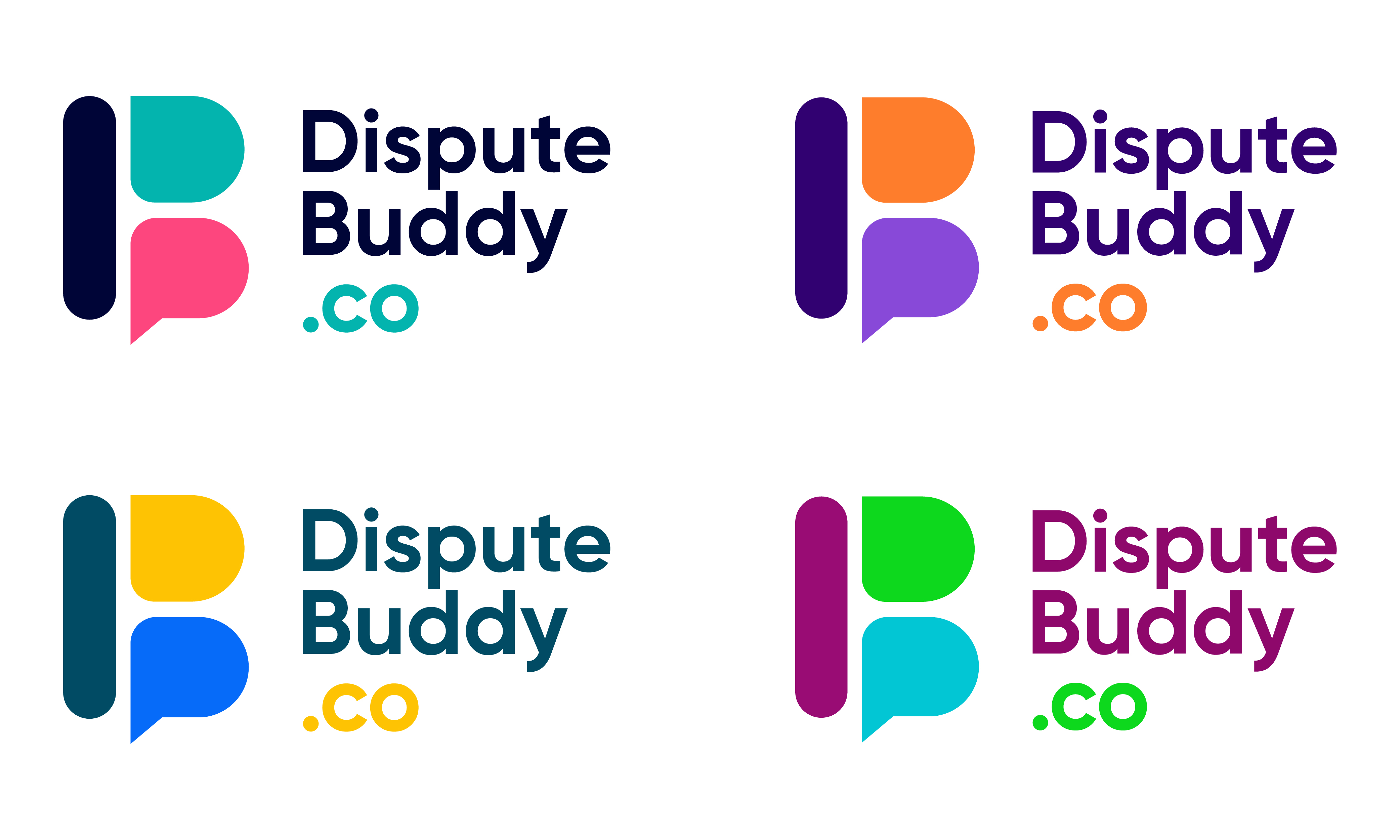
This customer received 266 logo designs from 118 designers. They chose this logo design from Max37 as the winning design.
Join for free Find Design Jobs- Guaranteed
-
 A$150
A$150
-
 266 designs
-
 118 designers
Logo Design Brief
Dispute Buddy Brand Refresh Brief
About Dispute Buddy
Dispute Buddy is a premium legal-tech product that helps people extract and analyse text messages from their phones for use in court proceedings.
The platform organises years of messages into lawyer-ready PDFs and uses AI to identify behavioural patterns such as coercive control, manipulation, threats, and financial abuse.
Our customers are often navigating separation, family court, custody disputes, or emotionally difficult legal situations. Many arrive overwhelmed, stressed, emotionally exhausted, and unsure where to begin. The product helps them feel organised, calm, and back in control.
The Problem With The Current Brand
Our existing brand feels:
too cheap
too playful/informal
visually inconsistent
not reflective of the premium nature of the product
not emotionally aligned with users in distress
The current colours and visual style don’t communicate:
trust
safety
professionalism
emotional reassurance
legal credibility
We want the brand to feel more sophisticated, calming, modern, and premium without becoming cold or corporate.
Brand Positioning
Dispute Buddy sits at the intersection of:
legal tech
emotional support
evidence organisation
AI-powered analysis
We are not a traditional legal brand.
We are:
calm
supportive
intelligent
discreet
reassuring
competent
human
The product should feel like:
“Someone capable is helping me through this.”
Target Audience
Mixed genders, typically:
30–60 years old
going through separation/divorce/family court
emotionally overwhelmed
under financial stress
non-technical users
seeking clarity and reassurance
Users are often:
frightened of missing evidence
exhausted by conflict
intimidated by legal processes
desperate for organisation and certainty
The brand should reduce cognitive load and emotional intensity.
Desired Emotional Response
We want users to feel:
calmer
safer
supported
understood
more in control
less overwhelmed
The experience should feel:
premium
modern
trustworthy
emotionally intelligent
private and secure
Visual Direction
Avoid
bright “startup” colours
overly feminine palettes
neon gradients
cartoonish illustrations
playful SaaS aesthetics
generic legal branding (gavels, scales, courtrooms)
harsh blacks or aggressive reds
Explore
muted premium palettes
soft neutrals
warm depth
subtle confidence
modern editorial styling
elegant typography
restrained UI
calming whitespace
understated sophistication
Potential colour directions:
deep navy
charcoal
soft sage
muted eucalyptus
warm stone
fog grey
muted teal
soft cream
Accent colours should feel intentional and premium, not loud.
Brand Personality
The refreshed brand should balance:
Human Professional
Calm Credible
Warm Precise
Supportive Secure
Reassuring Intelligent
Empathetic Premium
Inspiration Keywords
calm technology
premium healthcare brands
modern therapy brands
luxury productivity apps
emotionally intelligent UX
quiet confidence
privacy-first products
sophisticated minimalism
Deliverables
We are looking for:
refreshed colour palette
typography system
updated visual identity
homepage direction
UI styling direction
brand usage guidance
optional logo refinement (not necessarily a full redesign)
Important Context
This is a high-trust product dealing with:
legal disputes
emotional trauma
sensitive personal data
The brand must communicate:
discretion
security
competence
emotional safety
without feeling sterile or intimidating.
Logo Text
Dispute Buddy
Look and feel
Each slider illustrates characteristics of the customer's brand and the style your logo design should communicate.