

 Refresh
Paper & Purpose Logo Design
Want to win a job like this?
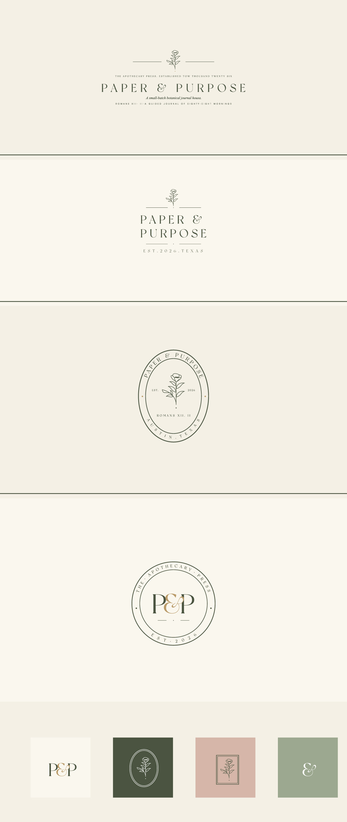
This customer received 232 logo designs from 76 designers. They chose this logo design from WB NAG as the winning design.
Join for free Find Design Jobs
-
 US$150
-
 232 designs
-
 76 designers
Logo Design Brief
We are commissioning a premium logo for Paper & Purpose, a faith-based brand built around a luxury guided journal for the first product. The brand has a completed identity system that defines color, typography, voice, and aesthetic. The logo is the final piece.
The Brand
Quiet, elegant, romantic, and timeless.
REFERENCE BRANDS FOR FEEL (not for copying)
Olive & Co. Juniper Banks. Josephine Interiors & Market. Bridges & Co. Gardenia Lane. Claremont Atelier. June Bloom Flower Co. Madison Avenue. Cressida Botanic. Cafe Lorraine.
These are heritage botanical wordmarks with refined serif typography, oval and circular badge constructions, hand-drawn botanical line illustrations, and a quiet sense of permanence. Study them for spirit, not imitation.
WORDMARK DIRECTION (already locked)
Set “PAPER & PURPOSE” in Cormorant Garamond Light, small caps, with generous tracking (approximately 0.18em). The ampersand is currently set in Cormorant Garamond Italic at 400 weight — soft, hand-shaped, romantic. Open to a different ampersand if the designer brings something better. We are not married to it.
THREE LOGO LOCKUPS REQUIRED
1. Primary wordmark — “PAPER & PURPOSE” Heritage establishment marker below, such as “EST. 2026 ” or a similar small caps line.
2. Oval badge — “PAPER & PURPOSE” wrapped around an oval frame.
3. Monogram — interlocking “P & P” inside a circular frame . For stamps, stickers, social avatars.
COLOR PALETTE (use these exact values)
• Bone Cream #F2EDE4 (foundation)
• Dusty Sage #9CA88E (secondary)
• Forest Olive #4A5340 (primary type)
• Soft Blush #D4B5A8 (accent)
• Antique Charcoal #2A2A26 (type accent)
• Heritage Gold #B89968 (whisper accent only, never hero)
• Stone Blue #A8B5BC (tertiary)
WHAT TO AVOID
• No watercolor. No pastel washes. No splashes of color.
• No butterflies as the hero element.
• No colorful florals or saturated bouquets. Use restrained botanical line work only.
• No script fonts as the primary wordmark. The wordmark stays in Cormorant.
• No clip art, no generic crosses, no doves, no church-bulletin aesthetic.
• No 2010s “modern minimalist” geometric mark. This is heritage, not flat tech.
FINAL DELIVERABLES REQUIRED FROM WINNER
• Vector files (AI, SVG, EPS)
• High-resolution PNG and JPG in full color, single color, and reverse (for dark backgrounds)
• All three lockups (primary, oval badge, monogram) in vector and raster
• Brand guidelines for clear space and minimum size
ADDITIONAL CONTEXT
This is a faith-based brand serving Christian women. The brand tone is warm, grounded, and elegant — never trendy, never loud. The logo will live on a journal cover, an apothecary-style sticker label, a hangtag, a Shopify store, an Instagram feed, and eventually merchandise like shirts and hats, mugs.
We are looking for a designer who can read the references, see the system that already exists, and bring craft to the final mark.
Target Market(s)
Christian women
Industry/Entity Type
Stationary Products
Logo Text
Paper & Purpose
Logo styles of interest
Wordmark Logo
Word or name based logo (text only)

Look and feel
Each slider illustrates characteristics of the customer's brand and the style your logo design should communicate.
Elegant
Bold
Playful
Serious
Traditional
Modern
Personable
Professional
Feminine
Masculine
Colorful
Conservative
Economical
Upmarket
Requirements
Should not have
- • No watercolor. No pastel washes. No splashes of color. • No butterflies as the hero element. • No colorful florals or saturated bouquets. Use restrained botanical line work only. • No script fonts as the primary wordmark. The wordmark stays in Cormorant. • No clip art, no generic crosses, no doves, no church-bulletin aesthetic. • No 2010s “modern minimalist” geometric mark. This is heritage, not flat tech.Masculine feel.


