International real estate sales company logo! Invest where it's beautiful
Want to win a job like this?
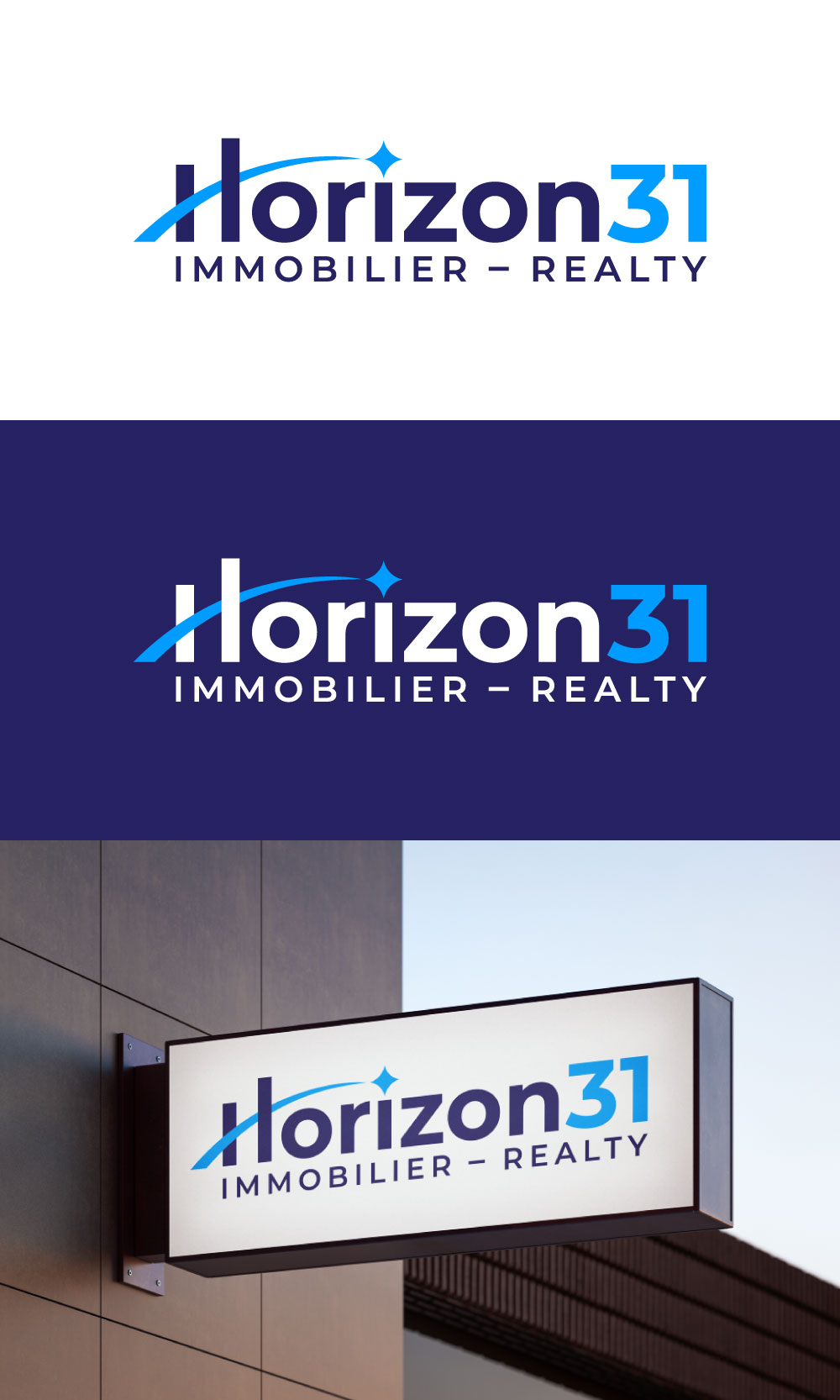
This customer received 102 logo designs from 44 designers. They chose this logo design from loveqis as the winning design.
Join for free Find Design Jobs-
 C$150
C$150
-
 102 designs
-
 44 designers
Logo Design Brief
Logo design for a company that acts as a broker for international real estate projects. We assist clients in their search in various markets (starting with Punta Cana, Spain, and Portugal).
Two main customer segments:
1. 👩❤️👨 Successful couple
wants pleasure + quality of life
seeks to “enjoy life differently”
wants to be reassured, not become an expert
👉 emotion + simplicity + projection
2. 🧠 Smart Investor
wants yield + structure
think in terms of portfolio
wants to understand, compare, optimize
👉 Logic + Clarity + Credibility
Key:
Credible, ambitious, premium without being snobbish, allows you to dream.
Introductory text for inspiration:
Pitch
At Horizon31, we support those who wish to go further — not only in their investments, but in their way of life.
A horizon is not a specific destination.
It's a line towards which we move. A space that attracts. A projection of what is possible.
The 31st is not a coincidence.
It represents the average latitude of our destinations — where quality of life, accessibility and investment coherence meet.
But beyond geography, it primarily symbolizes a point of equilibrium.
Between here and elsewhere.
Between pleasure and structure.
Between intuition… and decision.
Target Market(s)
Quebec Rich couple & Real investee investor
Industry/Entity Type
Immobilier/Realty
Logo Text
Horizon31 Immobilier/Realty
Font styles to use
Colors
Designer to choose colors to be used in the design.
Look and feel
Each slider illustrates characteristics of the customer's brand and the style your logo design should communicate.
Elegant
Bold
Playful
Serious
Traditional
Modern
Personable
Professional
Feminine
Masculine
Colorful
Conservative
Economical
Upmarket
Requirements
Must have
- high-resolution file, color chart used