WayPoint Market convenience store
Want to win a job like this?
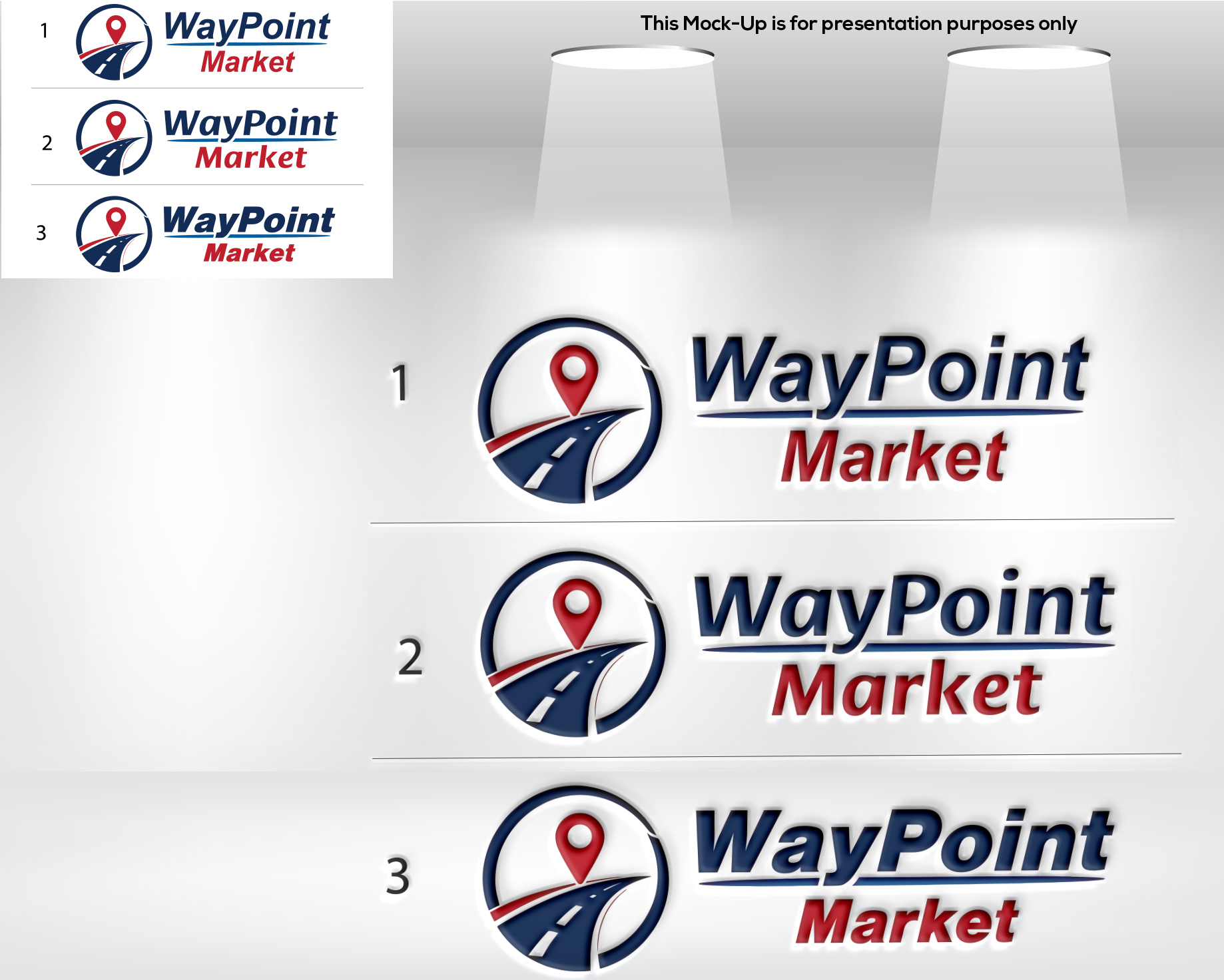
This customer received 645 logo designs from 253 designers. They chose this logo design from MT Tasnim as the winning design.
Join for free Find Design Jobs- Guaranteed
-
 US$150
-
 645 designs
-
 253 designers
Logo Design Brief
Looking for a sign and logo for a new convenience store brand. Must be modern, clean, easy to read from a long distance. It will be displayed on the store front, outside pole signs, inside the store on walls, uniforms, coffee cups. Colors must be easy to see and read. First store will be paired with a Space Age gas station. Store logo should not clash with gas logo (attached for reference). Future stores may not have a gas station attached or may have a different gas brand. Ideally, store logo should have colors that will work alongside other gas brands.
Target Market(s)
Convenience store customers
Industry/Entity Type
Convenience Store, Market
Logo Text
WayPoint Market
Logo styles of interest
Emblem Logo
Logo enclosed in a shape
Pictorial/Combination Logo
A real-world object (optional text)
Abstract Logo
Conceptual / symbolic (optional text)
Character Logo
Logo with illustration or character
Wordmark Logo
Word or name based logo (text only)
Font styles to use
Look and feel
Each slider illustrates characteristics of the customer's brand and the style your logo design should communicate.
Elegant
Bold
Playful
Serious
Traditional
Modern
Personable
Professional
Feminine
Masculine
Colorful
Conservative
Economical
Upmarket
Requirements
Nice to have
- Waypoint symbol or marker.
Should not have
- Gas station elements