OUM Med Spa: LOGO + BRAND IDENTITY
Want to win a job like this?
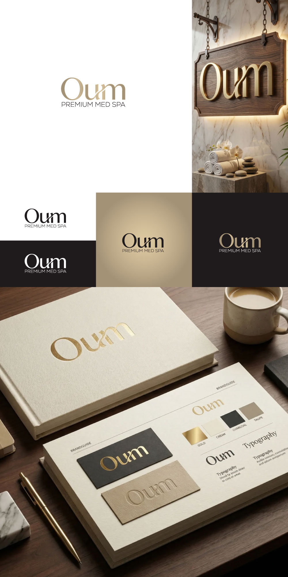
This customer received 107 logo designs from 56 designers. They chose this logo design from RB™ as the winning design.
Join for free Find Design Jobs-
 US$300
-
 107 designs
-
 56 designers
Logo Design Brief
Project Overview
We are launching Oum, a premium med spa in the Bentonville / Northwest Arkansas market. The business combines aesthetics/regenerative skincare, wellness, and functional medicine into one elevated brand experience. The service mix is expected to center first on aesthetics and injectables, then regenerative skincare, then wellness/longevity, then functional medicine.
This is not meant to feel like a generic spa, a trendy Instagram boutique, or a sterile medical office. It should feel like modern luxury with clinical credibility.
Brand Name
Oum
The logo should treat the name as premium, memorable, refined, and scalable.
What We Need
We want a designer to create:
- A timeless wordmark for Oum
- A simple supporting brand identity direction
- Optional secondary ideas for:
- monogram or subtle icon
- color palette
- typography pairing
- light brand-use examples
The priority is the wordmark, not an overly complicated symbol.
Brand Positioning
Oum should communicate:
- elevated beauty
- modern femininity
- aspiration
- trust
- expertise
- wellness
- transformation
- understated authority
The business is being built around a broader women’s wellness concept that blends beauty, personalization, and clinically informed care.
Target Audience
Primary audience:
- affluent women, roughly ages 30–55
- professionals, active moms, wellness-seeking women
- women who value looking polished, healthy, youthful, and confident
- women who want results that feel natural, tasteful, and high-end
The brand should feel premium enough to attract top-tier clients, but not cold, flashy, or exclusionary.
Desired Style
The visual tone should be:
- 50% bold aspirational luxury
- 50% modern feminine luxury
Think:
- polished
- refined
- elegant
- editorial
- premium
- confident
- modern
- sculptural
- quiet power
The logo should feel like it could live comfortably on:
- storefront signage
- injectable packaging/cards
- robes/towels
- skincare packaging
- website headers
- social media
- appointment cards
- embossed print materials
What the Logo Should Signal
In order of importance, the brand should most strongly suggest:
1. Aesthetics / injectables
2. Regenerative skincare
3. Wellness / longevity
4. Functional medicine / hormones / weight loss
This ranking matters. The identity should not lean so far into medical wellness that it loses beauty and luxury appeal.
Creative Direction
We are open to refined exploration, but the strongest direction is likely:
- elegant typography-led identity
- clean spacing
- strong letterform choices
- subtle custom character treatment
- restrained use of symbol, if any
- luxurious without being ornate
- feminine without looking soft or cliché
- modern without looking trendy or disposable
A subtle secondary mark is acceptable, but the main focus should be a distinctive, premium wordmark.
What to Avoid
Please do not submit concepts that use:
- script fonts
- overly feminine cursive
- lotus flowers
- leaves
- water drops
- spa stones
- generic faces in profile
- syringes
- medical crosses
- obvious beauty clichés
- overly literal wellness icons
- generic gold-on-white medspa branding
- anything that feels cheap, trendy, boho, or templated
Also avoid anything too close to:
- “clean girl Instagram spa”
- “day spa retreat”
- “holistic crystal wellness”
- “sterile dermatology clinic”
- “mass-market injectables chain”
Color Direction
We are open, but the palette should feel elevated and premium.
Possible directions:
- warm neutrals
- soft stone
- taupe
- sand
- bone
- muted champagne
- rich espresso accents
- deep olive/sage used sparingly
- subtle metallic direction if tasteful
Typography Direction
We are especially interested in typography that feels:
- custom
- fashion-informed
- editorial
- sophisticated
- modern serif or refined sans-serif
- timeless over trendy
The best concepts will probably win through letterform intelligence, not decoration.
Business Context
This is intended to become a serious, scalable premium business with recurring revenue from memberships, skincare retail, and high-value treatments. That means the identity should be strong enough to support:
- luxury service menus
- physical location signage
- physician-/NP-led consultations
- product retail
- events
- digital advertising
- long-term brand expansion
Deliverables Requested
Please provide:
- primary logo / wordmark
- black and white version
- reversed version
- suggested color palette
- typography recommendations
- optional secondary mark or monogram
- 2–4 simple mockups showing application
- Provide branding
Useful mockups:
- storefront sign
- business card
- product bottle/carton
- website hero
- social profile avatar
Winning Criteria
The winning design will feel:
- premium
- memorable
- ownable
- elegant
- feminine but not fragile
- clinically credible
- timeless
- scalable
It should look like a brand that could credibly grow into a regional luxury med spa and wellness brand, not just a local beauty studio.
Target Market(s)
Target Audience Primary audience: - affluent women, roughly ages 30–55 - professionals, active moms, wellness-seeking women - women who value looking polished, healthy, youthful, and confident - women who want results that feel natural, tasteful, and high-end The brand should feel premium enough to attract top-tier clients, but not cold, flashy, or exclusionary.
Industry/Entity Type
Med Spa, Functional Medicine, Wellness
Logo Text
Oum Premium Med Spa
Look and feel
Each slider illustrates characteristics of the customer's brand and the style your logo design should communicate.
Elegant
Bold
Playful
Serious
Traditional
Modern
Personable
Professional
Feminine
Masculine
Colorful
Conservative
Economical
Upmarket
Requirements
Must have
- What We Need We want a designer to create: - A timeless wordmark for Oum - A simple supporting brand identity direction - Optional secondary ideas for: - monogram or subtle icon - color palette - typography pairing - light brand-use examples
Nice to have
- What the Logo Should Signal In order of importance, the brand should most strongly suggest: 1. Aesthetics / injectables 2. Regenerative skincare 3. Wellness / longevity 4. Functional medicine / hormones / weight loss
Should not have
- What to Avoid Please do not submit concepts that use: - script fonts - overly feminine cursive - lotus flowers - leaves - water drops - spa stones - generic faces in profile - syringes - medical crosses - obvious beauty clichés - overly literal wellness icons - generic gold-on-white medspa branding - anything that feels cheap, trendy, boho, or templated Also avoid anything too close to: - “clean girl Instagram spa” - “day spa retreat” - “holistic crystal wellness” - “sterile dermatology clinic” - “mass-market injectables chain”