Ascend Partners Business Card Design
Want to win a job like this?
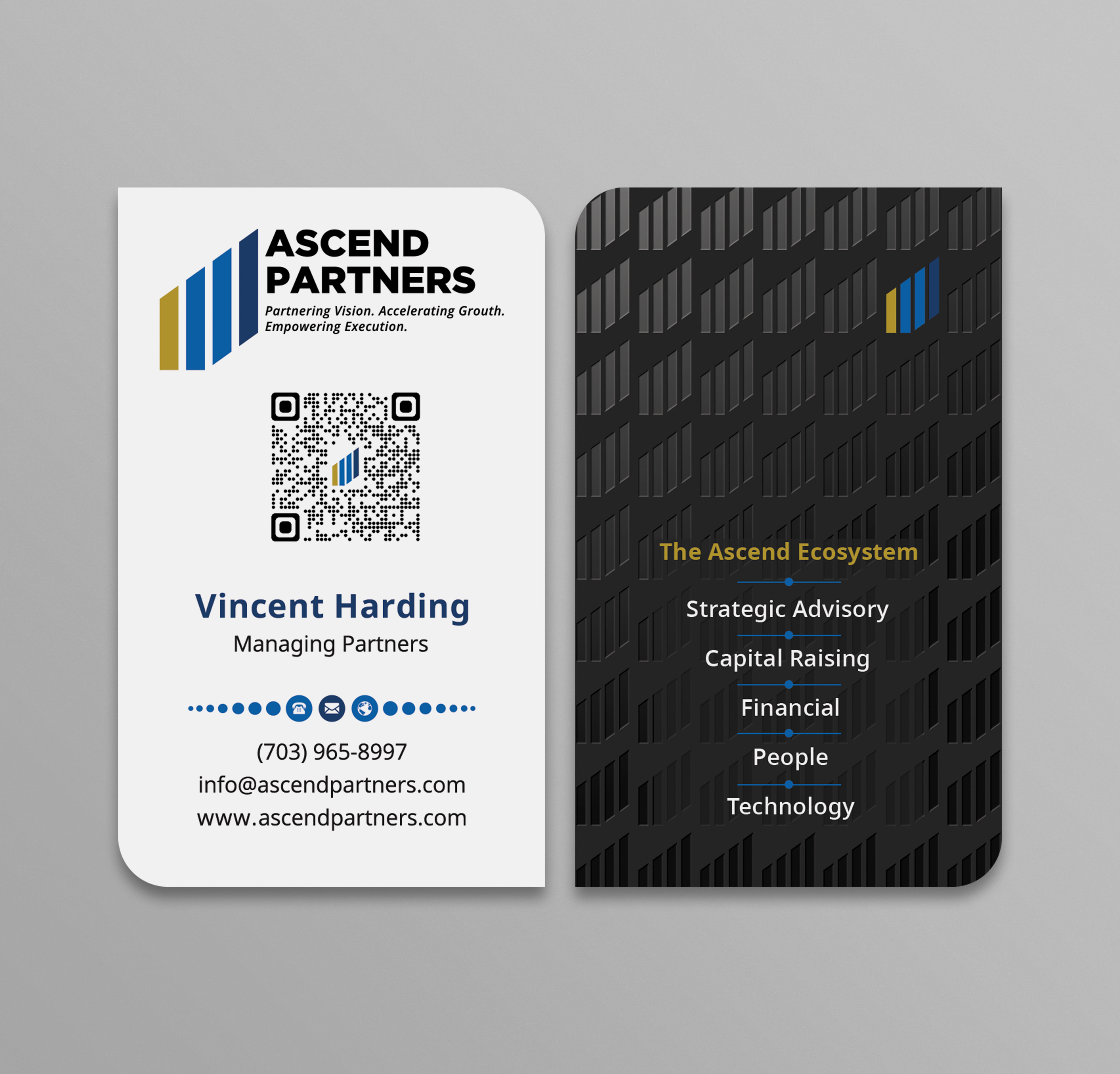
This customer received 170 business card designs from 17 designers. They chose this business card design from Sabbir_2025 as the winning design.
Join for free Find Design Jobs-
 US$90
US$90
-
 170 designs
-
 17 designers
Business Card Design Brief
Design Brief: Ascend Partners Business Card Design
Project Overview
Ascend Partners is a strategic partner to entrepreneurs and leadership teams, supporting business growth through clarity, execution, and trusted expertise. We are looking for a premium, modern business card design that reflects confidence, professionalism, and upward momentum.
Main logo the one with gold bar for the Ascend Partners.
This card will be used by executives and staff across the Ascend Partners business.
Brand Personality
Professional but human
Confident but collaborative
Strategic, credible, and execution-focused
Premium without being flashy
This is not a startup, tech gimmick, or overly creative brand.
Card Format
Portrait orientation (vertical)
Standard size: 55 × 90 mm
Two-sided
One corner cut (top-right corner preferred) to subtly represent upward movement and growth
Design must still work if corner cutting is not available with certain printers
Front Side (Contact Details)
Include:
Ascend Partners logo (provided)
Name
Title
Phone number
Email address
Website
Optional: tagline at the bottom
Style:
Clean
Minimal
Plenty of white space
Easy to read
Back Side (Ecosystem / Brand Message)
Include:
Heading such as: “The Ascend Ecosystem”
Short 2–3 line description explaining that Ascend is a strategic partner with an ecosystem of specialist professional services businesses operating across Strategic Advisory, Capital Raising, People, & Finance.
This side should reinforce scale, capability, and partnership, not sales messaging.
Colours
Primary brand colours:
Ascend Blue: #0063B0
Deep Blue: #1A3D6D
Gold accent (very subtle use only): #C9A24D
Rules:
No gradients
No bright or neon colours
No heavy textures
Gold should be minimal and refined
Typography
Clean, modern sans-serif
Professional and readable
No script or decorative fonts
What to Avoid
Landscape layouts (Unless recommended based on logo design, which is horizontal in nature)
Overdesigned or cluttered cards
Loud colours or gradients
Trendy effects that won’t age well
Multiple accent colours
Deliverables
Print-ready files (PDF)
Editable source files (AI / PSD)
Front and back designs
Mockups showing the portrait card and cut corner
Target Outcome
A business card that feels:
Executive
Distinctive
Timeless
Aligned to a strategic, multi-division business
Target Market(s)
Business Owners and Executives (Across industries)
Industry/Entity Type
Professional Services
Contact Information for Business Card
First name and Surname, Email address, Cell phone number, website
Font styles to use
Other font styles liked:
- IBM Plex Sans and or Sans Pro
Colors
Colors selected by the customer to be used in the logo design:
Look and feel
Each slider illustrates characteristics of the customer's brand and the style your logo design should communicate.
Elegant
Bold
Playful
Serious
Traditional
Modern
Personable
Professional
Feminine
Masculine
Colorful
Conservative
Economical
Upmarket
Requirements
Must have
- Include QR code to digital business card.