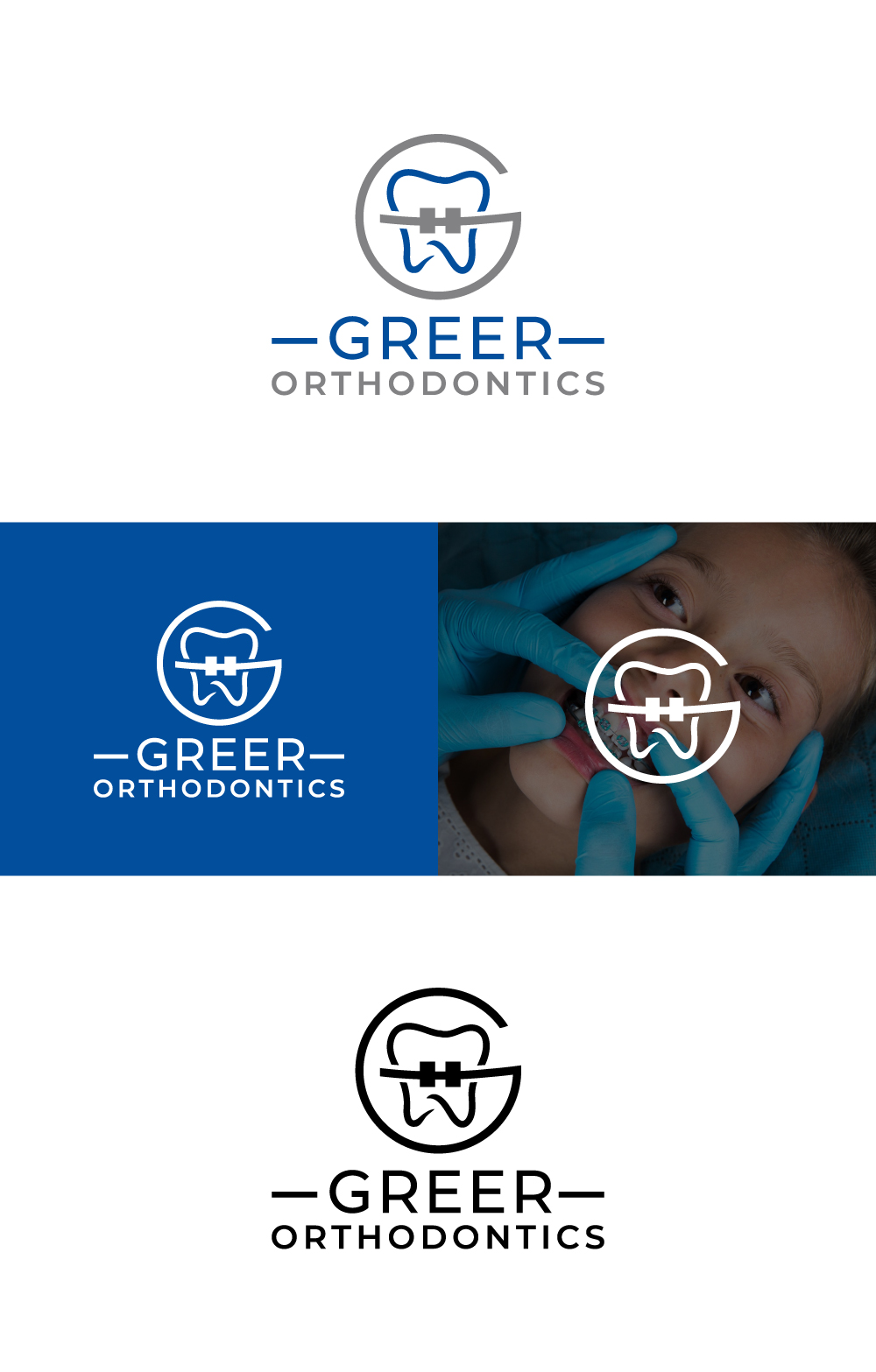
Logo design for Greer Orthodontics (orthodontic practice)

Want to win a job like this?
This customer received 772 logo designs from 222 designers. They chose this logo design from AbdurRahim@ as the winning design.
Join for free Find Design Jobs- Guaranteed
Logo Design Brief
We need a logo for our orthodontic (dental) practice. We want it to be clear and legible for a building sign, will use it on letterhead/website, but also have a little icon/symbol to use for social media, t-shirts, etc. Our business is Greer Orthodontics and we do braces and clear aligners for children and adults.
Updates
Gathering more feedback
Target Market(s)
Most common target market is a MOTHER, with children in age ranges of 7-17. Majority of our patients are children age 7 and up, but we also see about 20% adults, so we do not want a logo that is overly childish in appearance.
Industry/Entity Type
Dental - specifically the specialty of orthodontics (making straight smiles)
Logo Text
Greer Orthodontics
Look and feel
Each slider illustrates characteristics of the customer's brand and the style your logo design should communicate.
Elegant
Bold
Playful
Serious
Traditional
Modern
Personable
Professional
Feminine
Masculine
Colorful
Conservative
Economical
Upmarket
Requirements
Must have
- Full text of Greer Orthodontics spelled out
Nice to have
- Spell out "Greer Orthodontics" and also have an icon with just the letter G, or letters GO, in a way that has a subtle smile or arch. Do not include teeth, braces, or cursive text
Should not have
- No teeth, no braces, no cursive text