Knightwell Recruitment – Logo Design Brief
Want to win a job like this?
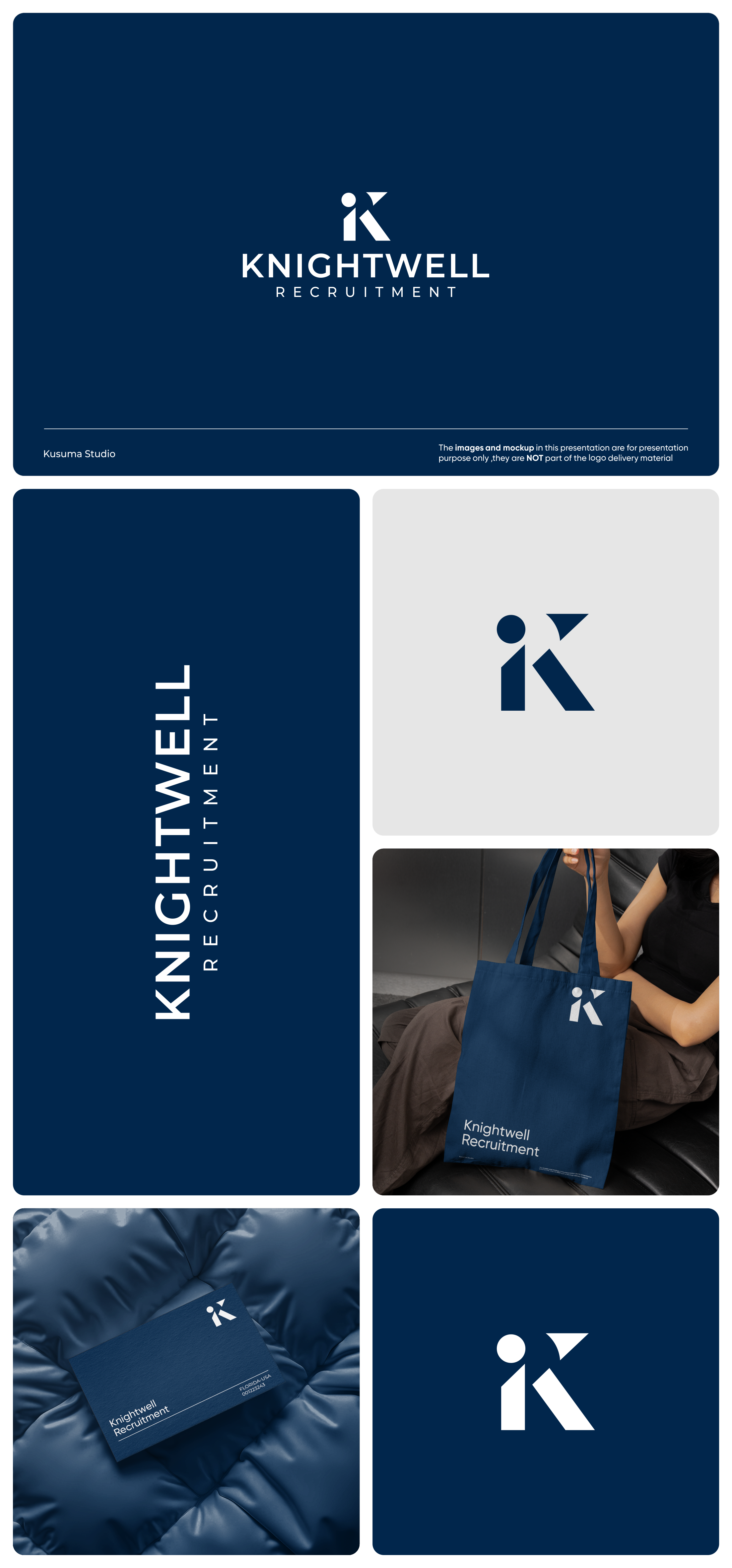
This customer received 235 logo designs from 63 designers. They chose this logo design from Kusuma Studio as the winning design.
Join for free Find Design Jobs- Guaranteed
-
 £110
£110
-
 235 designs
-
 63 designers
Logo Design Brief
We are looking for a font-based or watermark-style logo that feels strong, corporate, and highly professional. No playful elements.
The logo must work across multiple sectors, so it should feel universal, clean and timeless – similar to brands like Robert Walters, Michael Page, Hays, Page Personnel, are good examples.
We want the brand to communicate:
1: Trust
2: Strength
3: Professionalism
4: Stability & Confidence
5: Premium but minimal
No cartoon, mascot, or overly decorative icons. If an icon is used, it should be subtle, geometric or monogram-based (e.g., K / KR watermark).
Logo Style
- Font-based (primary preference)
- Clean, modern typography
- Bold but not heavy
- Avoid rounded playful fonts – keep it sharp and corporate
- Minimalistic and scalable.
Target Market(s)
B2B Businesses
Industry/Entity Type
Recruitment Agency
Logo Text
Knightwell
Logo styles of interest
Wordmark Logo
Word or name based logo (text only)
Lettermark Logo
Acronym or letter based logo (text only)
Font styles to use
Colors
Colors selected by the customer to be used in the logo design:
Look and feel
Each slider illustrates characteristics of the customer's brand and the style your logo design should communicate.
Elegant
Bold
Playful
Serious
Traditional
Modern
Personable
Professional
Feminine
Masculine
Colorful
Conservative
Economical
Upmarket
Requirements
Nice to have
- Colours: A deep navy/blue / Purples / Black & White
Should not have
- Cartoon, playfull logos