New Dental Chain Logo
Want to win a job like this?
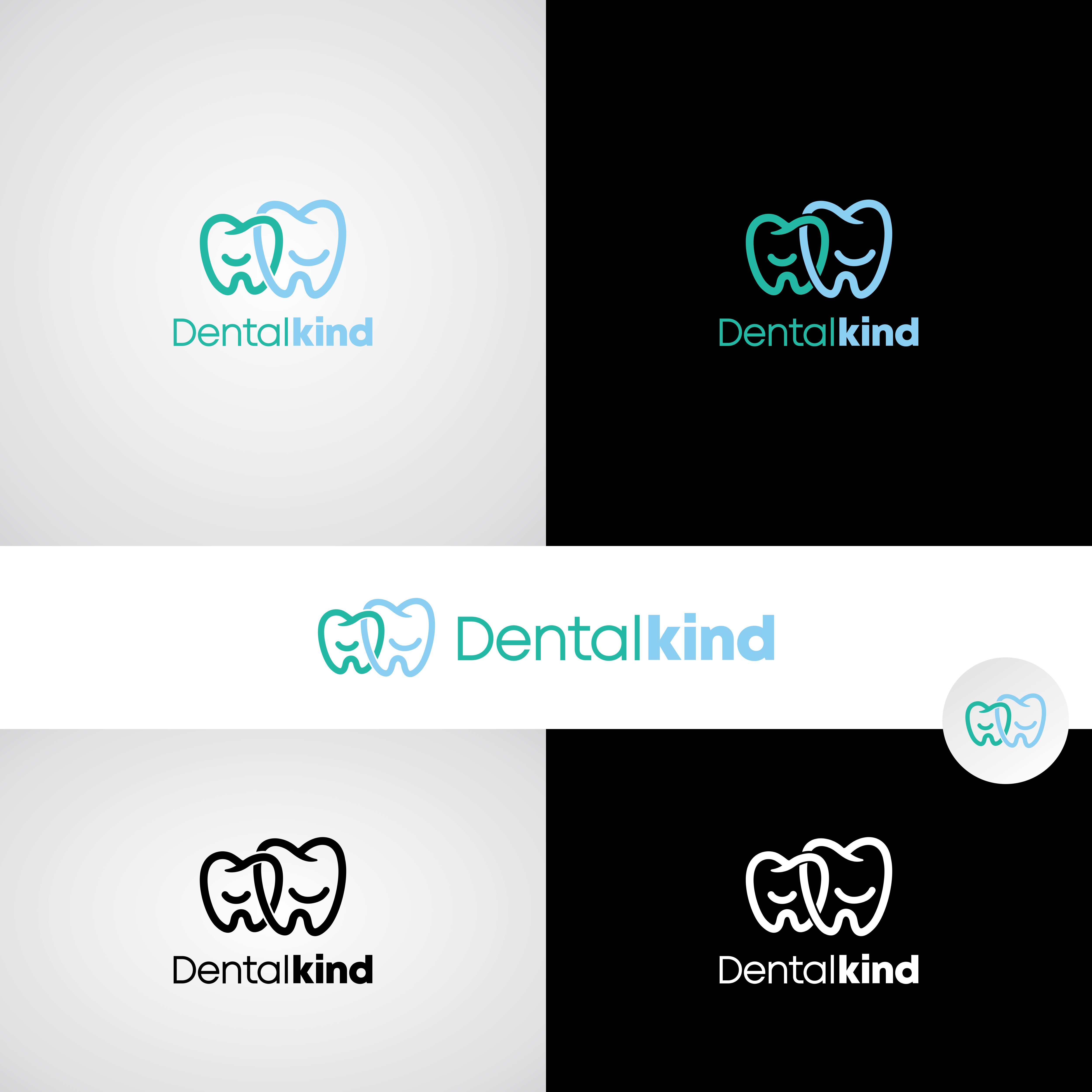
This customer received 400 logo designs from 186 designers. They chose this logo design from Adi firadika as the winning design.
Join for free Find Design Jobs- Guaranteed
-
 A$300
A$300
-
 400 designs
-
 186 designers
Logo Design Brief
ogo + Brand Direction Brief for “Dentalkind”
Business name: Dentalkind
Industry: Family-focused dental clinic
Audience: Young families, mums with children, local community
Tone: Warm, gentle, reassuring, slightly feminine, modern
Brand Identity Goals:
Communicate kindness, care, and a calm dental experience.
Feel approachable and family-friendly while still looking premium and professional.
Create a visual identity that appeals strongly to young families, especially mothers who make most dental decisions for their children.
Avoid anything overly clinical or harsh.
Design Style:
Soft, rounded typography (no sharp edges).
Feminine-leaning but not overly delicate.
Minimalist, clean, and modern.
Organic shapes or curves that convey care, protection, and ease.
Icon optional, but if used: something abstract, soft, and memorable (e.g., subtle smile curve, abstract heart-tooth shape, or stylised linework suggesting family or support).
Colour Palette:
Soft, calming tones (e.g., sage, eucalyptus, blush, nude, muted teal, dusty lavender).
Avoid bright primary colours or dark, harsh blues often used in traditional dental branding.
Consider a palette that works well across signage, uniforms, website, and social media.
Requirements:
Full logo (icon + wordmark).
Wordmark-only version.
Icon-only version.
Horizontal and stacked layouts.
Colour + monochrome versions.
Brand font recommendations and colour palette breakdown.
Brand Personality Keywords:
Kindness
Gentle
Modern
Family
Warm
Trustworthy
Community
Logo Text
DentalKind