Design Contest: A New Look & Feel for DAFLS.nl
Want to win a job like this?
This customer received 38 web designs from 8 designers. They chose this web design from pb as the winning design.
Join for free Find Design Jobs-
 €250
€250
-
 38 designs
-
 8 designers
Web Design Brief
🌍 Context
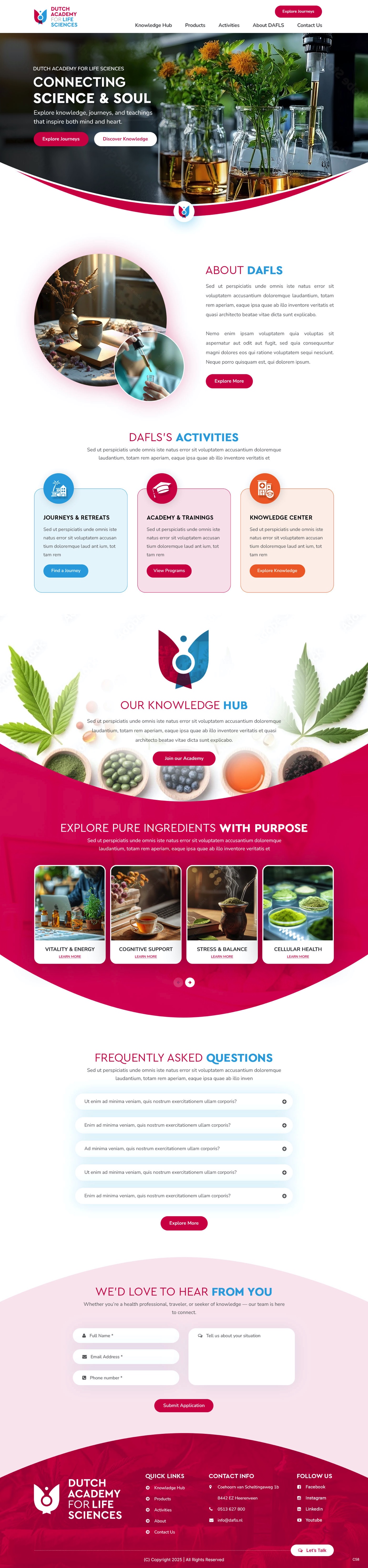
DAFLS.nl combines knowledge about supplements, ingredients, and spirituality, while also offering lectures, retreats, and training programs.
We are not a foundation or donation platform, but an open knowledge network with a professional, warm, and trustworthy presence.
Our mission is to connect science and soul, sharing valuable insights and experiences that inspire both rational understanding and spiritual growth.
🎯 The Goal
We’re inviting talented web designers and visual creatives to redesign DAFLS.nl into a modern, elegant, and emotionally resonant platform.
The new design should communicate:
Warmth and human connection,
Professionalism and clarity, and
A sense of discovery and inspiration.
The site will serve as a central hub for education, community, and conscious travel — bridging science, nature, and spirituality.
Landing Page (One-Pager):
A welcoming introduction to DAFLS that immediately conveys our essence: knowledge, connection, and inspiration.
Visually guides visitors toward our main areas — journeys, education, and knowledge — with clear calls to action.
Travel Page Design:
A dedicated layout for a spiritual journey or retreat
Should evoke curiosity, emotion, and trust — encouraging visitors to read the program and feel inspired to book.
Education Page Design:
A page for one specific training or lecture.
Should look professional and engaging, highlighting benefits and making visitors eager to sign up.
Ingredient Page Design:
A clean, structured layout for an ingredient (e.g., Curcumin C3 Complex®).
Should balance science and accessibility — informative yet visually appealing, showing related insights or products.
✨ What We’re Looking For
🌸 Warm, Friendly Aesthetic
A soft, grounded color palette (see moodboard below).
A look that feels welcoming, safe, modern, and inspiring.
Avoid harsh contrasts or corporate coldness — aim for organic elegance and heart-centered design.
🌿 Clean, Airy Layout
Generous white/cream space for readability and calm.
Rounded corners, smooth transitions, and balanced composition.
Use light textures (paper, waves, or organic shapes) to evoke warmth.
✍️ Modern Typography
Body text: Nunito, Lato, or Raleway — friendly, clear, and easy to read.
Headings: Playfair Display or Quicksand — elegant and expressive.
Typography should reflect both expertise and approachability.
🔗 Clear Navigation
Logical, intuitive structure with the following key areas:
Knowledge Hub – Products – Activities – About – Contact
Clear, soft-toned buttons and navigation encouraging exploration.
Consider “related content” cards or visual pathways connecting knowledge, events, and products.
💫 Visual Integration
Create visual links between knowledge, activities, and products (e.g., tags, badges, or modular cards).
Filters or category highlights to navigate supplement/ingredient content easily.
Visual flow should feel alive yet harmonious.
🧠 Local & Human Connection
Photography that emphasizes real people, learning moments, and connection with nature.
Avoid clinical or corporate stock images — show authenticity, empathy, and light.
🤝 Community Features
Dedicated space for reviews, expert Q&A, or interaction.
These areas should radiate trust, safety, and a sense of belonging.
🧩 Duda CMS Compatibility
Must be responsive and easily built within Duda CMS (drag-and-drop).
Show where dynamic content (articles, events, or journeys) will be placed and how cards adapt to different devices.
🎨 Moodboard & Color Palette
Color Name HEX Code Emotion & Use
Warm Beige #DFBAAA The grounding base color — evokes natural warmth, balance, and calm. Ideal for backgrounds and section dividers.
Light Cream #F5EAE5 Airy and gentle — conveys purity, openness, and readability. Use for backgrounds and whitespace.
Deep Aubergine #431624 Adds depth and mystery — perfect for headlines, highlights, or footers. Symbolizes introspection and wisdom.
Wine Red #750E2B Expresses vitality, heart energy, and focus. Ideal for buttons, accents, or key highlights.
Burnt Orange #F26C2E Brings creative spark and positivity. Great for hover states, subtle icons, or energetic accents.
Mustard Yellow #B68620 Symbolizes light, optimism, and knowledge. Use as a secondary accent or highlight.
Color philosophy:
This palette represents the meeting point between Earth and Fire — grounding warmth combined with vibrant inspiration.
It visually communicates the essence of DAFLS: trustworthy science, human connection, and transformative energy.
🧠 Target Audience
Health professionals and therapists seeking supplement and ingredient education.
Consumers and conscious individuals interested in wellbeing, spirituality, and science.
Spiritual explorers looking for transformative journeys and community learning.
💡 Functional & Structural Goals
The site should clearly showcase DAFLS’s four pillars:
Journeys & Retreats – spiritual travel experiences.
Academy & Trainings – professional education and lectures.
Knowledge Center – accessible supplement & ingredient knowledge (scientific yet warm).
📦 What to Submit
A homepage concept (desktop + mobile).
Final delivery as a layererd PSD
Updates
Need extra days to review
Need a revision of the winner.