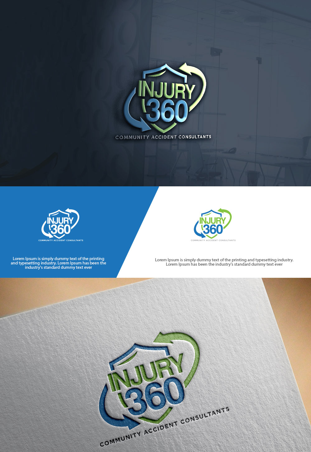
Injury 360 Personal Injury Logo

Want to win a job like this?
This customer received 135 logo designs from 68 designers. They chose this logo design from sulemani creation as the winning design.
Join for free Find Design JobsLogo Design Brief
Overview:
Injury 360 is a personal injury accident consulting network that connects clients with trusted legal and medical providers. We are the bridge between accident victims and the full range of care they need — from the moment of the accident through recovery and settlement. Our mission is to offer trust, reliability, and peace of mind by providing a complete, all-in-one support system for those navigating the aftermath of an accident.
We want our logo to reflect unity, protection, trust, and full-circle support — visually communicating that clients are never alone in the process.
Target Audience:
Individuals recently involved in car accidents or personal injury incidents
Attorneys and medical professionals seeking to partner within a trusted network
Community members seeking dependable guidance after an accident
Design Goals:
The logo should visually express:
Trust and professionalism
Connection between the legal and medical sides
Completion and continuity — the “360°” full-circle concept
Care and protection — reassuring clients they’re fully covered
Logo Style Preferences:
Modern and clean — professional yet approachable
Symbolic mark or icon that represents a circle, network, or interconnected system
Typography: Strong, confident, sans-serif font (clean lines, no gimmicks)
Possible elements to explore:
Circular motion or gradient ring symbolizing “360° coverage”
Interconnected shapes or lines representing the network of providers
Abstract shield or circle encapsulating balance between medical & legal sides
Dual color contrast (e.g., blue = trust, silver/gray = professionalism, accent color like green or orange for vitality or action)
Color Palette Inspiration:
Primary: Deep Blue (trust, dependability)
Secondary: Silver/Gray (professionalism, balance)
Accent Options: Green (healing, growth) or Orange (energy, action)
Logo Use Cases:
Website & social media profiles
Business cards and client materials
Banners and event signage
Branded merchandise and apparel
Deliverables:
Full-color logo
Black-and-white version
Transparent background versions (PNG, SVG, EPS)
Horizontal and stacked variations
Tone & Personality:
Professional, trustworthy, compassionate, dependable, modern, and confident.
Injury 360 is the trusted guide that clients turn to in moments of uncertainty — and the logo should feel like a promise of support and protection.
Industry/Entity Type
Personal Injury
Logo Text
INJURY 360 - Community Accident Consultants
Logo styles of interest
Pictorial/Combination Logo
A real-world object (optional text)
Wordmark Logo
Word or name based logo (text only)
Colors
Colors selected by the customer to be used in the logo design:
Look and feel
Each slider illustrates characteristics of the customer's brand and the style your logo design should communicate.