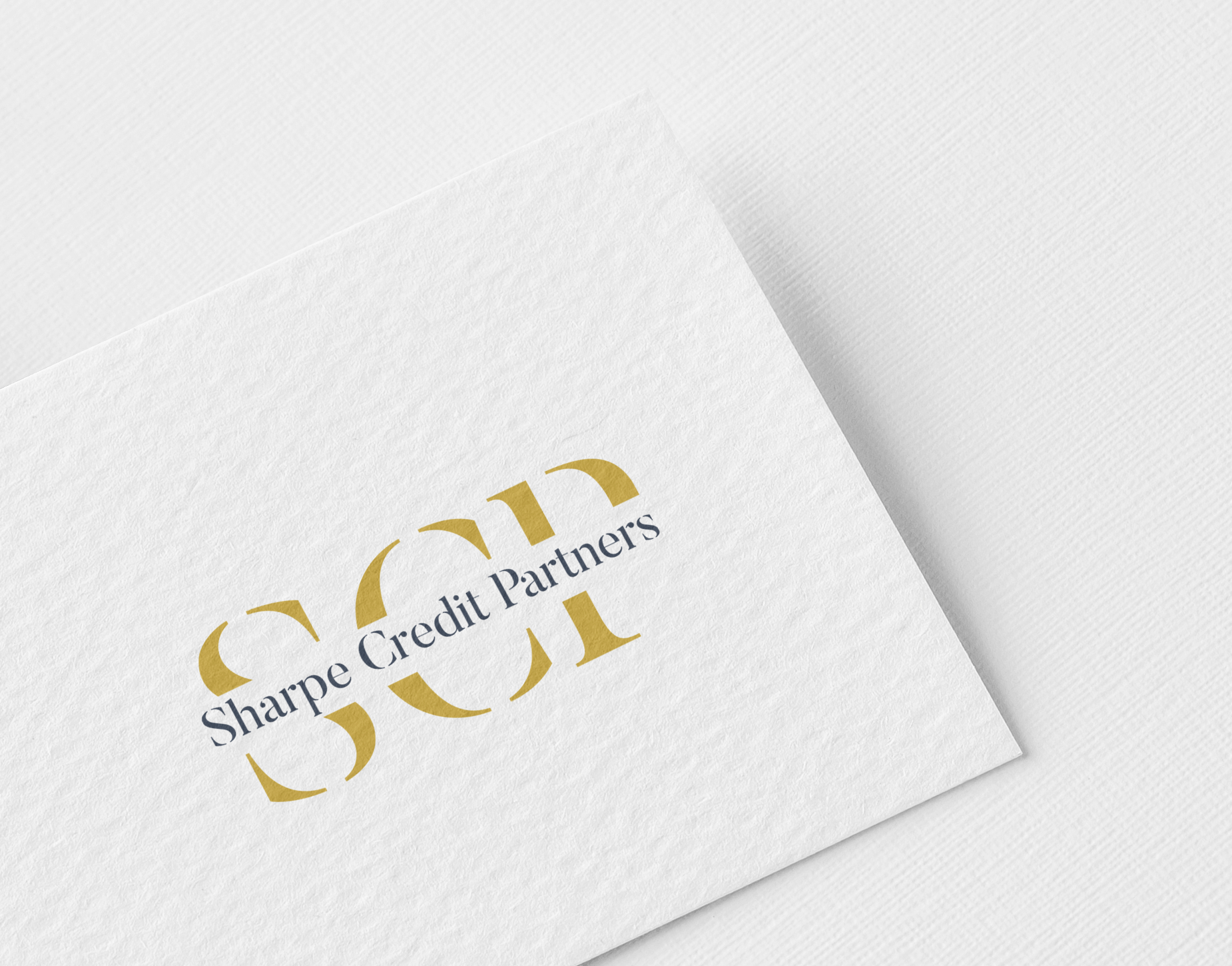
Sharpe Credit Partners Logo for Financial Services Company - Asset-backed lending platform
Want to win a job like this?
This customer received 193 logo designs from 77 designers. They chose this logo design from Md.Hanif Mahmud as the winning design.
Join for free Find Design Jobs-
 US$150
-
 193 designs
-
 77 designers
Logo Design Brief
Sharpe Credit Partners is a specialty asset-based lending platform that provides institutional-quality financing to underserved, niche industries — sectors often ignored by traditional banks due to unconventional collateral, small deal sizes, or regulatory complexity.
Our platform combines institutional process discipline with entrepreneurial agility, deploying capital into high-yield, asset-secured opportunities with strong downside protection.
We are building a multi-value stream enterprise spanning luxury automotive finance, medical equipment leasing, manufactured housing, and AI-enabled vehicle inspection systems.
Sharpe Credit Partners represents a new breed of financial platform — modern in execution, classic in ethos.
The Meaning Behind the Name
Our name is inspired by the Sharpe Ratio, a Nobel Prize–winning concept that measures risk-adjusted returns — the reward earned per unit of risk.
This principle embodies everything we stand for:
• Discipline over speculation
• Performance through precision
• Return with control
“Sharpe” is not just a name — it’s a philosophy of intelligent yield and institutional rigor.
The brand should convey confidence, balance, and timeless strength — the same equilibrium the Sharpe Ratio represents between reward and risk.
________________________________________
Brand Essence
Positioning: Institutional process, sub-institutional opportunities
Purpose: Unlock yield in complex, underbanked markets
Tone: Sophisticated • Trustworthy • Measured • Enduring
Think J.P. Morgan meets Apollo Global — built for investors who value precision, credibility, and discretion.
________________________________________
Design Objectives
We’re seeking a timeless, high-end wordmark or monogram that conveys:
• Stability and Authority — built for longevity and trust
• Discipline and Precision — professional, balanced, confident
• Modern Legacy — clean, minimalist design that feels established
The logo should look equally strong on investor materials, building signage, and embossed stationery.
________________________________________
Design Preferences
Style: Clean, refined, and elegant.
Typography: Serif typeface (modern or transitional, e.g., Chronicle, Canela, or Freight Display). Avoid script or decorative fonts.
Color Palette:
• See attached
Logo Type:
• Primary: Wordmark or monogram (“SCP” or stylized “Sharpe”).
• Symbol: Subtle geometric or abstract motif suggesting balance, proportion, or structure — never literal.
Tone Keywords: Institutional • Sophisticated • Measured • Confident • Enduring
________________________________________
Inspiration
• Goldman Sachs
• J.P. Morgan
• Apollo Global Management
• Brookfield Asset Management
• Blackstone
• Fortress Investment Group
Target Market(s)
Financial institutions and private investors
Logo Text
Sharpe Credit Partners
Logo styles of interest
Abstract Logo
Conceptual / symbolic (optional text)
Wordmark Logo
Word or name based logo (text only)
Lettermark Logo
Acronym or letter based logo (text only)
Font styles to use
Colors
Colors selected by the customer to be used in the logo design:
Look and feel
Each slider illustrates characteristics of the customer's brand and the style your logo design should communicate.