FourSix46 over time, it became a symbol of luck, purpose, and identity.
Want to win a job like this?
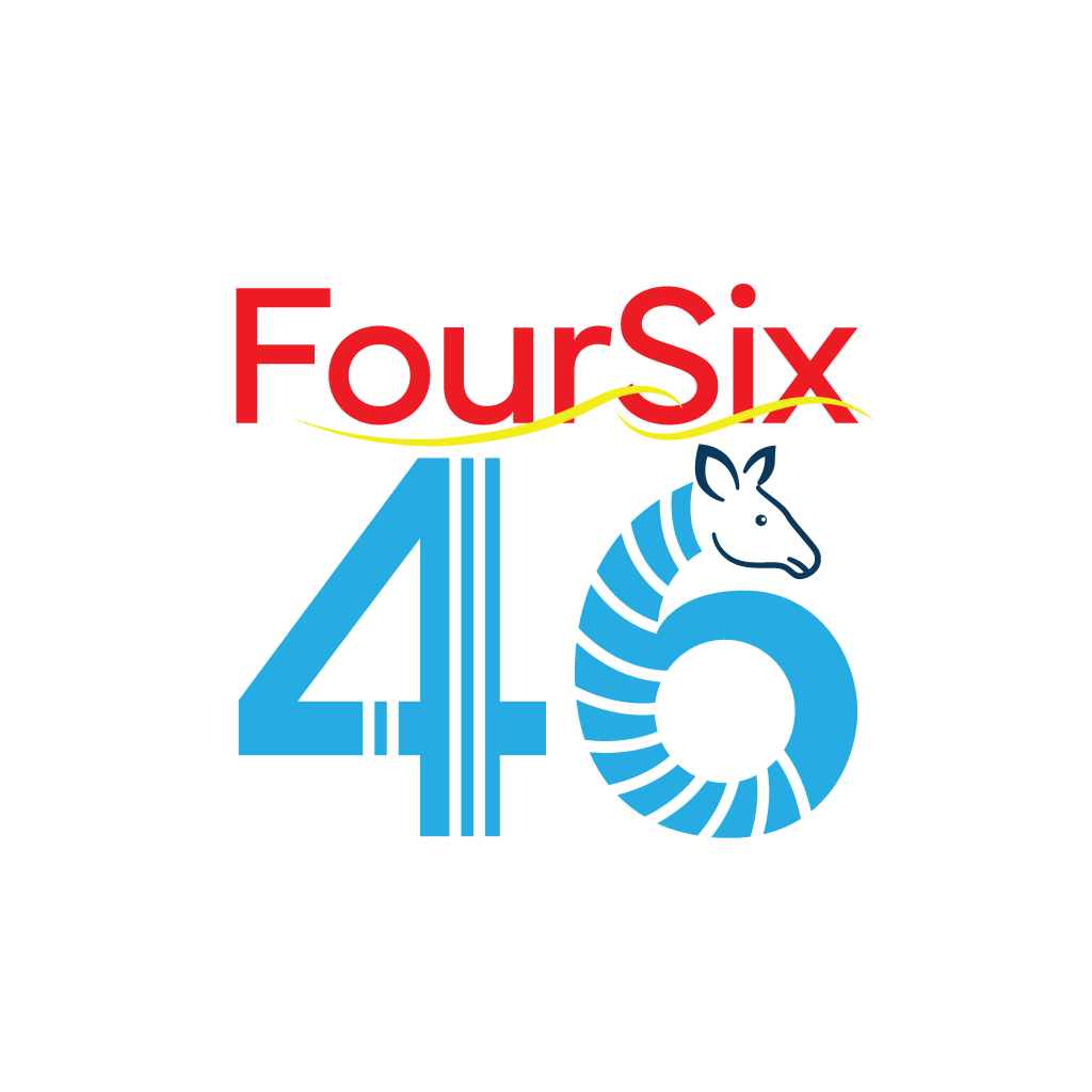
This customer received 15 logo designs from 3 designers. They chose this logo design from JohnnyCactus as the winning design.
Join for free Find Design Jobs-
 C$120
C$120
-
 15 designs
-
 3 designers
Logo Design Brief
Foursix46 is a global, multi-industry brand. We are not limited to one sector — our aim is to represent innovation, connectivity, and forward-thinking across industries like:
Logistics & supply chain
Fashion & lifestyle
Food & hospitality
Travel & tourism
Tech, services, and more The logo and symbol should reflect that unique origin — simple on the surface, but powerful in meaning. And i have uploaded a logo which okapi is blended into logo
Use that design or else come with a unique logo
And colours are Rich earthy tones (deep browns, blacks, and muted golds) — referencing the okapi’s natural beauty while projecting professionalism.
Target Market(s)
Globally
Industry/Entity Type
Logistics Fashion & retail Food & beverage Travel & tourism Technology E-commerce Events & media
Logo Text
We want a logo that speaks through the name itself — Foursix46 should be the brand. Preferred qualities: Modern & clean Bold but simple Memorable typography Scalable (works on small labels and large signage) Symbol if you create a symbol/icon, it must be abstract and versatile across sectors. our chosen brand symbol — integrated with or positioned beside the name FourSix46.
Logo styles of interest
Abstract Logo
Conceptual / symbolic (optional text)
Wordmark Logo
Word or name based logo (text only)
Font styles to use
Other font styles liked:
- Modern sans - serif typeface
Colors
Designer to choose colors to be used in the design.
Look and feel
Each slider illustrates characteristics of the customer's brand and the style your logo design should communicate.
Elegant
Bold
Playful
Serious
Traditional
Modern
Personable
Professional
Feminine
Masculine
Colorful
Conservative
Economical
Upmarket
Requirements
Must have
- Dont want to compromise on Quality! Must be a unique design , Abstract mark/icon that can evolve into a brand symbol use colours that standout with the brand , colours representation is the most important thing for this company to became a successful brand
Nice to have
- We want people to recognise the brand by the symbol alone — just like world-class brands. The okapi should look elegant, unique, and intelligent — not cartoonish or aggressive. It can be abstracted, using geometric lines or negative space. If stripes are used, they should be subtle and artistic, not literal. Should feel balanced — representing both strength and refinement.– The symbol should be unique to Foursix46 — distinct, memorable, and capable of representing the brand without the name over time
Should not have
- Logo should be original — not built from stock vector libraries Avoid generic or unoriginal shapes/designs