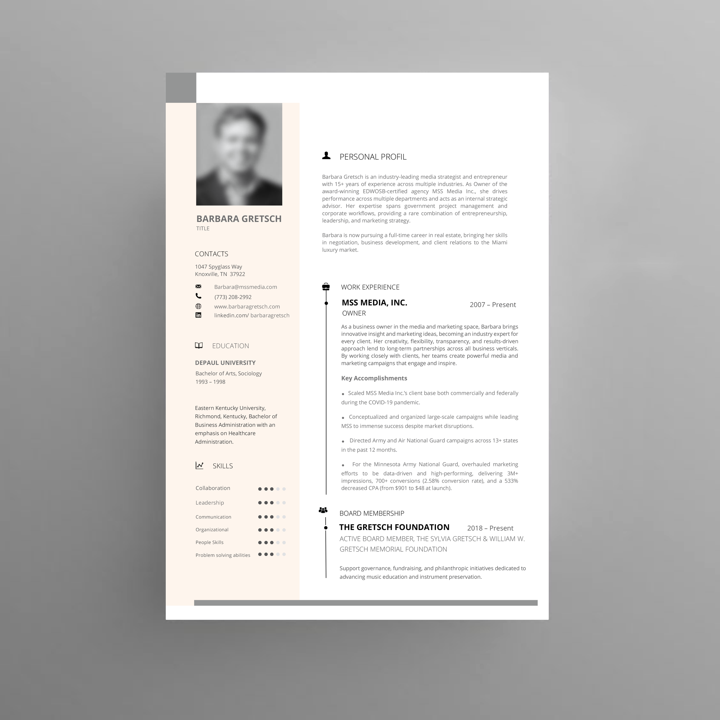
Barbara Gretsch Resume 2025
Want to win a job like this?
This customer received 21 resume designs from 3 designers. They chose this resume design from nafizrahat as the winning design.
Join for free Find Design Jobs- Guaranteed
-
 US$120
-
 21 designs
-
 3 designers
Resume Design Brief
🎨 Design Aesthetic
Overall Look: Sophisticated, clean, minimalist — less “corporate template,” more “editorial/luxury brand.” Think Architectural Digest meets Sotheby’s International Realty.
Colors:
Base: Warm white or ivory background (instead of stark white, which can feel clinical).
Accents: Soft taupe, blush beige, muted rose-gold, warm gray. These lean feminine, elegant, and upscale without being distracting.
Avoid heavy blacks — use charcoal gray for text.
🔤 Typography
You’ll want fonts that are timeless, system-available (no downloading), and upscale. Pairing one serif with one sans-serif is a proven high-end combo.
Primary Serif (for Name + Section Headers):
Georgia (classic, built-in)
Times New Roman (if you want ultra-traditional, though a bit expected)
Palatino Linotype (a softer, elegant serif)
Secondary Sans-serif (for body text):
Helvetica Neue (clean, luxury feel)
Calibri (simple, highly readable, professional)
Arial Narrow (refined but modern)
✨ Recommended pairing: Name/Headings in Georgia Bold + Body in Helvetica Neue Light → refined, professional, easy to use in all your collateral.
📐 Layout & Structure
Header (Top Third):
Your name large, centered or left-aligned.
Subline with phone, email, location in smaller font, spaced out with dividers (e.g., |).
Neutral line or subtle accent bar under the header (warm gray or muted blush).
Section Layout:
Plenty of white space (breathe between sections, upscale feel).
Clear section headers (all caps serif font, spaced letters for luxury look).
Use subtle horizontal rules in a soft accent color instead of thick lines.
Accents:
Very subtle shading in soft beige or blush for section backgrounds (not blocks, just highlights).
Icons kept minimal — avoid anything too “clip-arty.”
🖼 Visual Mood Reference
Imagine:
A high-end boutique hotel brand sheet
Hermès packaging tones (ivory, taupe, gold accent) but dialed down to be subtle
Editorial spacing like in Vogue or Elle Decor
🗂 Sections to Highlight (for your pivot)
Profile / Objective – Short 2–3 lines at the top making clear you are pivoting into luxury real estate, with transferable leadership skills.
Experience – MSS Media (as Owner, not Managing Partner) with emphasis on entrepreneurship, strategy, client growth.
Board Membership – Gretsch Foundation role (philanthropy adds prestige).
Certifications – Shows discipline and learning.
Education – Clean, simple.
“I want a resume design that feels refined and luxury-oriented, clean and sophisticated, with soft neutral feminine tones (ivory, blush beige, taupe, warm gray). Font pairing should be elegant but standard (e.g., Georgia for headings + Helvetica Neue for body) so I can reuse across collateral without downloading special fonts. Layout should have lots of white space, understated lines/dividers, and feel like something you’d expect from a luxury real estate or fashion brand.”
Target Market(s)
Real Estate Brokerage Houses
Industry/Entity Type
Real Estate - Luxury
Look and feel
Each slider illustrates characteristics of the customer's brand and the style your logo design should communicate.