Logo Refresh
Want to win a job like this?
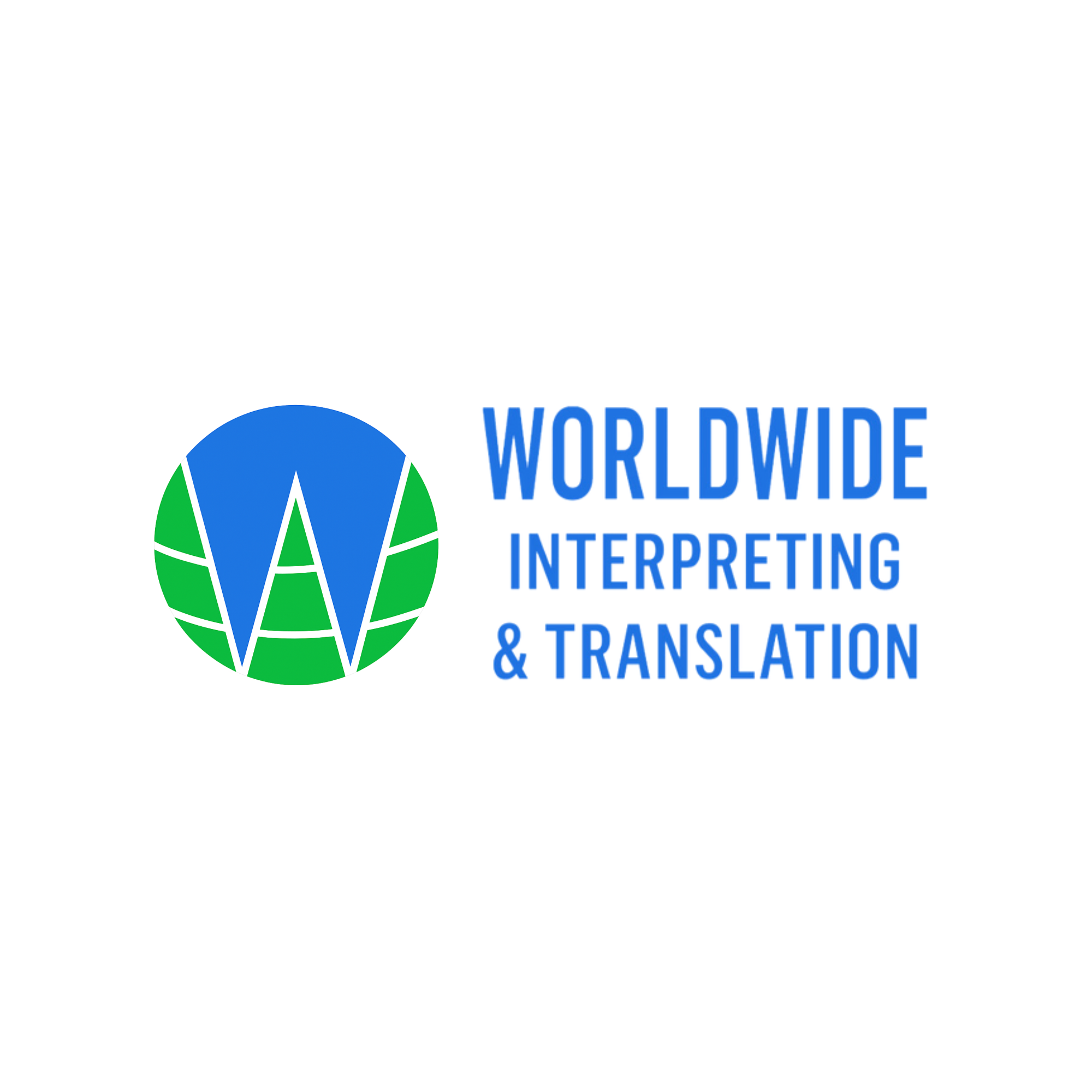
This customer received 263 logo designs from 108 designers. They chose this logo design from putri elegant as the winning design.
Join for free Find Design Jobs-
 A$150
A$150
-
 263 designs
-
 108 designers
Logo Design Brief
Objective:
Refine the existing logo to make the globe concept and the "W" symbol clearer and more professional, while retaining the current font style for brand consistency.
Requirements
Font:
Keep the existing typeface exactly as it is.
Maintain the current alignment (icon to the left, text to the right).
Icon (Globe + W):
The circle should clearly represent a globe.
Use subtle longitude/latitude curved lines or a stylised world map impression to make the globe element more obvious.
The W should be more recognisable inside the globe.
Consider making it bold, symmetrical, and centred.
Ensure the "W" integrates seamlessly with the globe rather than looking like random shapes.
Colour balance should remain simple and professional:
Blue and green palette (representing global trust and growth).
Optionally, refine shades to improve contrast.
Style Direction:
Aim for a modern, clean, and professional look.
The design should be easily adaptable for:
Website header
Business cards and letterheads
Social media icons (small-scale clarity is important)
Variations to Deliver:
Full-colour version (blue/green globe with W).
Monochrome/black-and-white version (for stamps, invoices, or single-colour print).
Simplified favicon version (for website browser tab).
Notes
Avoid overcomplicating the globe; it should stay minimal and easily recognisable at a glance.
The "W" must remain the hero element while still harmonising with the global theme.
Keep proportions balanced so the icon and text work well side by side.
Updates
Low design quality