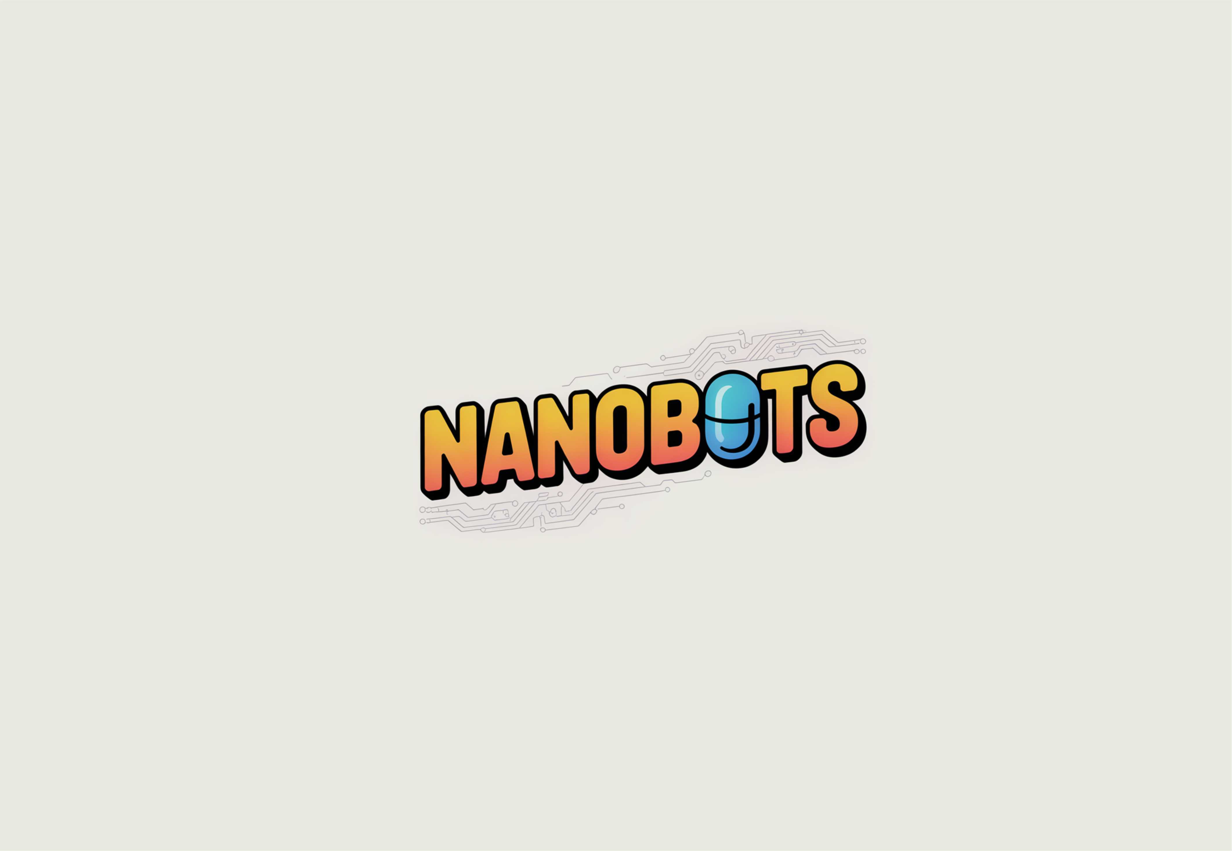
Logo for the animated children’s series “NANOBOTS”
Want to win a job like this?
This customer received 365 logo designs from 135 designers. They chose this logo design from nikkiblue as the winning design.
Join for free Find Design Jobs- Guaranteed
-
 US$150
-
 365 designs
-
 135 designers
Logo Design Brief
The series is about a team of nanorobots inside scientist Peter’s body, who help him cope with various illnesses and malfunctions, as well as understand how the human body works.
Genre: children’s, educational, entertaining
Target audience: children aged 4–10
Design Requirements:
- Minimalist yet expressive design
- Clear, readable font
- A sense of movement/dynamics in the lettering.
The Logo Must Be:
- Simple
- Memorable
- Free of unnecessary elements
- Feature one stylized letter (e.g., the "O").
The Logo Must Reflect:
- Comedy: Through saturated, bright colors.
- Adventure: Through slanted/tilted lettering and a sense of dynamism.
- Science: Through a symbol, e.g., a pill/capsule.
Optionally, can include elements of:
- Medical theme (science, biology, body structure, chemistry, anatomy)
- A hint of robots or digital.
The logo needs to incorporate a distinctive element that will also feature within the cartoon itself and be used separately from the logo (e.g., as a favicon). Currently, this element is envisioned as a pill/capsule, but alternative ideas are welcome.
Updates
Slow in providing feedback
Gathering more feedback
Slow in providing feedback
Low design quality
Low design quality
Logo Text
NANOBOTS