Elegant, Modern Logo for K-Beau – Korean Skincare & Beauty Brand
Want to win a job like this?
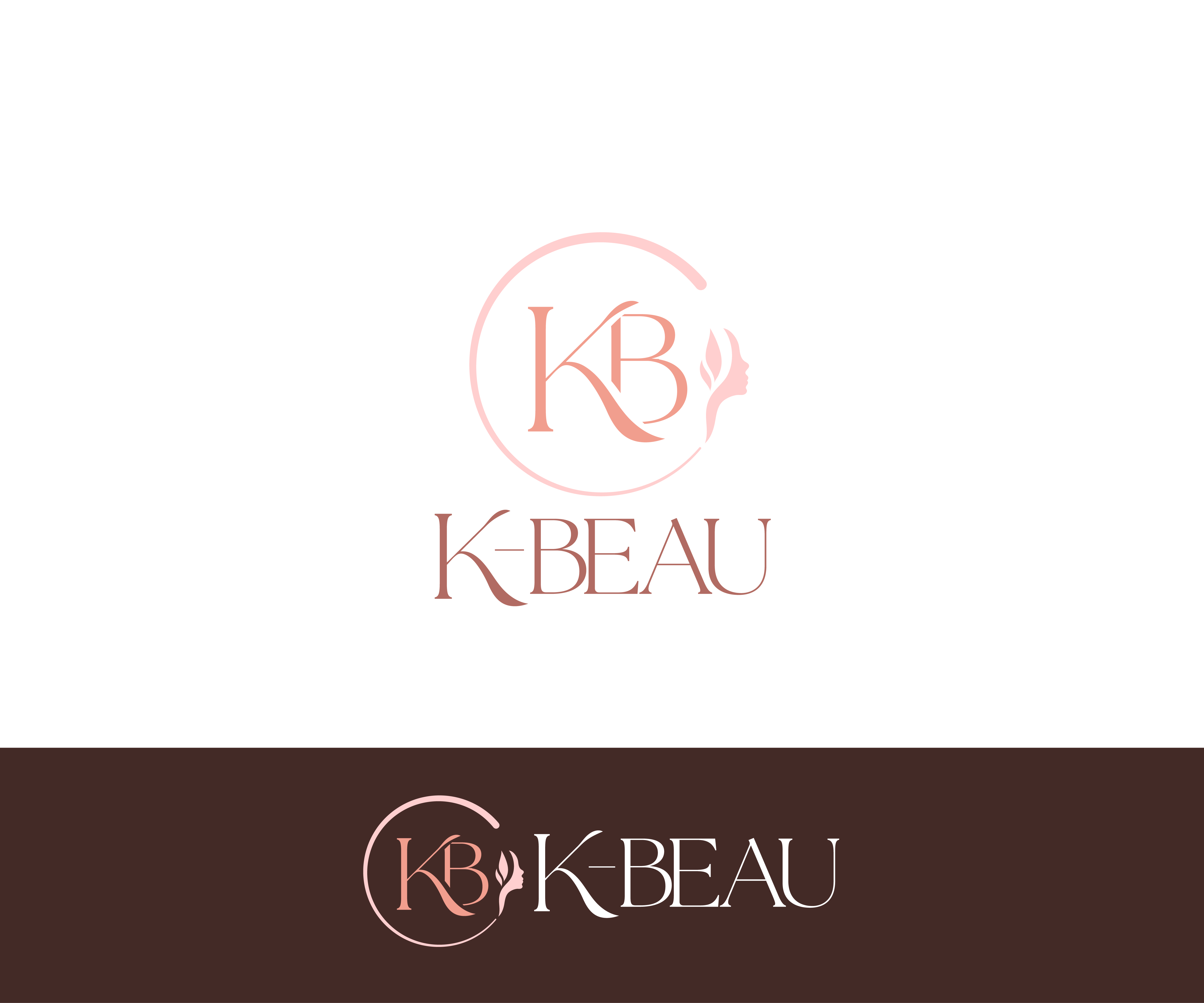
This customer received 15 logo designs from 5 designers. They chose this logo design from James J. as the winning design.
Join for free Find Design Jobs-
 A$120
A$120
-
 15 designs
-
 5 designers
Logo Design Brief
Logo Design for K-Beau (Modern, Inclusive Korean Skincare Brand)
We are looking for a talented designer to create a clean, modern, and inclusive logo for our skincare and beauty brand, K-Beau.
About the Brand:
K-Beau is a skincare and beauty brand inspired by the innovation and quality of Korean skincare. The name combines “K” for Korea with “Beau” (French for beauty), reflecting a global, elegant identity rooted in performance and simplicity.
Unlike many beauty brands, K-Beau is gender-neutral and age-inclusive. We’re not another “girly beauty store.” Our products are designed for:
Teens starting their skincare journey
Men seeking straightforward, quality care
Mature skin requiring effective, gentle solutions
Anyone who values clean, honest, and well-designed skincare
What We’re Looking For:
We want a logo that feels:
Minimalist, premium, and professional
Inclusive – appealing to all genders and ages
Modern with subtle Korean-inspired aesthetics
Clean enough for digital and print, and versatile across packaging and platforms
You’re welcome to explore:
Typography-first designs (wordmark or lettermark)
Subtle iconography (bring your own creativity)
Scalable designs that look great on both large packaging and small digital icons
Color Preferences:
Soft pastel tones (bring your own creative options)
Neutral base colors for a calming, modern feel.
Optional muted metallic accents.
Please avoid overly bright, neon, or heavily gendered colors
Deliverables:
Full logo in vector formats (AI, EPS)
PNG, JPG, and SVG versions
Light and dark background variations
Icon-only or simplified version (for social/profile use)
Where the Logo Will Be Used:
Skincare product packaging
E-commerce site
Marketing material (stickers, boxes, inserts)
Social media and digital campaigns
We are building something long-lasting and fresh. We want a logo that balances clarity and sophistication, while staying true to our Korean skincare roots and inclusive brand philosophy. Looking forward to seeing your creative take on K-beau!
We are open to your creative interpretation and encourage you to explore fresh ideas. We’re excited to see how you bring the K-Beau brand to life visually!
Target Market(s)
K-Beau serves a diverse audience of skincare users aged 16 to 55+, including teens, men, and mature skin types. Our customers value clean, effective Korean skincare with a modern, gender-neutral aesthetic.
Industry/Entity Type
Beauty & Cosmetics/Health & Wellness
Logo Text
K-Beau or K-BEAU
Font styles to use
Other font styles liked:
- Open to suggestions.
Look and feel
Each slider illustrates characteristics of the customer's brand and the style your logo design should communicate.
Elegant
Bold
Playful
Serious
Traditional
Modern
Personable
Professional
Feminine
Masculine
Colorful
Conservative
Economical
Upmarket
Requirements
Must have
- The logo must clearly include the brand name: K-Beau (with capital "K" and hyphen) Clean, modern design that works across product packaging, website, and digital use. Must be gender-neutral and age-inclusive — no overly feminine or masculine styling. Logo should be scalable (looks great at small and large sizes) Final files must include: Vector formats (AI, EPS) Web-ready formats (PNG, JPG, SVG) Versions for light and dark backgrounds. Optional icon-only version (for compact use)
Nice to have
- A subtle visual nod to Korean skincare origins (e.g. clean lines, soft organic shapes, minimalist beauty cues) An icon or monogram version that can be used for stickers, app icons, or social media avatars. Typography with a modern, premium feel. Pastel or muted color accents that complement a neutral base. A design that feels balanced on both white and soft-colored packaging.
Should not have
- No overly feminine, masculine, or gender-stereotyped visuals. Avoid bright neon or harsh primary colors. No cluttered, busy, or overly decorative designs. Do not use makeup-related symbols (like lipstick, lashes, etc.) — we’re focused on skincare, not cosmetics. Avoid cliché imagery (e.g. generic leaves, spa stones, water splashes) unless integrated in a subtle, creative way. No gradients that make the logo hard to reproduce in print or at small sizes.