Not your average candle company needs label design
Want to win a job like this?
This customer received 44 label designs from 22 designers. They chose this label design from Creative Studio X as the winning design.
Join for free Find Design Jobs- Guaranteed
-
 US$300
-
 44 designs
-
 22 designers
Label Design Brief
HERB + WRECK A Brand Deck for Disruptive Candles
WHO WE ARE
Herb + Wreck is a disruptive candle brand built on contrast. We create clean-burning, scent-forward rituals for people who are both grounded and undone.
We’re not here for the beige wellness aesthetic. We’re here for the moments that are messy, bold, emotional, and beautifully real.
Rooted in botanical craftsmanship. Branded in poetic defiance.
WHAT WE WANT PEOPLE TO THINK
When someone encounters Herb + Wreck, we want them to feel like they’ve stumbled into something intimate, moody, and unforgettable.
We want them to think:
• “This brand gets me.”
• “This feels like design, emotion, and scent in one.”
• “It’s art I can burn.”
• “I’ve never seen a candle brand like this before.”
Our name alone sparks curiosity. Our story keeps them. Our product delivers.
Target Market(s)
Women and men ages 25–45 who appreciate thoughtful design and emotional storytelling People who love brands like Otherland, Boy Smells, Flamingo Estate, Tatcha, and Le Labo Design-minded buyers who shop indie, high-end, or artisanal and care about self-expression through scent Emotionally intelligent rebels. Introspective, edgy, but craving grounding rituals.
Industry/Entity Type
Candle Industry
Font styles to use
Other font styles liked:
- Herb should be more refined in a serif font and I like mistrully font for wreck.
Look and feel
Each slider illustrates characteristics of the customer's brand and the style your logo design should communicate.
Elegant
Bold
Playful
Serious
Traditional
Modern
Personable
Professional
Feminine
Masculine
Colorful
Conservative
Economical
Upmarket
Requirements
Must have
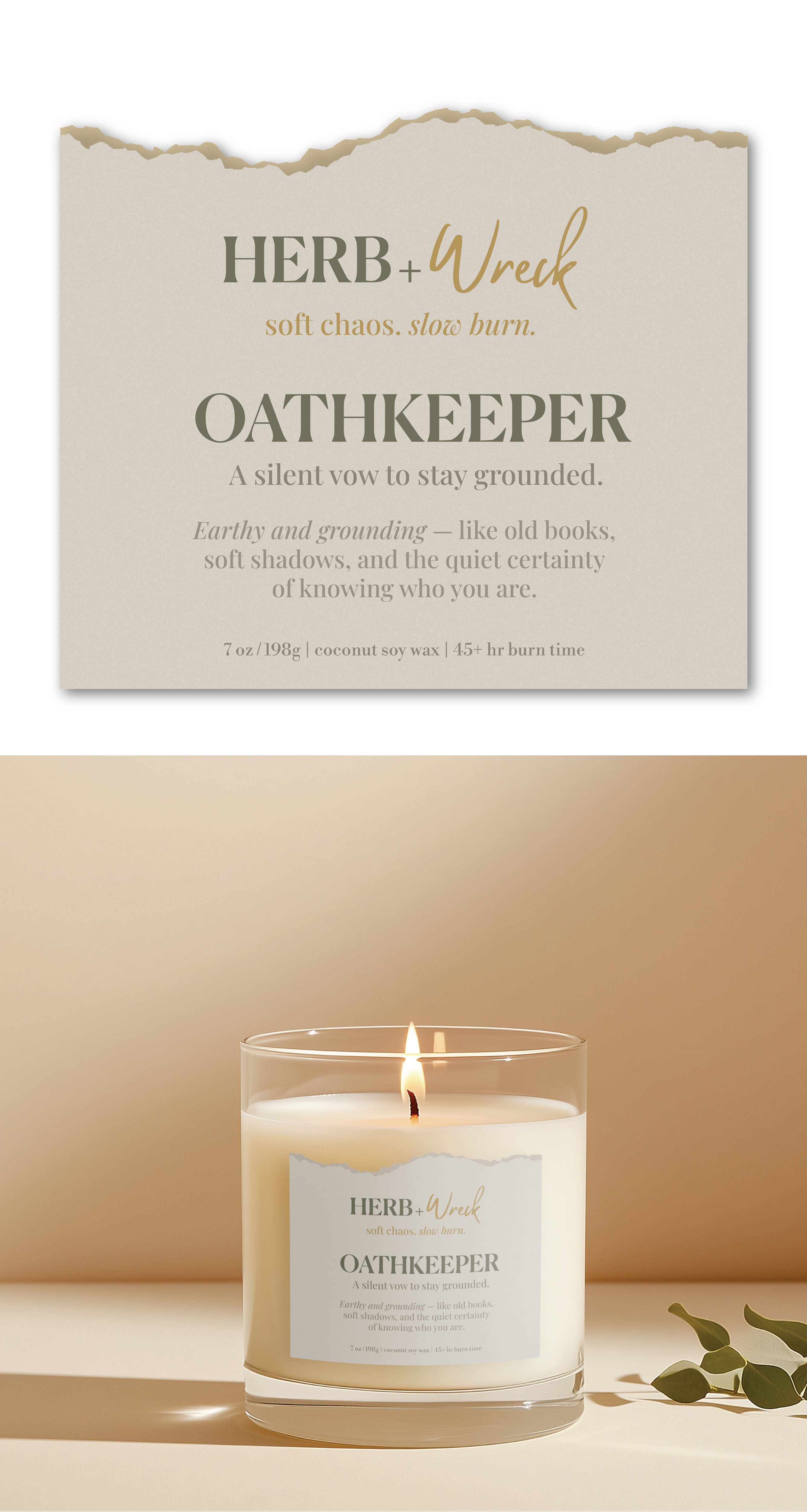
- Space for scent name and optionally, a small poetic tagline (like soft chaos. slow burn.) Layout that’s elegant but with tension — surprise us with something that doesn't play it safe Optional: room for batch no., burn time, scent notes on side or bottom. HERB + WRECK soft chaos. slow burn. Scent name example: Oathkeeper A silent vow to stay grounded. Earthy and grounding — like old books, soft shadows, and the quiet certainty of knowing who you are. [optional: 7 oz / 198g | coconut soy wax | 45+ hr burn time]
Nice to have
- raw edge opening with gold font. Open to colored labels. We’re creating an unforgettable candle brand called Herb + Wreck — a contrast-rich, emotionally resonant collection of candles that blend botanical beauty with bold edge. The name is intentional: Herb reflects grounding, ritual, and plant-based purity; Wreck speaks to vulnerability, chaos, and strength through contrast. Our brand is not dark or gothic — it’s confident, elevated, and style-forward, with packaging that feels like a cross between modern apothecary and high fashion. Think Tatcha meets Rick Owens. Gloss vessels, textured labels, contrasting fonts, and emotional scent storytelling.
Should not have
- goth vibe, typical candle label template layout.