Update the Bullseye Birdies Logo
Want to win a job like this?
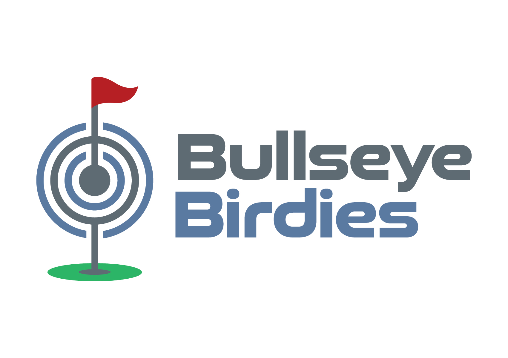
This customer received 253 logo designs from 117 designers. They chose this logo design from Atec as the winning design.
Join for free Find Design Jobs- Guaranteed
-
 A$150
A$150
-
 253 designs
-
 117 designers
Logo Design Brief
I have a pre-existing logo concept for our new business 'Buslleye Birdies' - a tavern with darts and golf simulators. Please read the brief in full before you commence this project.
We like the current logo concept but are unhappy with the font and a few small elements of the golf/darts icon that sits tp the left of the Bullseye Birdies text.
We are seeking a minor recreation of this logo to make it look more dynamic and available in two visual styles 1. Standard logo with a clear (vector) background that can be applied on white paper, email footers etc.; and 2: a reverse version of the colours with a clear (vector) background so the logo can be applied to our black walls for exterior signage, or dark colour background in advertisements.
*We have a logo graphic sample and a font file example of the new font style we would like to replace the old one with.
Deliverable formats required will be high resolution jpeg, png, pdf, psd and eps files of the regular and reverse logo versions please.
This is an urgent project. Thank you
Target Market(s)
Local Geraldton community and visitors who like pubs and playing golf or darts
Industry/Entity Type
Hospitality, tourism and sports
Logo Text
Bullseye Birdies
Font styles to use
Other font styles liked:
- Good Timing Regular or Bold (or a similar font that has bold and light options and that can be downloaded for free and used across our business) )
Look and feel
Each slider illustrates characteristics of the customer's brand and the style your logo design should communicate.
Elegant
Bold
Playful
Serious
Traditional
Modern
Personable
Professional
Feminine
Masculine
Colorful
Conservative
Economical
Upmarket
Requirements
Must have
- 1. Same or better version of the golf pin and dart board icon to the left of the text (I have provided a mock up version attached so would like a slightly better quality image. 2. Change text font to 'Good Timing Regular or Bold' Font (or similar - *if you choose another similar font, it must have some bold and light options that we can download it for use across all our sales, marketing, menus etc.). 3. Keep the current corporate colours (minor font shade changes accepted).
Nice to have
- We like the basic look of the logo sample we have provided, just slight improvements + a reversed out version for use on our black walls and website would be great please.
Should not have
- Must not have any major changes that don't resemble the basic look we have presented. We like the concept, just need a designers touch to bring it to life. Should not have a font that we can not download for free that has bold and light options for use across our marketing and signage.