Oak and Sprout Playthings - a heritage brand with children at heart
Want to win a job like this?
This customer received 10 logo designs from 5 designers. They chose this logo design from JohnnyCactus as the winning design.
Join for free Find Design Jobs- Guaranteed
-
 £80
£80
-
 10 designs
-
 5 designers
Logo Design Brief
1. Brand Overview
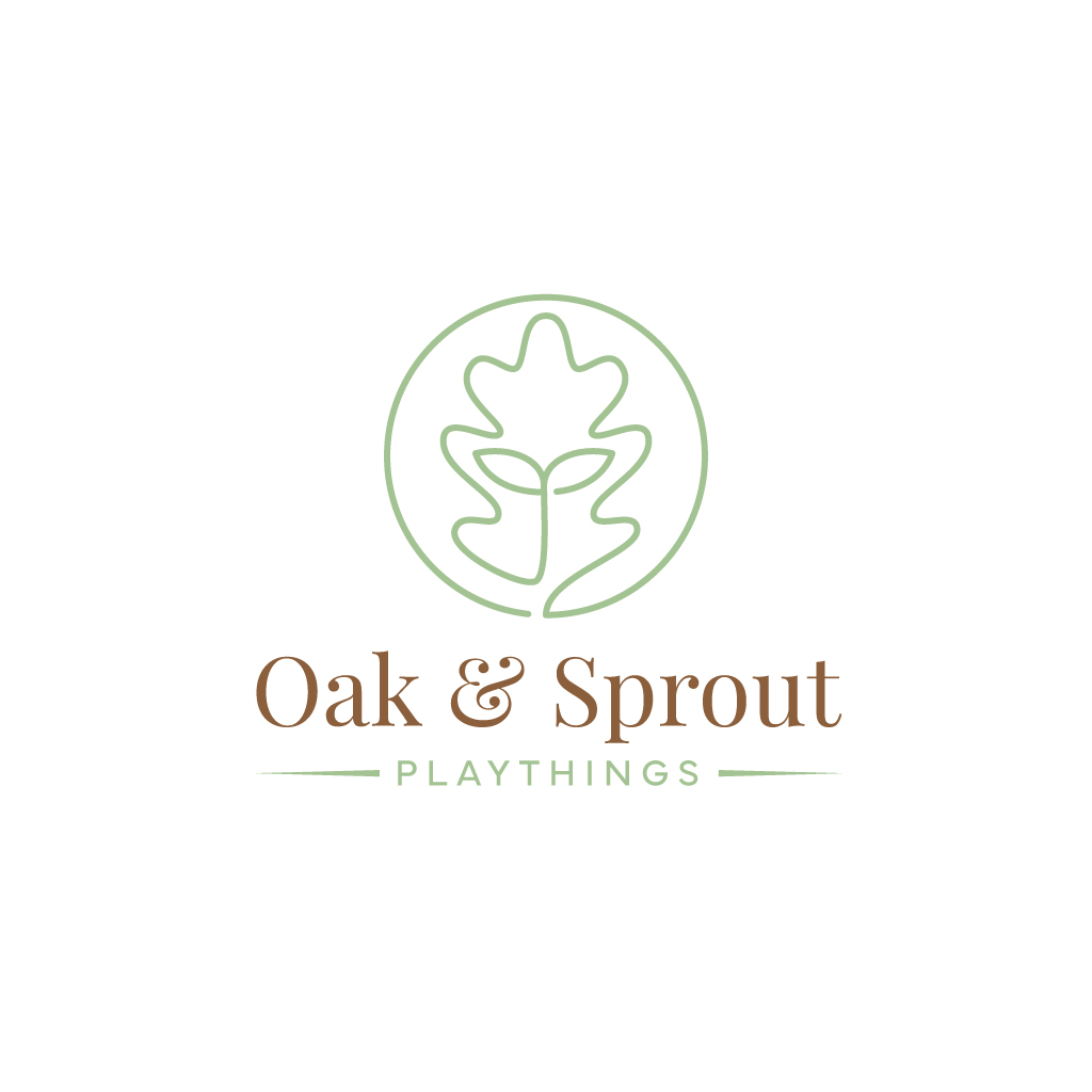
Name: Oak & Sprout Playthings
Tagline: Timeless Treasures
Founders’ Story:
We’re a couple of Montessori-inspired makers who started crafting solid-oak tracing boards and keepsakes for our daughter. Friends loved them so much, we decided to share the joy—and now we’re building timeless, heirloom-quality toys for curious little minds everywhere.
⸻
2. Brand Architecture
• Master Brand (Primary): Oak & Sprout Playthings
• Endorsed Promise (Tagline): Timeless Treasures
⸻
3. Logo Concept & Stamp Version
1. Primary Logo
• Icon: A single-line oak leaf that seamlessly curves into a young sprout.
• Logotype: “Oak & Sprout” in a sturdy serif/slab font, “Playthings” in a friendly, rounded sans below.
• Layout: Horizontal lock-up (icon to left of text) plus a centered badge version (icon above text) for square applications.
2. Stamp-Friendly Version
• Monochrome-only, simplified to bold outlines (no gradients or fine shading).
• All elements reduced to single-stroke paths at a minimum stroke weight of ~2 pt when scaled to a 2 cm stamp.
• Ensure ≥1 mm clear space between elements so the stamp won’t bleed.
Note for designer: Deliver vector files (SVG, EPS, PDF) with separate “Full Logo” and “Stamp Version” artboards.
Color Palette
Primary Neutral
Oak Brown
#8B5E3C
Main backgrounds, logotype, text
Primary Accent
Sprout Green
#A3C293
Highlights, buttons, links
Secondary Neutral
Cream
#F5F3EB
Secondary backgrounds, cards
Secondary Accent
Moss Green
#6B8E23
Call-outs, icons
Deep Contrast
Dark Brown
#5A3E25
Body copy, stamp outlines
Typography
• Primary Font (Headlines & Logo):
• A sturdy serif or slab (e.g. Merriweather Bold, Playfair Display).
• Secondary Font (Body & UI):
• A clean, rounded sans-serif (e.g. Lato, Nunito).
• Web-safe fallbacks: Georgia, serif / Arial, sans-serif
Usage:
• Headlines: Title case, 1.25–1.5 × line-height
• Body copy: Sentence case, 1.6 × line-height
• Small text: all-caps, tracking +50 for labels/buttons
Target Market(s)
Montessori parents, eco, heritage, traditional
Industry/Entity Type
Online and in person retail
Logo Text
Oak & (or and) Sprout Playthings
Logo styles of interest
Emblem Logo
Logo enclosed in a shape
Pictorial/Combination Logo
A real-world object (optional text)
Wordmark Logo
Word or name based logo (text only)
Font styles to use
Look and feel
Each slider illustrates characteristics of the customer's brand and the style your logo design should communicate.