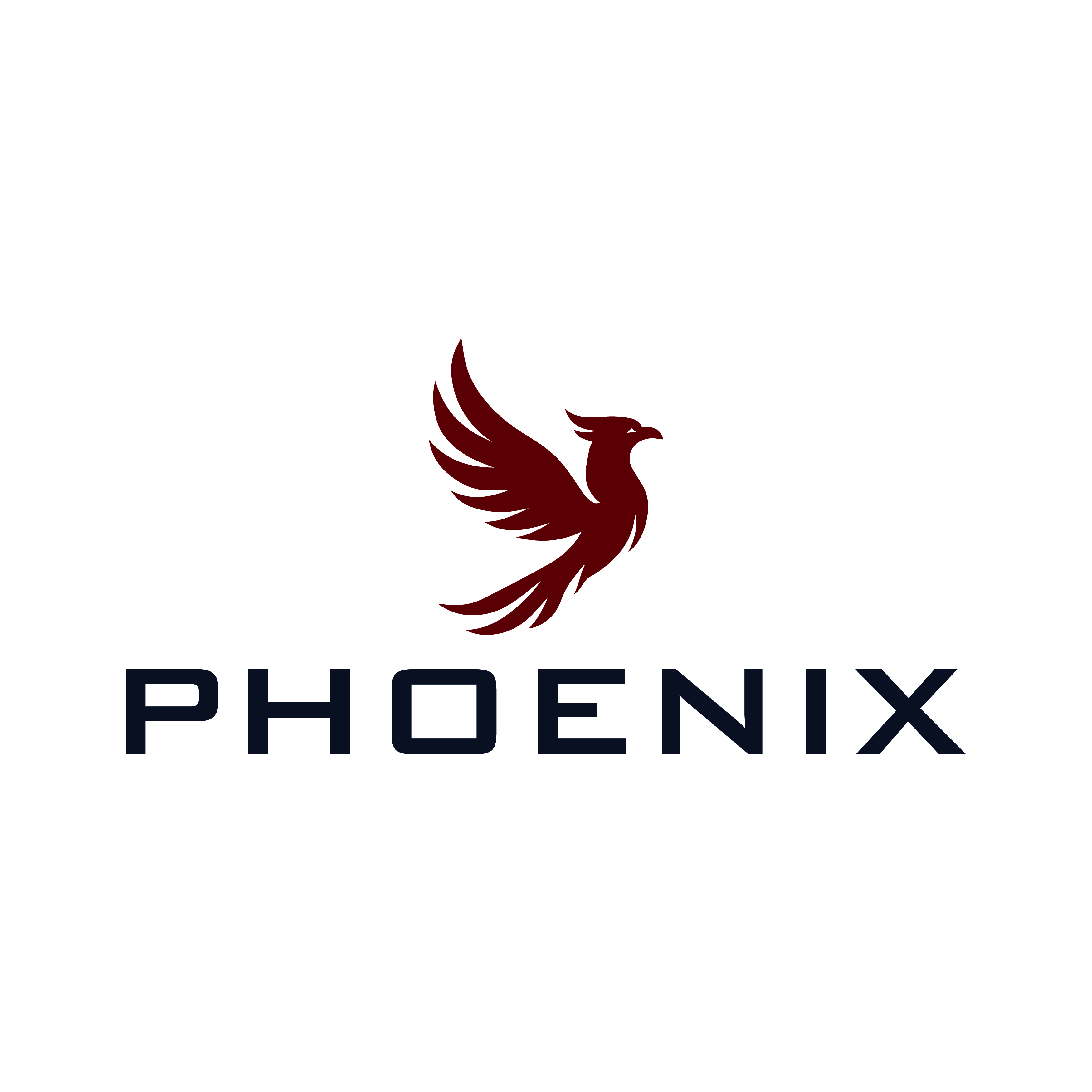
Sophisticated Logo for Phoenix: Healthcare Experts Rising from the Ashes
Winner
Want to win a job like this?
This customer received 282 logo designs from 96 designers. They chose this logo design from Faisal Graphics as the winning design.
Join for free Find Design Jobs-
 €190
€190
-
 282 designs
-
 96 designers
Logo Design Brief
Phoenix is a company that focuses on healthcare. We coach, advise, train and mediate personnel in healthcare.
We do not want to come across as a healthcare company, but we want to come across as experts. Businesslike, simple, high level.
Phoenix means that we have risen from the ashes, We are strong, one of its kind, and the tear has healing powers. Our company is not big, but no one can ignore us. That is what we want to radiate
Target Market(s)
Healthcare
Industry/Entity Type
Health Care
Logo Text
Phoenix
Logo styles of interest
Pictorial/Combination Logo
A real-world object (optional text)
Abstract Logo
Conceptual / symbolic (optional text)
Character Logo
Logo with illustration or character
Font styles to use
Sans Serif
Other font styles liked:
- Arial
Look and feel
Each slider illustrates characteristics of the customer's brand and the style your logo design should communicate.
Elegant
Bold
Playful
Serious
Traditional
Modern
Personable
Professional
Feminine
Masculine
Colorful
Conservative
Economical
Upmarket
Requirements
Must have
- Th Phoenix
Nice to have
- The Phoenix rises from the ashes. It would be nice if the tail rises from the fire and that this tail forms the O of the name Phoenix
Should not have
- It shouldn't get too busy
Payments
1st place
€150
Participation payments x 4
€10