GiddySquid Children’s Swimwear
Want to win a job like this?
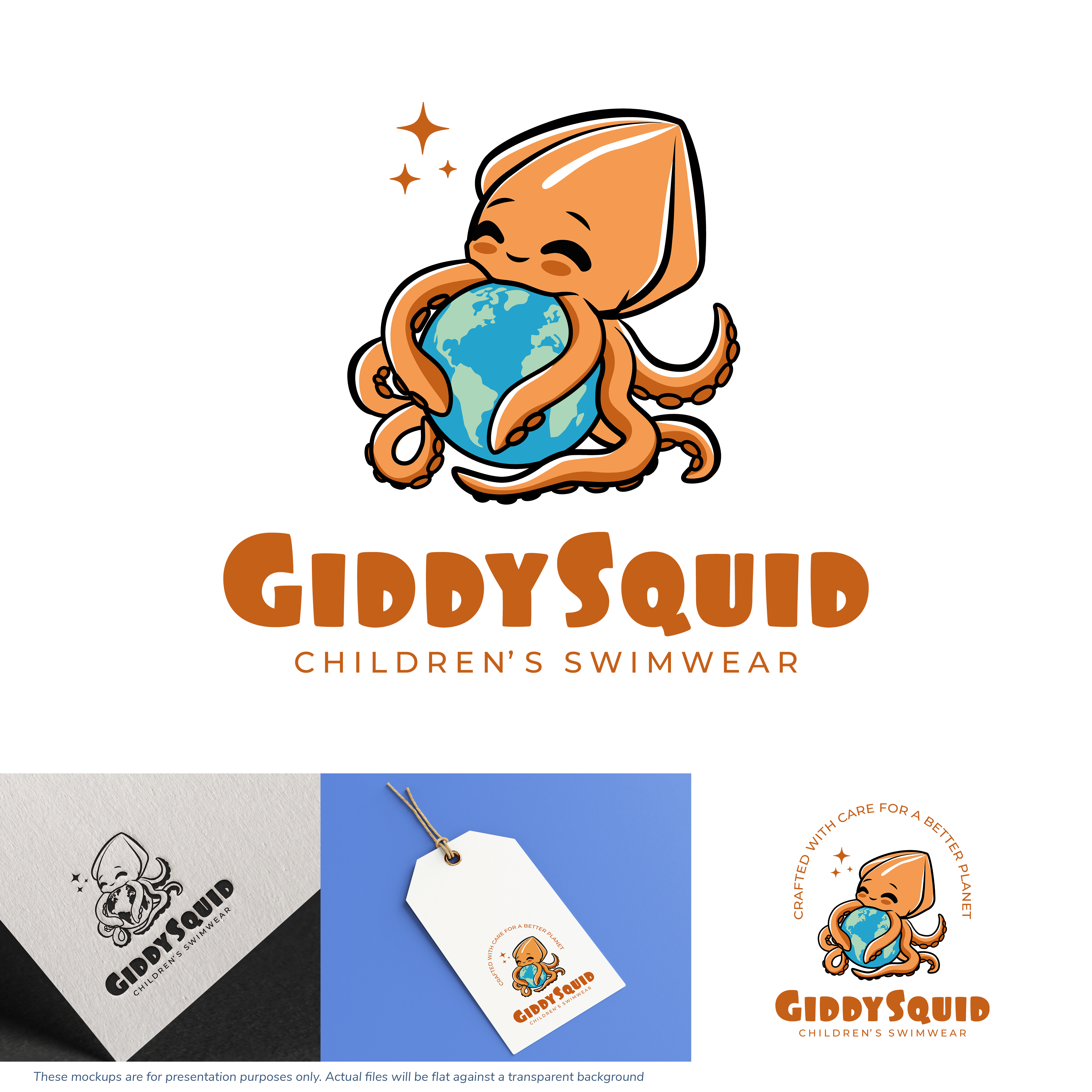
This customer received 149 logo designs from 66 designers. They chose this logo design from iohanna as the winning design.
Join for free Find Design Jobs- Guaranteed
-
 £155
£155
-
 149 designs
-
 66 designers
Logo Design Brief
Logo Design Brief – GiddySquid
Hi, I’m looking to redesign the logo for a children’s swimwear brand called GiddySquid. The current logo has some elements I really like, but overall there’s just too much going on. I’m now looking for something much more simplified, scaled down, and clean, while still keeping the playful, eco-conscious spirit of the brand.
I’ve attached several images to help explain the direction. The first image is the current logo, and the others are concept references and ideas. I’ve also included a few test logo layouts I’ve been playing around with myself to try out different typeface styles and explore the kind of simplicity I’m aiming for.
Needs to be gender neutral colours.
About the Brand
GiddySquid is a sustainable children’s swimwear brand. It’s fun, imaginative, and eco-friendly, and the logo should reflect those qualities in a way that appeals to both kids and parents. It should also be versatile and scalable, working across labels, tags, packaging, and digital platforms.
What I Like About the Current Logo
• The cheeky face on the squid – it gives personality and appeals to children
• The colour palette – fun, bright, and vibrant
• The use of the Earth, which supports the eco-friendly message
However…
• The design is too busy overall
• Some people think the squid looks more like an octopus
• The typeface doesn’t quite fit
• The phrase “Crafted with care for a better planet” adds too much text – though I’m open to keeping it in a cleaner, simpler way
What to Keep
• A squid character with a cheeky, friendly expression
• A globe or Earth to reflect sustainability
• The brand name: GiddySquid (one word, with a capital G and S)
• The tagline: Children’s Swimwear
Please provide:
• One version with the phrase “Crafted with care for a better planet”
• One version without
Style & Typography
• Rounded, child-friendly fonts (e.g. Dreaming Outloud Sans)
• Simple, modern, and playful – nothing too detailed
• Works in full colour and black & white
• Must be scalable for small spaces like tags and labels
Concept Inspiration
Image 2 – Squid Hugging the Earth
• I love the idea of the squid’s tentacles hugging the Earth – it’s fun, charming, and feels on-brand
• I’d love to see the squid’s cheeky little face popping out from the top – it adds character and a sense of playfulness
Images 3 & 4 – Globe with Airplane
• In the first airplane image, the airplane could be replaced by a squid, with the tentacles flowing behind where the airplane’s smoke trail is
• In the second image, the smoke curves into the Earth and almost forms a letter G
• This sparked the idea that the squid’s tentacles could form a G, and the brand name GiddySquid could be placed in the centre of the Earth
• It’s a clever and creative way to link the squid, the planet, and the brand name in a single, stylish image
Thank you so much – I’m really excited to see the creative directions you explore!
Best regards,
Jenny
Logo Text
GiddySquid Children’s Swimwear