Design the Visual Identity for PREMA the Bridge: Connect - Learn - Grow
Want to win a job like this?
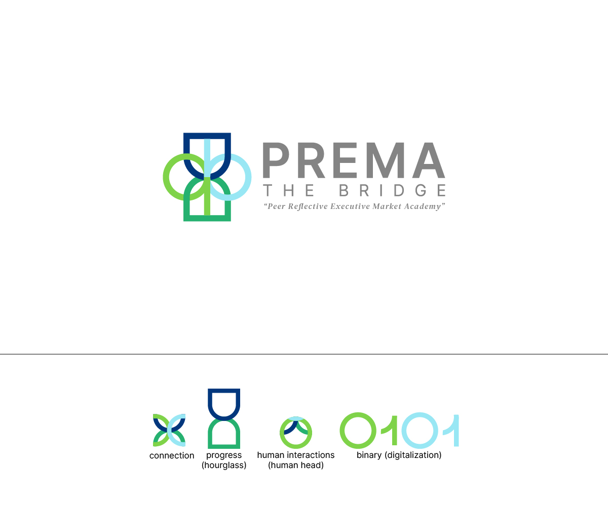
This customer received 115 logo designs from 44 designers. They chose this logo design from WahyuHMD as the winning design.
Join for free Find Design Jobs- Guaranteed
-
 €110
€110
-
 115 designs
-
 44 designers
Logo Design Brief
Logo Design Briefing for "PREMA the Bridge"
Commission title: "Crafting the Visual Identity for PREMA the Bridge: Connect - Learn - Grow" Where PREMA stands for 'Peer Reflective Executive Market Academy' Incorporate the logo into a symbolic imagery that embodies connection, learning, and growth.
1. Brand Name: PREMA the Bridge
2. Vision: A world where leaders across industries collaborate to develop and implement sustainable solutions for today's challenges.
3. Mission: To empower tomorrow's leadership through high-quality peer-to-peer learning networks, interactive training, and transformative coaching offerings, enabling leaders to proactively shape their organizations and societies.
4. Tagline: Connect - Learn - Grow
5. Target Audience: C-level executives from various industries who value continuous education, networking, and personal and professional development.
6th Design Requirements:
The logo should visually capture both the acronym "PREMA" and the element "The Bridge."
It should appear modern, clear, and professional to appeal to the high-level target audience.
Incorporate elements that represent future orientation, digitalization, and the human element, such as abstract depictions of people in networks or interactions.
The logo should be integrated into a symbolic imagery that reflects themes of connection, learning, and growth.
The logo should function well across different media, both online and in print, and be scalable for small and large formats.
Color scheme: Please provide suggestions for a color palette that conveys seriousness, innovation, and human warmth. Potential colors might include shades of blue, green, gray, and perhaps warm earth tones to symbolize trust, growth, and human aspects.
7th Sources of Inspiration:
The idea of “The Bridge” can metaphorically stand for connection, progress, and human interactions.
Elements that represent networking, dynamic interaction, and human collaboration, such as linked nodes or interlocking forms.
Clear, minimalist designs that are recognizable from a distance and convey authority and accessibility.
Designs that reflect modern digital technologies and progressiveness, eg, pixel patterns or schematic diagrams of digital networks.
8. What to Avoid:
Overly complex or playful designs that undermine clarity and professionalism.
Stereotypical or clichéd “bridge” images that are too literal and do not reflect the deeper meaning of “The Bridge” in a modern business context.
Logo Text
PREMA the Bridge