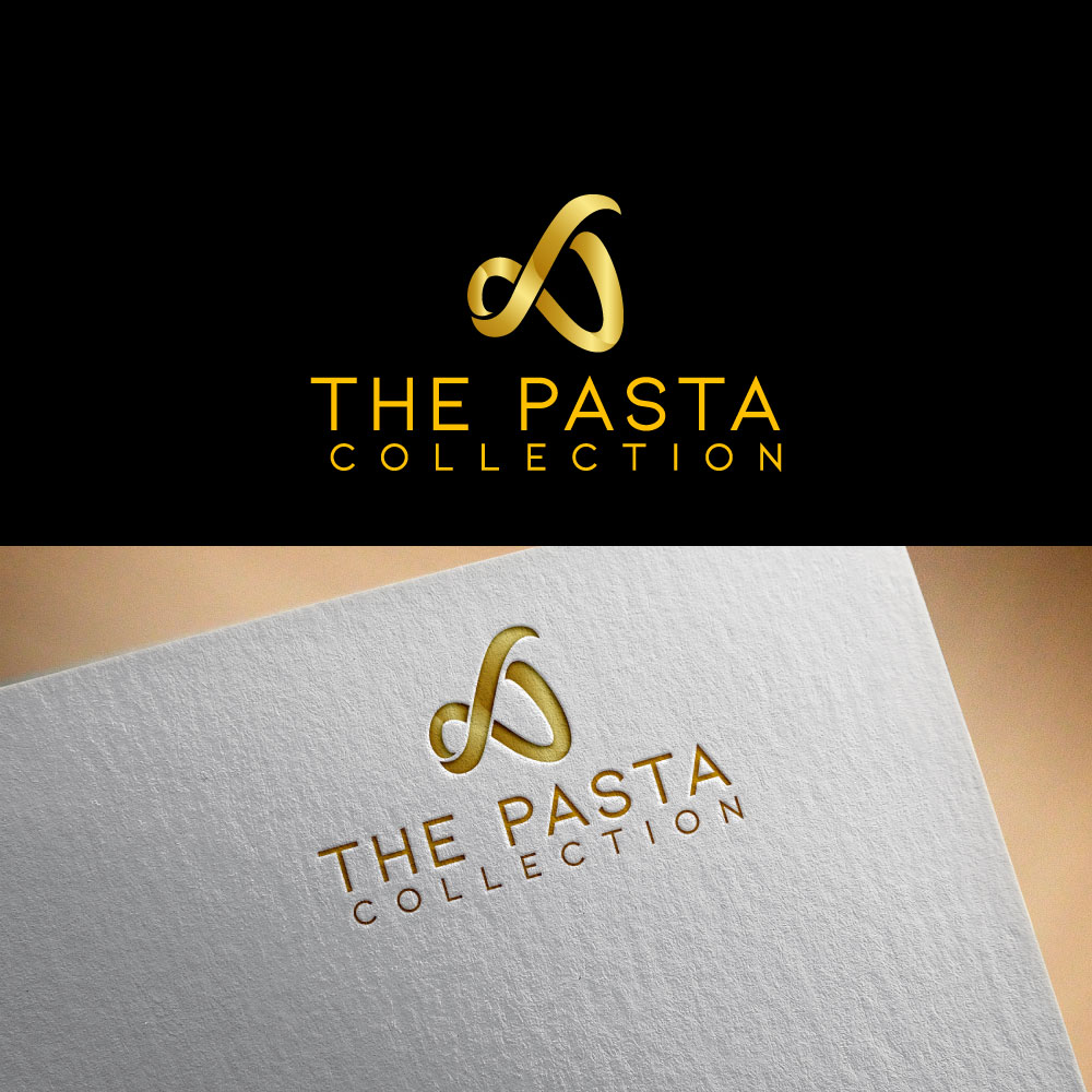
Logo for small batch start up Pasta Maker in Canada
Want to win a job like this?
This customer received 91 logo designs from 39 designers. They chose this logo design from designhunt(verifiyed01) as the winning design.
Join for free Find Design Jobs- Guaranteed
-
 C$150
C$150
-
 91 designs
-
 39 designers
Logo Design Brief
Logo Design Brief
We are a small-batch pasta maker (not a restaurente) that uses traditional methods to craft unique, flavorful pasta with a twist. For over a year, we've been perfecting our recipes under a different name, offering a limited selection of pasta shapes but an unlimited array of flavors. We are not a restaurant, we are a small manufacturer that has one retail location and wholesale the rest to other retailers.
Our collection is curated from a variety of flours, high-performance nutritional ingredients, and creative flavor combinations. We specialize in shapes like tagliatelle nests, ribbed macaroni, rotini, and rigatoni. Our pasta collection is unique.
We want our brand to reflect something simple and classy, yet with a touch of funk, embodying the essence of pasta in a high-class and sophisticated way. Unlike other pasta joints with the same boring logos and colors, we aim to stand out with a unique and vibrant identity that truly captures the spirit of our creative pasta offerings.
For colors:
I like yellow gold (semolina), Black and grey. Not oppose to other colors... Do not represent the Italian flag.
!!!!!!The logo need to pop out when on white or black background.!!!!!!!!
Inspiration: Reference to ancient Syrian, Iraqi, Greek, Egyptian culture... We are only organic, and stone milled grain.
We prefer simple an minimalist and more refined...
We like contrasted gradient shape within letters or other element. See attached inspiration in file.
File 3- I like the folded ribbon effect and that could be a folded Tagliatelle!
No need to put more emphasis on any of the words more then another but if you do it must be Pasta not the word Collection. (The Pasta Collection)
On my upload file 10 - I like the watercolour ink splash. I think that is less modern but could be a theme I play with . Although my original toughs was to keep it more modern. Anyway that is one of the options aesthetically speaking. Water colour could be substituted by type of flours and grounded spices. I am not oposse to abstract element, but it should be somewhat related to the business mission.
Target Market(s)
Mostly women. People that are above average earners... Luxury pasta for fit and active people.
Industry/Entity Type
Food industry - Organic - Artisan
Logo Text
The Pasta Collection
Logo styles of interest
Abstract Logo
Conceptual / symbolic (optional text)
Wordmark Logo
Word or name based logo (text only)
Font styles to use
Other font styles liked:
- Just inspirations: Aguero Serif - La Orleans - Mialgor – Luxury Classy Font
Look and feel
Each slider illustrates characteristics of the customer's brand and the style your logo design should communicate.
Elegant
Bold
Playful
Serious
Traditional
Modern
Personable
Professional
Feminine
Masculine
Colorful
Conservative
Economical
Upmarket
Requirements
Must have
- International flare (Durum Wheat semolina color)
Nice to have
- Logo that fits in a square for best fit in social media profil pic... Other that the letter an element that we could be using for developping an iconography.
Should not have
- I do not want something that looks like the Italian Flag...