OrthoPediatrics Division Logos
Want to win a job like this?
This customer received 90 logo designs from 43 designers. They chose this logo design from Isnah Logo as the winning design.
Join for free Find Design Jobs-
 US$150
-
 90 designs
-
 43 designers
Logo Design Brief
REQUIREMENTS
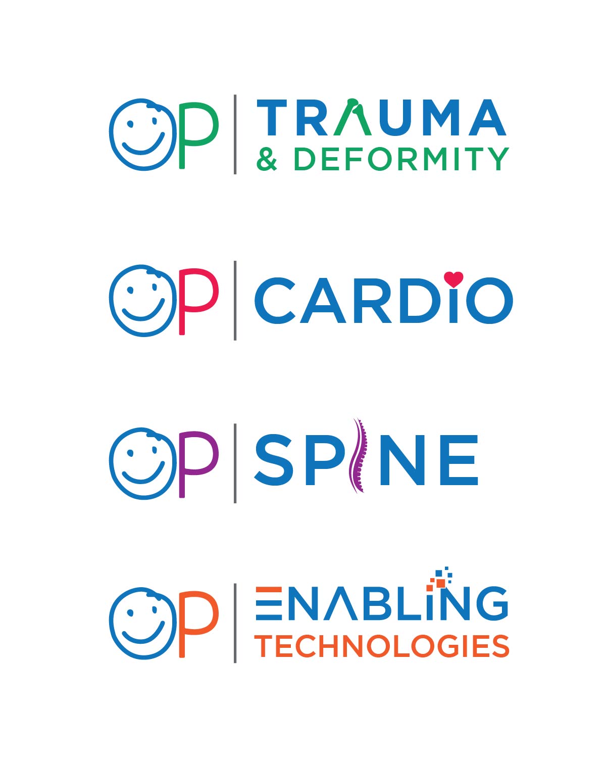
We are looking to build a brand standard for logos around the OrthoPediatrics "OP" logo (see "Logo-OP-092619" attachment). 1. We want to keep the current “OP” brand with the same treatment of the “O” with the smile and the same font, but without the little arms and hand. OP is the Parent Company that owns many subsidiary companies and the original logo is file "Logo-OP-092519", also attached.
- Subsidiary names are shown to the right of the OP in attached file (Logo-Samples-1).
2. We want to use the OP with each of the subsidiary company names as shown here. We are open to any ideas on how to combine these together.
- Does each subsidiary have a different color?
- Do we add a Human Spine in where the “I” is on the Spine name?
- Do we dot the “I” in Cardio with an image of a Heart?
3. We would like some Digital or High Tech feel to the “Enabling Technologies” name (sample for this logo attached - "Logo-OP-ET-2-Flat").
4. As you can see, some of the subsidiary names have 1 name and others have 2. How do we design around this?
5. We are open to different positioning of the OP and the subsidiary name.
6. We are open to different FONTS – these examples are just placeholders. Please get creative.
7. We are open to different ways to separate the OP from the subsidiary name.
8. Most time critical logo is the Enabling Technologies logo. Need that ASAP.
Logo Text
OP and then the subsidiary/division name