569th Dive Detachment - Logo Modernization
Want to win a job like this?
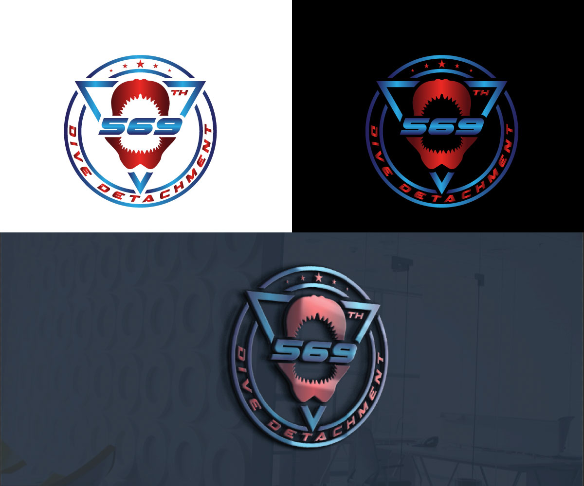
This customer received 76 logo designs from 36 designers. They chose this logo design from RS_Design as the winning design.
Join for free Find Design Jobs- Guaranteed
-
 US$150
-
 76 designs
-
 36 designers
Logo Design Brief
Hi,
My organization, the 569th Dive Detachment, recently just moved from Williamsburg, VA to Honolulu and we are looking to update our logo. We would like our new logo to be more sleek and modern looking, with the use of color gradients to make it look more 3-dimensional, while still paying homage to the original design (i.e. keeping the shape of the shark jaws the same). I've attached our original logo (as both a pptx and png) and I've also attached the logo for one of our sister dive detachments (the 511th dive detachment). We obviously don't want our logo to look exactly like theirs, but want it to have a similar modern/industrial feel. We would like to color gradient to be black and gold (please feel free to use other neutral colors if you think it would make the design look better - grey, white, etc.). Additionally, we want our logo to be scalable (see the attached example). Lastly, since our unit just re-stationed to Hawaii, we would like the logo to have some Hawaiian or "Island Life" elements added to it.
All the best,
Jon
Logo Text
"569th Dive Detachment"
Logo styles of interest
Pictorial/Combination Logo
A real-world object (optional text)
Colors
Designer to choose colors to be used in the design.
Look and feel
Each slider illustrates characteristics of the customer's brand and the style your logo design should communicate.